For the last few years (since at least 2016), I’ve shared predictions for the next annual global mean surface air temperature (GMSAT) anomaly based on the long term trend and the state of ENSO at the start of the year. Generally speaking, this has been quite skillful compared to persistence or just the long term trend alone – the eventual anomaly was consistently within the predicted bounds. Until 2023.
[Read more…] about Annual GMSAT predictions and ENSOFeatured Story
2023 appears to follow an upward trend in the North Atlantic/Caribbean named tropical cyclone count
This year’s (2023) tropical cyclone season in the North Atlantic and Caribbean witnessed a relatively high number of named tropical cyclones: 20. In spite of the current El Niño, which tends to give lower numbers. But it appears to follow a historical trend for named tropical cyclones with an increasing number over time.
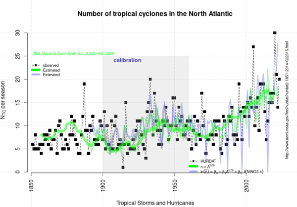
The curve presented above is an update of the analysis presented in 2020 and posted here on RealClimate.
[Read more…] about 2023 appears to follow an upward trend in the North Atlantic/Caribbean named tropical cyclone countReferences
- R.E. Benestad, "On tropical cyclone frequency and the warm pool area", Natural Hazards and Earth System Sciences, vol. 9, pp. 635-645, 2009. http://dx.doi.org/10.5194/nhess-9-635-2009
Science denial is still an issue ahead of COP28
It is 33 years now since the IPCC in its first report in 1990 concluded that it is “certain” that greenhouse gas emissions from human activities “will enhance the greenhouse effect, resulting on average in an additional warming of the Earth’s surface.” That has indeed happened as predicted, it has been confirmed by a zillion studies and has been scientific consensus for decades. Yet, when the next global climate summit is coming up (it’s starting tomorrow), we don’t only learn that the host, United Arab Emirates, intends to use the event for new oil deals. We also see more attempts to cast doubt that global warming is caused by emissions from burning oil, gas and coal – as so often before these summits.
This time making the rounds is a “discussion paper” published by Statistics Norway. It is noteworthy not because it contains anything new (it doesn’t), but because despite clearly violating the established standards of good scientific practice, it was published by a government agency. That’s why it is having an impact in non-scientific quarters including the corporate world, and it has even been cited in a submission to proceedings of the German parliament.
The flood of fallacies or deceptions begins with the paper’s title: “To what extent are temperature levels changing due to greenhouse gas emissions?” But the effect of greenhouse gases is not even investigated in the paper – which suggests the title is politically motivated. And the paper revolves around ignoring past studies and basic physics, using dubious sources, and the glaring blunder of arguing that warming at any individual weather station might be caused by random weather variations, without ever wondering how it is possible that these supposed random variations go in the same direction all over the planet: in the direction of warming.
The paper provides a good opportunity to illustrate how climate science obfuscation works, and to remind readers how we actually know for sure that greenhouse gas emissions are indeed responsible for modern global warming.
Egregious scientific errors
The paper contains far too many egregious scientific errors and logical fallacies to review here, but let’s look at one: The paper continually mixes up local and global temperatures. It performs some statistical analysis on local temperature changes and argues they individually might just be within random fluctuations (a 25-year-old argument, which works if you assume long autocorrelation) – but even if that were true, the same does not apply to the global temperature. In an unchanging climate, the random fluctuations would lead to warming in some parts of the world and cooling in others. The fact that all parts of the world, with very few exceptions, show warming at the same time cannot be explained by random internal fluctuations.
It’s not hard to understand. In a world with just random local fluctuations but no climate change, about half the weather stations would show a (more or less significant) warming, the other half a cooling. With a modest amount of global warming, perhaps 60% would be warming and 40% cooling. With strong global warming, close to 100% will show warming, and that is exactly what is happening. It shows global warming has overwhelmed natural temperature variability, and that is what the Statistics Norway paper confirms yet again. Its authors literally don’t see the forest for the trees when they falsely claim the opposite.
Figure 1: Map of observed near-surface air temperature changes since the late 19th Century. Gray areas show lack of data. The only region of cooling is the northern Atlantic, where climate models have long predicted just that due to a slowing of the Atlantic Ocean overturning circulation. The data are from the independent open-source Berkeley Earth project – a project by the formerly outspoken climate skeptic physicist Richard Muller, which in 2010 set out to do better than the traditional climate institutes and in the end obtained almost exactly the same results, just a slightly faster global warming. Muller was converted to accepting mainstream climate science by his own results. Image: Zeke Hausfather / Berkeley Earth.
Such statistics have of course been investigated for other climate parameters, too. For extreme rainfall events, a study of a global dataset of 8326 high-quality weather stations found that “64% of stations show increasing trends and 36% show decreasing trends”. Another study has shown the same for 940 Western European weather stations. That confirms that extreme rainfall is increasing – as predicted by elementary physics as well as climate models.
Blind use of statistics without understanding physics
Perhaps the most important law of physics is the conservation of energy, and the observed warming of Earth requires a huge energy input, which cannot be provided by random weather fluctuations. But even first-term physics is completely ignored in the Statistics Norway paper.
The heating of the global ocean has been going on at a steady rate of nine zeta Joules per year for decades, which is 15 times the worldwide primary energy consumption. We know this from the thousands of Argo floats drifting in the oceans, regularly diving down to 2000 meters while taking measurements. And we know where this staggering amount of heat energy comes from: It represents 91% of the additional heat retained on our planet by the human-caused increase in greenhouse gases. The energy balance of our planet, the radiation arriving and leaving, is continually monitored by a global radiation network at the surface and by dedicated satellites.
The greenhouse effect is in fact the largest control knob to dial up the temperature of our planet. We are receiving 342 Watts per square meter of Earth surface in back-radiation from the greenhouse effect, which is more than twice the Sun’s energy absorbed at Earth’s surface. And yes, also the increase in back-radiation towards the Earth surface from the CO2 greenhouse effect is a measured fact.
The physics behind the greenhouse effect and the gases that cause it have been understood since the 1800s, and that is why global warming was correctly predicted since the 1970s, even before observations unequivocally showed it. This warming was predicted not only by independent university and government scientists, but also by scientists from the oil company Exxon.
Is it sheer incompetence or is it politically motivated?
So the Statistics Norway paper ignores physics, misinterprets statistics and cherry-picks data – but is that just sheer incompetence, or is it politically motivated? In addition to the title, there are many tell-tale signs that strongly suggest the latter. Here’s just a few examples.
The paper shows a graph of local Greenland temperature from the famous Camp Century ice core drilled in 1960-1966. But rather than the data from the original publication in Science, it shows a hand-drawn version that has never been published in the peer-reviewed literature and is mislabeled, with the vertical axis showing variations around an average temperature of 15 °C (rather than -25 °C) to suggest it represents the global mean. This version originates from a 1995 German book and to this day is highly popular with the climate skeptics bubble on social media, and with the German right-wing AfD climate denial party (see my 2019 blog article).
The Statistics Norway authors try to cast doubt on modern warming being human-caused by pointing to the fact that Greenland was warmer during past millennia. But they don’t tell you why: as explained for example in the paleoclimate chapter of the 4th IPCC report of 2007 (which I co-authored), this is as expected from Earth’s natural orbital cycles. And they conveniently ignore global data reconstructions, which show Earth is warmer now than any time at least since the last Ice Age 24.000 years ago.
Similarly, they show Antarctic ice core data, taken from the climate skeptic website climate4you rather than a scientific source, with the figure caption falsely claiming that these data show global temperature when in fact, it is local. Greenland and Antarctica are perhaps the two locations on Earth where temperature variations are least representative of the global average.
The statistical analysis in fact confirms climate change
The paper analyses only one temperature data set which is actually global: the HadCRUT3 data, one of the well-established global temperature series. Strangely, the data shown end in December 2010 and the diagram is copied from the same climate skeptic website, instead of using the current HadCRUT5 data which have improved global coverage and are readily available from the source (which google finds in one second). But regardless: for this data set even their method “found that the HadCRUT3 time series is far from stationary”. The real result of their statistical analysis is thus: global temperature does show climate change! They even wonder why it does that, despite their home-baked aggregate of a small number of weather stations does not even though it shows a similar trend. They don’t seem to understand that the signal-to-noise ratio matters, which is worse the fewer data one uses (they used a meagre 74 stations).
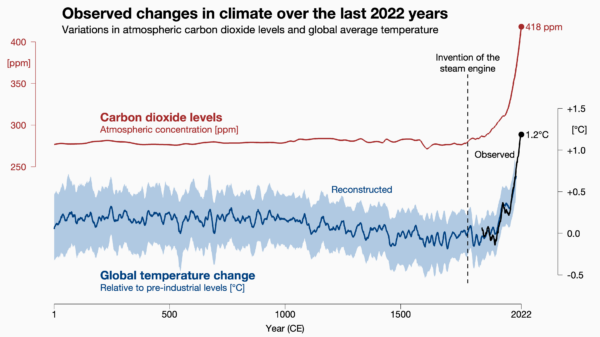
Figure 2: Carbon dioxide levels and global temperature over the past 2022 years. Carbon dioxide data from air bubbles enclosed in Antarctic ice. Global temperature data from the PAGES2k project, a collaboration of 78 paleo-climatologists from 24 countries. The Statistics Norway paper conveniently ignored these well-known state-of-the art data, even though they are shown in the IPCC report. Image: Prof. Ed Hawkins, National Centre for Atmospheric Science.
Unscientific sources
The paper also repeatedly cites a climate skeptics book by Fritz Vahrenholt and Sebastian Lüning, a former German CEO and an employee of the energy giant RWE, the largest CO2 emitter in Europe. The US edition of this book, called The Neglected Sun, is published by the climate denial lobby Heartland Institute. Yes, that’s the think tank which ran a poster campaign comparing the Unabomber and Osama Bin Laden to those concerned about global warming.
The original German title of this book is called Die kalte Sonne (The Cold Sun), referring to the fact that solar activity has declined, and thus has counteracted a small amount of the greenhouse warming caused by burning coal, oil and gas. This book badly overestimated the importance of solar variations and thus predicted an imminent global cooling. When this was soon disproven by observations, they accused NASA of doctoring the data.
I could go on. The paper presents many more hair-raising false statements and misleading climate-change-denial talking points. The authors have clearly swallowed a great mouthful of the toxic brew found on climate denial websites. But they have apparently not bothered to look at real climate science or talk to a climate scientist before publishing this “discussion paper”.
A massive blow to Statistics Norway’s credibility
It is more than embarrassing that Statistics Norway has published this nonsense. It is a scandal. Let’s hope it was not political on the part of that institution, but just a bad mistake. If they want to salvage their reputation and credibility, they should withdraw it immediately, with an appropriate explanation of the real science of global warming.
Clauser-ology: Cloudy with a chance of meatballs
John Clauser’s theory of climate explained.

Some of you will have heard of John Clauser because he was an awardee of the 2022 Nobel Prize in Physics for his role in the experimental verification of quantum entanglement. Some of you will have heard of him because the first thing that he did after winning the Nobel was join a climate denial organization and make some rather odd claims about climate science. And some of you will never have heard of him (in which case, feel free to skip this post!).
At no point in his long and, by all accounts, successful, career has he ever published a paper on climate[1]. He has not penned an article, nor even a blog post or a tweet on the topic, and so any scientific basis for his opinions (if any) has been opaque… until recently. In the last few months he has given two interviews in which he goes into to detail about what he describes as a ‘missing element’ in climate science and what he imagines the consequences are for climate change. The first interview was for the Epoch Times (a far right-wing newspaper and media organization affiliated with Falun Gong). The second was a podcast with the somewhat troubled Chris Smith, an Australian journalist. (The material is somewhat similar in each). And more comprehensively, it was repeated in a recent video lecture as well.
And what is this supposed ‘missing element’? Clouds.
[Read more…] about Clauser-ology: Cloudy with a chance of meatballsA distraction due to errors, misunderstanding and misguided Norwegian statistics
A friend asked me if a discussion paper published on Statistics Norway’s website, ‘To what extent are temperature levels changing due to greenhouse gas emissions?’, was purposely timed for the next climate summit (COP28). I don’t know the answer to his question.
[Read more…] about A distraction due to errors, misunderstanding and misguided Norwegian statisticsThe 5th International Conference on Regional Climate
The fifth international conference on regional climate (ICRC 2023), organised by World Climate Research Programme’s (WCRP) coordinated downscaling experiment (CORDEX), has just completed. It was a hybrid on-site/online conference with hubs in both Trieste/Italy (hosted by the International Centre on Theoretical Physics, ICTP) and Pune/India.
The hybrid set-up, with video links between the two hubs and digital attendence through zoom, was a change from previous ICRCs held in ICTP (2011), Brussels (2013), Stockholm (2016), and Beijing (2019). It worked impressively well, and the CORDEX ICRC 2023 streaming is available from the WCRP CORDEX YouTube channel.
It seems as an eternity since the previous ICRC before the COVID pandemic, so I was curious to see how things have progressed since then. It was also interesting to compare my impressions from this conference with my blog posts here on RealClimate from the first ICRC in Trieste, the second in Brussels, the third ICRC in Stockholm, I see that questions concerning uncertainty and added value are still being debated.
Old habits
Media awareness about global warming and climate change has grown fairly steadily since 2004. My impression is that journalists today tend to possess a higher climate literacy than before. This increasing awareness and improved knowledge is encouraging, but there are also some common interpretations which could be more nuanced. Here are two examples, polar amplification and extreme rainfall.
[Read more…] about Old habitsThe Scafetta Saga
It has taken 17 months to get a comment published pointing out the obvious errors in the Scafetta (2022) paper in GRL.
Back in March 2022, Nicola Scafetta published a short paper in Geophysical Research Letters (GRL) purporting to show through ‘advanced’ means that ‘all models with ECS > 3.0°C overestimate the observed global surface warming’ (as defined by ERA5). We (me, Gareth Jones and John Kennedy) wrote a note up within a couple of days pointing out how wrongheaded the reasoning was and how the results did not stand up to scrutiny.
[Read more…] about The Scafetta SagaReferences
- N. Scafetta, "Advanced Testing of Low, Medium, and High ECS CMIP6 GCM Simulations Versus ERA5‐T2m", Geophysical Research Letters, vol. 49, 2022. http://dx.doi.org/10.1029/2022GL097716
As Soon as Possible
The latest contrarian crowd pleaser from Soon et al (2023) is just the latest repetition of the old “it was the sun wot done it” trope[1] that Willie Soon and his colleagues have been pushing for decades. There is literally nothing new under the sun.
[Read more…] about As Soon as PossibleReferences
- W. Soon, R. Connolly, M. Connolly, S. Akasofu, S. Baliunas, J. Berglund, A. Bianchini, W. Briggs, C. Butler, R. Cionco, M. Crok, A. Elias, V. Fedorov, F. Gervais, H. Harde, G. Henry, D. Hoyt, O. Humlum, D. Legates, A. Lupo, S. Maruyama, P. Moore, M. Ogurtsov, C. ÓhAiseadha, M. Oliveira, S. Park, S. Qiu, G. Quinn, N. Scafetta, J. Solheim, J. Steele, L. Szarka, H. Tanaka, M. Taylor, F. Vahrenholt, V. Velasco Herrera, and W. Zhang, "The Detection and Attribution of Northern Hemisphere Land Surface Warming (1850–2018) in Terms of Human and Natural Factors: Challenges of Inadequate Data", Climate, vol. 11, pp. 179, 2023. http://dx.doi.org/10.3390/cli11090179
The AMOC: tipping this century, or not?
A few weeks ago, a study by Copenhagen University researchers Peter and Susanne Ditlevsen concluded that the Atlantic Meridional Overturning Circulation (AMOC) is likely to pass a tipping point already this century, most probably around mid-century. Given the catastrophic consequences of an AMOC breakdown, the study made quite a few headlines but also met some skepticism. Now that the dust has settled, here some thoughts on the criticisms that have been raised about this study.
I’ve seen two main arguments there.
1. Do the data used really describe changes in AMOC?
We have direct AMOC measurements only since 2004, a time span too short for this type of study. So the Ditlevsens used sea surface temperatures (SST) in a region between the tip of Greenland and Britain as an indicator, based on Caesar et al. 2018 (PDF; I’m a coauthor on that paper). The basic idea starts with the observation that this region is far warmer than what is normal for that latitude, because the AMOC delivers a huge amount of heat into the area. The following chart which I made 25 years ago illustrates this.
If the AMOC weakens, this region will cool. And in fact it is cooling – it’s the only region on Earth which has cooled since preindustrial times. This is commonly referred to as ‘warming hole’ or ‘cold blob’.
We argued in Caesar et al. that the sea surface temperature there in winter is a good index of AMOC strength, based on a high-resolution climate model. (Not in summer when the ocean is covered by a shallow surface mixed layer heated by the sun and highly dependent on weather conditions.) We checked this across other climate models and found that our AMOC index (i.e. based on SST in the ‘cold blob’ region) and the actual AMOC slowdown correlated highly there (correlation coefficient R=0.95).
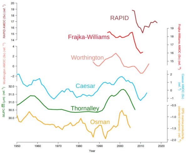
There are some other indicators, either using measured ocean salinities or using various types of proxy data from sediment cores, e.g. sediment grain sizes at the ocean bottom as indicators of flow speed of the deep southward AMOC branch. The key point to me is: these different indicators provide rather consistent AMOC reconstructions, as we showed in Caesar et al. 2021. The sediment data go back further in time but are likely not as reliable and don’t reach up to the present.
For recent decades there are potentially better approaches like ocean state estimates, and those are also consistent with the SST fingerprint – but these don’t go back far enough in time for the Ditlevsen type of study. The next graph shows a comparison of different reconstructions for the relevant time period used in the Ditlevsen study.
Reconstructions based on salinity may also be good but they depend on precipitation, a notoriously variable quantity so it is rather doubtful whether analysing variance of salinity is doing any better than the SST signal.
The argument has been made that the ‘cold blob’ might not be caused by an AMOC decline but by heat loss at the ocean surface. That’s easy to check: if that were the case, then cooling in the area would be linked to increased heat loss at the surface. But if the AMOC is the culprit, then less heat should be lost, as a cooler ocean surface due to reduced ocean heat transport will lose less heat. The reanalysis data show the latter is the case.
This was shown by Halldór Björnsson of the Icelandic weather service and presented at the Arctic Circle conference 2016. I discussed this here in 2016 and also in my 2018 RealClimate article “If you doubt that the AMOC has weakened, read this”, together with possible other alternative explanations of the ‘cold blob’. We have recently repeated Halldór’s analysis at PIK and got the same results.
My conclusion: for the past century or so the SST data are probably the best AMOC indicator we have, and I don’t see concrete evidence suggesting that it’s unreliable.
2. The Ditlevsen study assumes that the AMOC follows a quadratic curve when approaching the tipping point.
That’s a more technical criticism. Their assumption follows from Stommel’s 1961 simple model of the AMOC tipping point. It results from the basic idea that (a) AMOC changes are proportional to density changes, and (b) the density change results from a balance between freshwater input and AMOC salt transport to the deep water formation (i.e. ‘cold blob’) region. Combined, these two assumptions lead to a quadratic equation.
These are very plausible basic assumptions, albeit using a linear equation of state, but we all know you can linearize things around a given point to get a first-order estimate. The argument that this is “too simple” doesn’t mean it’s wrong; rather this is correct at least to first order.
In a 1996 study I compared the results of a quadratic box model response to a fully-fledged 3D primitive equation ocean circulation model with nonlinear equation of state, the MOM model of the Geophysical Fluid Dynamics Lab in Princeton. It looks like this.
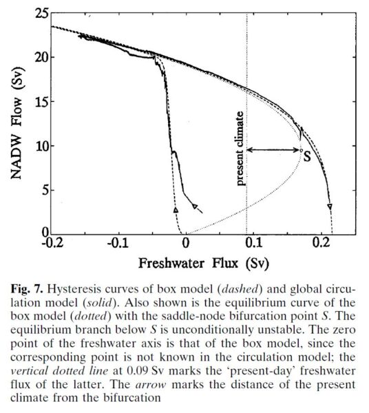
You can’t get a much better fit than that. A similar quadratic shape has also been found by Henk Dijkstra’s group at Utrecht University in a state-of-the-art global climate model, the CESM model (yet to be published). I have not seen any concrete evidence by the critics suggesting the shape may not be quadratic; that seems to be a purely hypothetical possibility. Also, if it is not exactly quadratic, the stated uncertainty range will be larger but it doesn’t fundamentally change the result.
What does it all mean?
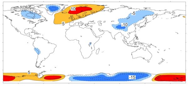
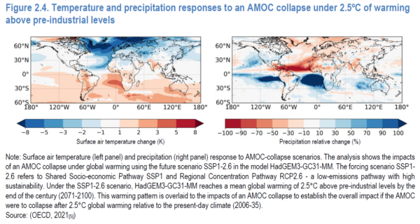
An AMOC collapse would be a massive, planetary-scale disaster. Some of the consequences: Cooling and increased storminess in northwestern Europe, major additional sea level rise especially along the American Atlantic coast, a southward shift of tropical rainfall belts (causing drought in some regions and flooding in others), reduced ocean carbon dioxide uptake, greatly reduced oxygen supply to the deep ocean, likely ecosystem collapse in the northern Atlantic, and others. Check out the OECD report Climate Tipping Points which is well worth reading, and the maps below. You really want to prevent this from happening.
We know from paleoclimatic data that there have been a number of drastic, rapid climate changes with focal point in the North Atlantic due to abrupt AMOC changes, apparently after the AMOC passed a tipping point. They are known as Heinrich events and Dansgaard-Oeschger events, see my review in Nature (pdf).
The point: it is a risk we should keep to an absolute minimum.
In other words: we are talking about risk analysis and disaster prevention. This is not about being 100% sure that the AMOC will pass its tipping point this century; it is that we’d like to be 100% sure that it won’t. Even if there were just (say) a 40% chance that the Ditlevsen study is correct in the tipping point being reached between 2025 and 2095, that’s a major change to the previous IPCC assessment that the risk is less than 10%. Even a <10% chance as of IPCC (for which there is only “medium confidence” that it’s so small) is in my view a massive concern. That concern has increased greatly with the Ditlevsen study – that is the point, and not whether it’s 100% correct and certain.
Would you live in a village below a dammed lake if you’re told there is a one in ten chance that one day the dam will break and much of the village will be washed away? Would you say: “Not to worry, that’s 90 % chance it won’t happen?” Or would you demand action by the authorities to reduce the risk? What if a new study appears, experienced scientists, reputable journal, that says it is nearly certain that the dam will break, the question is only when? Would you demand immediate attention to mitigate this danger, or would you say: “Oh well, some have questioned whether the assumptions of this study are entirely correct. Let’s just assume it is wrong”?
For the AMOC (and other climate tipping points), the only action we can take to minimise the risk is to get out of fossil fuels and stop deforestation as fast as possible. One major assumption of the Ditlevsen study is that global warming continues as in past decades. That is in our hands – or more precisely, that of our governments and powerful corporations. In 2022, the G20 governments alone subsidised fossil fuel use with 1.4 trillion dollars, up by 475% above the previous year. They aren’t trying to end fossil fuels.
Yet, as soon as we reach zero emissions, global warming will stop within years, and the sooner this happens the smaller the risk of passing tipping points. It also minimises lots of other losses, damages and human suffering from “regular” global warming impacts, which are already happening all around us even without passing major climate tipping points.
Links
For more on this, see my long TwiX thread with many images from relevant studies.
What is happening in the Atlantic Ocean to the AMOC?
If you doubt that the AMOC has weakened, read this
AMOC slowdown: Connecting the dots
And for even more, just enter “AMOC” into the search field of this blog!