This month’s open thread on climate topics. Despite everything going on, please avoid generic political arguments – there are many other places on line for that. Impacts on climate science or actions from the layoffs in the US federal government are, however, very much on topic.
Communicating Climate
The AMOC is slowing, it’s stable, it’s slowing, no, yes, …
There’s been a bit of media whiplash on the issue of AMOC slowing lately – ranging from the AMOC being “on the brink of collapse” to it being “more stable than previously thought”. AMOC, of course, refers to the Atlantic Meridional Overturning Circulation, one of the worlds major ocean circulation systems which keeps the northern Atlantic region (including Europe) exceptionally warm for its latitude. So what is this whiplash about?
As is often the case with such media whiplash, there isn’t much scientific substance behind it, except for the usual small incremental steps in the search for improved understanding. It is rare that one single paper overthrows our thinking, though media reports unfortunately often give that impression. Real science is more like a huge jigsaw puzzle, where each new piece adds a little bit.
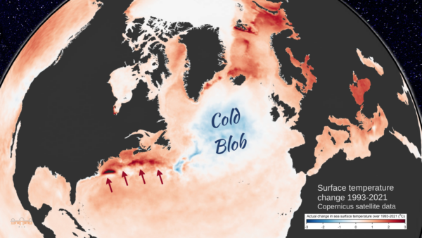
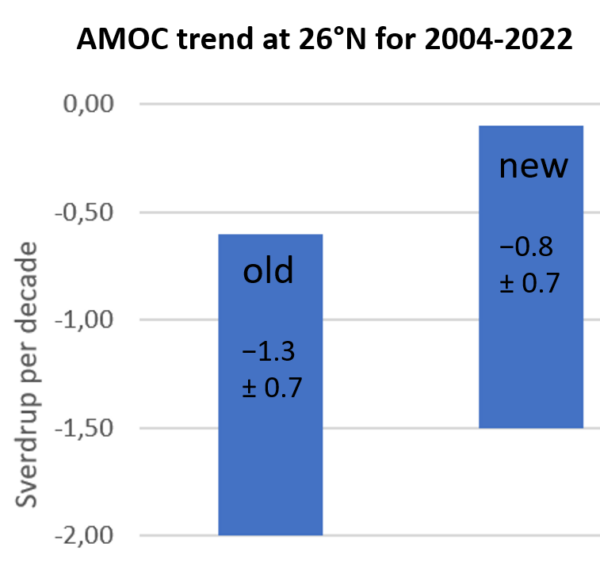
The latest new piece is a new reconstruction of how the AMOC has changed over the past 60 years, by Jens Terhaar and colleagues. The background to this discussion is familiar to our regular readers (else just enter ‘AMOC’ in the RealClimate search field): proper measurements of the AMOC flow are only available since 2004 in the RAPID project, thus for earlier times we need to use indirect clues. One of these is the sea surface temperature ‘finger print’ of AMOC changes as discussed in our paper Caesar et al. 2018 (Fig. 1). There we used the cold blob temperature anomaly (Nov-May) as an index for AMOC strength. Other studies have used other sea surface temperature or salinity patterns as well as paleoclimatic proxy data (e.g. sediment grain sizes), and generally found an AMOC decline since the 19th Century superimposed by some decadal variability. The new paper critices our (i.e. Caesar et al) reconstruction and suggests a new method using surface heat fluxes from reanalysis data as an indicator of AMOC strength.
Here’s three questions about it.
1. Does the ‘cold blob’ work well as AMOC indicator?
We had tested that in the historic runs of 15 different CMIP5 climate models in Caesar et al. 2018 (our Fig. 5) and found it works very well, except for two outlier models which were known to not produce a realistic AMOC. Now Terhaar et al. redid this test with the new CMIP6 model generation und found it works less well, i.e. the uncertainty is larger (although for future simulations where the AMOC shows a significant decline in the models, our AMOC index also works well in their analysis).
Which raises the question: which models are better for this purpose: CMIP5 or CMIP6? One might think that newer models are better – but this does not seem to be the case for CMIP6. Irrespective of the AMOC, the CMIP6 models created substantial controversy when their results came out: the climate sensitivity of a subset of ‘hot models’ was far too high, these models did not reproduce past temperature evolution well (compared to observed data), and IPCC made the unprecedented move of not presenting future projections as straightforward model average plus/minus model spread, but instead used the new concept of “assessed global warming” where models are weighted according to how well they reproduce observational data.
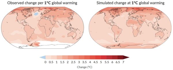
In the North Atlantic, the historic runs of CMIP6 models on average do not reproduce the ‘cold blob’ despite this being such a striking feature of the observational data, as shown clearly in the Summary for Policy Makers of the IPCC AR6 (see Fig. 2 below). Of the 24 CMIP6 models, a full 23 underestimate the sea surface cooling in the ‘cold blob’. And most of the CMIP6 models even show a strengthening of the AMOC in the historic period, which past studies have shown to be linked to strong aerosol forcing in many of these models (e.g. Menary et al. 2020, Robson et al. 2022). The historic Northern Hemisphere temperature evolution in the models with a strong aerosol effect “is not consistent with observations” and they “simulate the wrong sign of subpolar North Atlantic surface salinity trends”, as Robson et al. write. Thus I consider CMIP6 models as less suited to test how well the ‘cold blob’ works as AMOC indicator than the CMIP5 models.
2. Is the new AMOC reconstruction method, based on the surface heat loss, better?
In the CMIP6 models it looks like that, and the link between AMOC heat transport and surface heat loss to the north makes physical sense. However, in the models the surface heat loss is perfectly known. In the real ocean that is not an observed quantity. It has to be taken from model simulations, the so-called reanalysis. While these simulations assimilate observational data, over most of the ocean surface these are basically sea surface temperatures, but surface heat loss depends also on air temperature, wind speed, humidity, radiation and cloud cover in complex ways, all of which are not accurately known. Therefore these surface heat loss data are much less accurate than sea surface temperature data and in my view not well suited to reconstruct the AMOC time evolution.
That is supported by the fact that two different reanalysis data sets were used, leading to quite different AMOC reconstructions. Also the AMOC time evolution they found differs from other reconstruction methods for the same time period (see point 3 below).
And there is another issue: we’ve previously looked at ERA5 surface heat flux trend, as shown here from my article in Oceanography 2024:
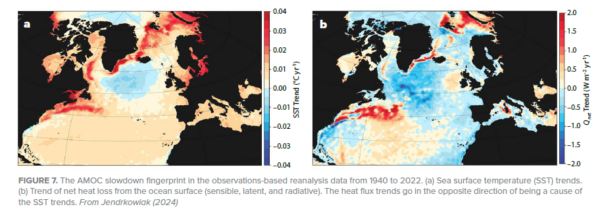
You see in both figures (in temperature as well as surface heat flux) the AMOC slowdown ‘fingerprint’ which includes both the ‘cold blob’ and a warming along the American coast due to a northward Gulf Stream shift, which is also a symptom of AMOC weakening. However, Terhaar et al. integrate over the whole northern Atlantic north of 26 °N so that the red area of increasing heat loss largely compensates for the blue area of decreasing heat loss. So in their analysis these two things cancel, while in the established concept of the ‘fingerprint’ (see Zhang 2008: Coherent surface-subsurface fingerprint of the Atlantic meridional overturning circulation) these two things both reinforce the evidence for an AMOC weakening.
3. How do these new reconstructions compare to others?
Here is how the Terhaar reconstructions (bottom two) compare:
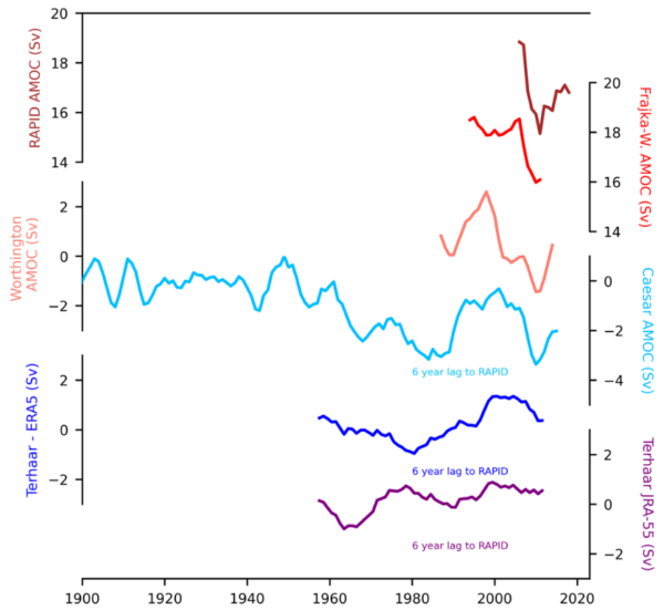
The reconstruction at the bottom using a reanalysis product from Japan doesn’t resemble anything, while the blue one using the European ERA5 reanalysis at least has the 1980s minimum and early 2000s maximum in common with other data, albeit with much smaller amplitude; it is a lot smoother. Thus it also misses the strong AMOC decline 2004-2010 and subsequent partial recovery seen in the RAPID measurements as well as the Caesar and Worthington reconstructions. A main reason for the lack of significant trend in the Terhaar reconstructions further is the time interval they used; for the same time span the Caesar reconstruction also does not show an even remotely significant trend (p-value is only 0.5), so in this respect our reconstructions actually agree for the period they overlap. The fact that ours shows a significant AMOC decline is because of the stable AMOC we find during 1900-1960, which is stronger than in the following sixty years. Here our reconstruction method shows its advantage in that reliable and accurate sea surface temperature data exist so far back in time.
Hence, I do not believe that the new attempt to reconstruct the AMOC is more reliable than earlier methods based on temperature or salinity patterns, on density changes in the ‘cold blob’ region, or on various paleoclimatic proxy data, which have concluded there is a weakening. But since we don’t have direct current measurements going far enough back in time, some uncertainty about that remains. The new study however does not change my assessment of AMOC weakening in any way.
And all agree that the AMOC will weaken in response to global warming in future and that this poses a serious risk, whether this weakening has already emerged from natural variability in the limited observational data we have, or not. Hence the open letter of 44 experts presented in October at the Arctic Circle Assembly (see video of my plenary presentation there), which says:
We, the undersigned, are scientists working in the field of climate research and feel it is urgent to draw the attention of the Nordic Council of Ministers to the serious risk of a major ocean circulation change in the Atlantic. A string of scientific studies in the past few years suggests that this risk has so far been greatly underestimated. Such an ocean circulation change would have devastating and irreversible impacts especially for Nordic countries, but also for other parts of the world.
Post script
Since I’m sometimes asked about that: last year a data study by Volkov et al. revised the slowing trend of the Florida current as well as the AMOC. Contrary to ‘climate skeptics’ claims, it has no impact on our long-term estimate of ~3 Sv slowing since 1950, i.e. -0.4 Sv/decade (Caesar et al. 2018). Both the original and the revised trend estimates for the RAPID section data (see Figure) suggest the recent AMOC weakening since 2004 is steeper than the long-term trend we estimated.
Twenty years of blogging in hindsight
It’s 20 years since we started blogging on climate here on RealClimate (December 10, 2004). We wanted to counter disinformation about climate change that was spreading through various campaigns. In those days it was an unusual move that prompted a welcome from Nature.
[Read more…] about Twenty years of blogging in hindsightScience is not value free
An interesting commentary addressing a rather odd prior commentary makes some very correct points.
[Read more…] about Science is not value freeThe need for pluralism in climate modelling
How should we allocate resources for climate modelling if the goal is to improve climate-related decisions? Higher resolution, machine learning and/or storylines? A call for a deeper discussion on how we should develop the climate modelling toolbox.
Guest post by Marina Baldissera Pacchetti, Julie Jebeile and Erica Thompson
[Read more…] about The need for pluralism in climate modelling2023 appears to follow an upward trend in the North Atlantic/Caribbean named tropical cyclone count
This year’s (2023) tropical cyclone season in the North Atlantic and Caribbean witnessed a relatively high number of named tropical cyclones: 20. In spite of the current El Niño, which tends to give lower numbers. But it appears to follow a historical trend for named tropical cyclones with an increasing number over time.
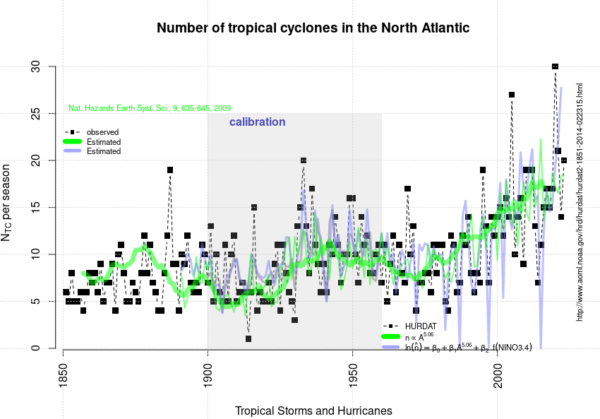
The curve presented above is an update of the analysis presented in 2020 and posted here on RealClimate.
[Read more…] about 2023 appears to follow an upward trend in the North Atlantic/Caribbean named tropical cyclone countReferences
- R.E. Benestad, "On tropical cyclone frequency and the warm pool area", Natural Hazards and Earth System Sciences, vol. 9, pp. 635-645, 2009. http://dx.doi.org/10.5194/nhess-9-635-2009
Unforced Variations: Dec 2023
Well, that year went quickly. This month, there is the COP28 hoopla, the ongoing El Niño and the speculation about the 2023 temperature ranking (which will not be that surprising). An open thread for climate topics…
Science denial is still an issue ahead of COP28
It is 33 years now since the IPCC in its first report in 1990 concluded that it is “certain” that greenhouse gas emissions from human activities “will enhance the greenhouse effect, resulting on average in an additional warming of the Earth’s surface.” That has indeed happened as predicted, it has been confirmed by a zillion studies and has been scientific consensus for decades. Yet, when the next global climate summit is coming up (it’s starting tomorrow), we don’t only learn that the host, United Arab Emirates, intends to use the event for new oil deals. We also see more attempts to cast doubt that global warming is caused by emissions from burning oil, gas and coal – as so often before these summits.
This time making the rounds is a “discussion paper” published by Statistics Norway. It is noteworthy not because it contains anything new (it doesn’t), but because despite clearly violating the established standards of good scientific practice, it was published by a government agency. That’s why it is having an impact in non-scientific quarters including the corporate world, and it has even been cited in a submission to proceedings of the German parliament.
The flood of fallacies or deceptions begins with the paper’s title: “To what extent are temperature levels changing due to greenhouse gas emissions?” But the effect of greenhouse gases is not even investigated in the paper – which suggests the title is politically motivated. And the paper revolves around ignoring past studies and basic physics, using dubious sources, and the glaring blunder of arguing that warming at any individual weather station might be caused by random weather variations, without ever wondering how it is possible that these supposed random variations go in the same direction all over the planet: in the direction of warming.
The paper provides a good opportunity to illustrate how climate science obfuscation works, and to remind readers how we actually know for sure that greenhouse gas emissions are indeed responsible for modern global warming.
Egregious scientific errors
The paper contains far too many egregious scientific errors and logical fallacies to review here, but let’s look at one: The paper continually mixes up local and global temperatures. It performs some statistical analysis on local temperature changes and argues they individually might just be within random fluctuations (a 25-year-old argument, which works if you assume long autocorrelation) – but even if that were true, the same does not apply to the global temperature. In an unchanging climate, the random fluctuations would lead to warming in some parts of the world and cooling in others. The fact that all parts of the world, with very few exceptions, show warming at the same time cannot be explained by random internal fluctuations.
It’s not hard to understand. In a world with just random local fluctuations but no climate change, about half the weather stations would show a (more or less significant) warming, the other half a cooling. With a modest amount of global warming, perhaps 60% would be warming and 40% cooling. With strong global warming, close to 100% will show warming, and that is exactly what is happening. It shows global warming has overwhelmed natural temperature variability, and that is what the Statistics Norway paper confirms yet again. Its authors literally don’t see the forest for the trees when they falsely claim the opposite.
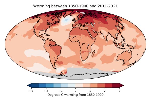
Figure 1: Map of observed near-surface air temperature changes since the late 19th Century. Gray areas show lack of data. The only region of cooling is the northern Atlantic, where climate models have long predicted just that due to a slowing of the Atlantic Ocean overturning circulation. The data are from the independent open-source Berkeley Earth project – a project by the formerly outspoken climate skeptic physicist Richard Muller, which in 2010 set out to do better than the traditional climate institutes and in the end obtained almost exactly the same results, just a slightly faster global warming. Muller was converted to accepting mainstream climate science by his own results. Image: Zeke Hausfather / Berkeley Earth.
Such statistics have of course been investigated for other climate parameters, too. For extreme rainfall events, a study of a global dataset of 8326 high-quality weather stations found that “64% of stations show increasing trends and 36% show decreasing trends”. Another study has shown the same for 940 Western European weather stations. That confirms that extreme rainfall is increasing – as predicted by elementary physics as well as climate models.
Blind use of statistics without understanding physics
Perhaps the most important law of physics is the conservation of energy, and the observed warming of Earth requires a huge energy input, which cannot be provided by random weather fluctuations. But even first-term physics is completely ignored in the Statistics Norway paper.
The heating of the global ocean has been going on at a steady rate of nine zeta Joules per year for decades, which is 15 times the worldwide primary energy consumption. We know this from the thousands of Argo floats drifting in the oceans, regularly diving down to 2000 meters while taking measurements. And we know where this staggering amount of heat energy comes from: It represents 91% of the additional heat retained on our planet by the human-caused increase in greenhouse gases. The energy balance of our planet, the radiation arriving and leaving, is continually monitored by a global radiation network at the surface and by dedicated satellites.
The greenhouse effect is in fact the largest control knob to dial up the temperature of our planet. We are receiving 342 Watts per square meter of Earth surface in back-radiation from the greenhouse effect, which is more than twice the Sun’s energy absorbed at Earth’s surface. And yes, also the increase in back-radiation towards the Earth surface from the CO2 greenhouse effect is a measured fact.
The physics behind the greenhouse effect and the gases that cause it have been understood since the 1800s, and that is why global warming was correctly predicted since the 1970s, even before observations unequivocally showed it. This warming was predicted not only by independent university and government scientists, but also by scientists from the oil company Exxon.
Is it sheer incompetence or is it politically motivated?
So the Statistics Norway paper ignores physics, misinterprets statistics and cherry-picks data – but is that just sheer incompetence, or is it politically motivated? In addition to the title, there are many tell-tale signs that strongly suggest the latter. Here’s just a few examples.
The paper shows a graph of local Greenland temperature from the famous Camp Century ice core drilled in 1960-1966. But rather than the data from the original publication in Science, it shows a hand-drawn version that has never been published in the peer-reviewed literature and is mislabeled, with the vertical axis showing variations around an average temperature of 15 °C (rather than -25 °C) to suggest it represents the global mean. This version originates from a 1995 German book and to this day is highly popular with the climate skeptics bubble on social media, and with the German right-wing AfD climate denial party (see my 2019 blog article).
The Statistics Norway authors try to cast doubt on modern warming being human-caused by pointing to the fact that Greenland was warmer during past millennia. But they don’t tell you why: as explained for example in the paleoclimate chapter of the 4th IPCC report of 2007 (which I co-authored), this is as expected from Earth’s natural orbital cycles. And they conveniently ignore global data reconstructions, which show Earth is warmer now than any time at least since the last Ice Age 24.000 years ago.
Similarly, they show Antarctic ice core data, taken from the climate skeptic website climate4you rather than a scientific source, with the figure caption falsely claiming that these data show global temperature when in fact, it is local. Greenland and Antarctica are perhaps the two locations on Earth where temperature variations are least representative of the global average.
The statistical analysis in fact confirms climate change
The paper analyses only one temperature data set which is actually global: the HadCRUT3 data, one of the well-established global temperature series. Strangely, the data shown end in December 2010 and the diagram is copied from the same climate skeptic website, instead of using the current HadCRUT5 data which have improved global coverage and are readily available from the source (which google finds in one second). But regardless: for this data set even their method “found that the HadCRUT3 time series is far from stationary”. The real result of their statistical analysis is thus: global temperature does show climate change! They even wonder why it does that, despite their home-baked aggregate of a small number of weather stations does not even though it shows a similar trend. They don’t seem to understand that the signal-to-noise ratio matters, which is worse the fewer data one uses (they used a meagre 74 stations).
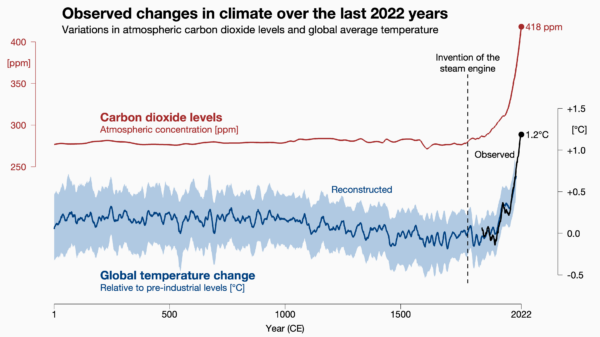
Figure 2: Carbon dioxide levels and global temperature over the past 2022 years. Carbon dioxide data from air bubbles enclosed in Antarctic ice. Global temperature data from the PAGES2k project, a collaboration of 78 paleo-climatologists from 24 countries. The Statistics Norway paper conveniently ignored these well-known state-of-the art data, even though they are shown in the IPCC report. Image: Prof. Ed Hawkins, National Centre for Atmospheric Science.
Unscientific sources
The paper also repeatedly cites a climate skeptics book by Fritz Vahrenholt and Sebastian Lüning, a former German CEO and an employee of the energy giant RWE, the largest CO2 emitter in Europe. The US edition of this book, called The Neglected Sun, is published by the climate denial lobby Heartland Institute. Yes, that’s the think tank which ran a poster campaign comparing the Unabomber and Osama Bin Laden to those concerned about global warming.
The original German title of this book is called Die kalte Sonne (The Cold Sun), referring to the fact that solar activity has declined, and thus has counteracted a small amount of the greenhouse warming caused by burning coal, oil and gas. This book badly overestimated the importance of solar variations and thus predicted an imminent global cooling. When this was soon disproven by observations, they accused NASA of doctoring the data.
I could go on. The paper presents many more hair-raising false statements and misleading climate-change-denial talking points. The authors have clearly swallowed a great mouthful of the toxic brew found on climate denial websites. But they have apparently not bothered to look at real climate science or talk to a climate scientist before publishing this “discussion paper”.
A massive blow to Statistics Norway’s credibility
It is more than embarrassing that Statistics Norway has published this nonsense. It is a scandal. Let’s hope it was not political on the part of that institution, but just a bad mistake. If they want to salvage their reputation and credibility, they should withdraw it immediately, with an appropriate explanation of the real science of global warming.
Clauser-ology: Cloudy with a chance of meatballs
John Clauser’s theory of climate explained.

Some of you will have heard of John Clauser because he was an awardee of the 2022 Nobel Prize in Physics for his role in the experimental verification of quantum entanglement. Some of you will have heard of him because the first thing that he did after winning the Nobel was join a climate denial organization and make some rather odd claims about climate science. And some of you will never have heard of him (in which case, feel free to skip this post!).
At no point in his long and, by all accounts, successful, career has he ever published a paper on climate[1]. He has not penned an article, nor even a blog post or a tweet on the topic, and so any scientific basis for his opinions (if any) has been opaque… until recently. In the last few months he has given two interviews in which he goes into to detail about what he describes as a ‘missing element’ in climate science and what he imagines the consequences are for climate change. The first interview was for the Epoch Times (a far right-wing newspaper and media organization affiliated with Falun Gong). The second was a podcast with the somewhat troubled Chris Smith, an Australian journalist. (The material is somewhat similar in each). And more comprehensively, it was repeated in a recent video lecture as well.
And what is this supposed ‘missing element’? Clouds.
[Read more…] about Clauser-ology: Cloudy with a chance of meatballsA distraction due to errors, misunderstanding and misguided Norwegian statistics
A friend asked me if a discussion paper published on Statistics Norway’s website, ‘To what extent are temperature levels changing due to greenhouse gas emissions?’, was purposely timed for the next climate summit (COP28). I don’t know the answer to his question.
[Read more…] about A distraction due to errors, misunderstanding and misguided Norwegian statistics