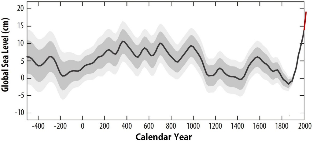
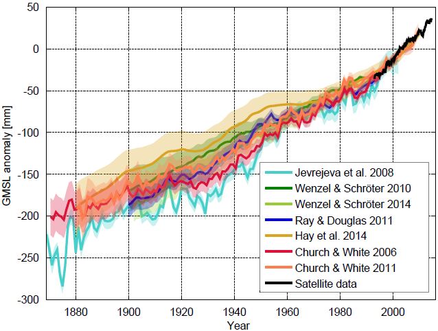
The “zoo” of global sea level curves calculated from tide gauge data has grown – tomorrow a new reconstruction of our US colleagues around Carling Hay from Harvard University will appear in Nature (Hay et al. 2015). That is a good opportunity for an overview over the available data curves. The differences are really in the details, the “big picture” of sea-level rise does not change. In all curves, the current rates of rise are the highest since records began.
The following graph shows the new sea level curve as compared to six known ones.
Fig 1 Sea level curves calculated by different research groups with various methods. The curves show the sea level relative to the satellite era (since 1992). Graph: Klaus Bittermann.
All curves show the well-known modern sea level rise, but the exact extent and time evolution of the rise differ somewhat. Up to about 1970, the new reconstruction of Hay et al. runs at the top of the existing uncertainty range. For the period from 1880 AD, however, it shows the same total increase as the current favorites by Church & White. Starting from 1900 AD it is about 25 mm less. This difference is at the margins of significance: the uncertainty ranges overlap. [Read more…] about A new sea level curve
References
- C.C. Hay, E. Morrow, R.E. Kopp, and J.X. Mitrovica, "Probabilistic reanalysis of twentieth-century sea-level rise", Nature, vol. 517, pp. 481-484, 2015. http://dx.doi.org/10.1038/nature14093