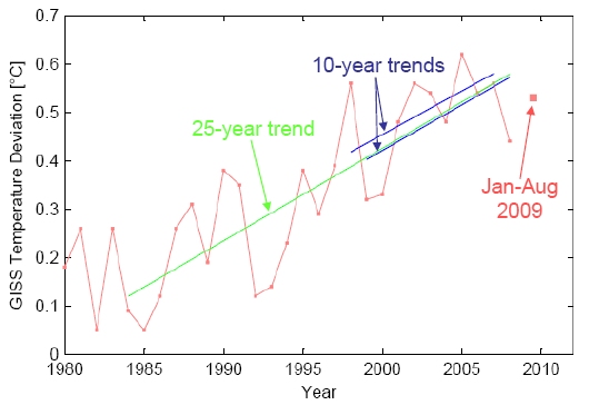
It’s long been known that El Niño variability affects the global mean temperature anomalies. 1998 was so warm in part because of the big El Niño event over the winter of 1997-1998 which directly warmed a large part of the Pacific, and indirectly warmed (via the large increase in water vapour) an even larger region. The opposite effect was seen with the La Niña event this last winter. Since the variability associated with these events is large compared to expected global warming trends over a short number of years, the underlying trends might be more clearly seen if the El Niño events (more generally, the El Niño – Southern Oscillation (ENSO)) were taken out of the way. There is no perfect way to do this – but there are a couple of reasonable approaches.
Instrumental Record
North Pole notes
I always find it interesting as to why some stories get traction in the mainstream media and why some don’t. In online science discussions, the fate of this years summer sea ice has been the focus of a significant betting pool, a test of expert prediction skills, and a week-by-week (almost) running commentary. However, none of these efforts made it on to the Today program. Instead, a rather casual article in the Independent showed the latest thickness data and that quoted Mark Serreze as saying that the area around the North Pole had 50/50 odds of being completely ice free this summer, has taken off across the media.
Of buckets and blogs
This last week has been an interesting one for observers of how climate change is covered in the media and online. On Wednesday an interesting paper (Thompson et al) was published in Nature, pointing to a clear artifact in the sea surface temperatures in 1945 and associating it with the changing mix of fleets and measurement techniques at the end of World War II. The mainstream media by and large got the story right – puzzling anomaly tracked down, corrections in progress after a little scientific detective work, consequences minor – even though a few headline writers got a little carried away in equating a specific dip in 1945 ocean temperatures with the more gentle 1940s-1970s cooling that is seen in the land measurements. However, some blog commentaries have gone completely overboard on the implications of this study in ways that are very revealing of their underlying biases.
The best commentary came from John Nielsen-Gammon’s new blog where he described very clearly how the uncertainties in data – both the known unknowns and unknown unknowns – get handled in practice (read that and then come back). Stoat, quite sensibly, suggested that it’s a bit early to be expressing an opinion on what it all means. But patience is not one of the blogosphere’s virtues and so there was no shortage of people extrapolating wildly to support their pet hobbyhorses. This in itself is not so unusual; despite much advice to the contrary, people (the media and bloggers) tend to weight new individual papers that make the news far more highly than the balance of evidence that really underlies assessments like the IPCC. But in this case, the addition of a little knowledge made the usual extravagances a little more scientific-looking and has given it some extra steam.
[Read more…] about Of buckets and blogs
Tropical tropospheric trends again
Back in December 2007, we quite heavily criticised the paper of Douglass et al (in press at IJoC) which purported to show that models and data were inconsistent when it came to the trends in the tropical troposphere. There were two strands to our critique: i) that the statistical test they used was not appropriate and ii) that they did not acknowledge the true structural uncertainty in the observations. Most subsequent discussion has been related to the statistical issue, but the second point is perhaps more important.
Even when Douglass et al was written, those authors were aware that there were serious biases in the radiosonde data (they had been reported in Sherwood et al, 2005 and elsewhere), and that there were multiple attempts to objectively address the problems and to come up with more homogeneous analyses. We mentioned the RAOBCORE project at the time and noted the big difference using their version 1.4 vs 1.2 made to the comparison (a difference nowhere mentioned in Douglass et al’s original accepted paper which only reported on v1.2 despite them being aware of the issue). However, there are at least three new papers in press that independently tackle the issue, and their results go a long towards addressing the problems.
[Read more…] about Tropical tropospheric trends again
Uncertainty, noise and the art of model-data comparison
Gavin Schmidt and Stefan Rahmstorf
John Tierney and Roger Pielke Jr. have recently discussed attempts to validate (or falsify) IPCC projections of global temperature change over the period 2000-2007. Others have attempted to show that last year’s numbers imply that ‘Global Warming has stopped’ or that it is ‘taking a break’ (Uli Kulke, Die Welt)). However, as most of our readers will realise, these comparisons are flawed since they basically compare long term climate change to short term weather variability.
This becomes immediately clear when looking at the following graph:
[Read more…] about Uncertainty, noise and the art of model-data comparison
A barrier to understanding?
People don’t seem to embrace global measures of temperature rise (~0.2ºC/decade) or sea level rise (> 3mm/yr) very strongly. They much prefer more iconic signs – The National Park formerly-known-as-Glacier, No-snows of Kilimanjaro, Frost Fairs on the Thames etc. As has been discussed here on many occasions, any single example often has any number of complicating factors, but seen as part of a pattern (Kilimanjaro as an example of the other receding tropical glaciers), they can be useful for making a general point. However, the use of an icon as an example of change runs into difficulty if it is then interpreted to be proof of that change.
With respect to sea level, the Thames Barrier is a concrete example that has been frequently raised.
[Read more…] about A barrier to understanding?
Tropical tropospheric trends
Once more unto the breach, dear friends, once more!
Some old-timers will remember a series of ‘bombshell’ papers back in 2004 which were going to “knock the stuffing out” of the consensus position on climate change science (see here for example). Needless to say, nothing of the sort happened. The issue in two of those papers was whether satellite and radiosonde data were globally consistent with model simulations over the same time. Those papers claimed that they weren’t, but they did so based on a great deal of over-confidence in observational data accuracy (see here or here for how that turned out) and an insufficient appreciation of the statistics of trends over short time periods.
Well, the same authors (Douglass, Pearson and Singer, now joined by Christy) are back with a new (but necessarily more constrained) claim, but with the same over-confidence in observational accuracy and a similar lack of appreciation of short term statistics.
[Read more…] about Tropical tropospheric trends
Sweatin’ the Mediterranean Heat
Guest Commentary from Figen Mekik
This quote from Drew Shindell (NASA Goddard Institute for Space Studies, New York) hit me very close to home: “Much of the Mediterranean area, North Africa and the Middle East rapidly are becoming drier. If the trend continues as expected, the consequences may be severe in only a couple of decades. These changes could pose significant water resource challenges to large segments of the population” (February, 2007-NASA, Science Daily).
I live in Michigan, but Turkey is my home where I go for vacation on the Med. This year’s drought was especially noteworthy, so I would like to share some of my observations with you, and then explore the links between the North Atlantic Oscillation (NAO), Mediterranean drought and anthropogenic global warming (AGW).
The 10-hour flight from Chicago to Istanbul often inspires passengers to romanticize about Istanbul, both tourists and natives alike. Istanbul is the city of legends, forests, and the Bosphorus. It is an open museum of millennia of history with archeological and cultural remnants surrounded by green lush gardens. It is the place where east meets west; where blue meets green; where the great Mevlâna’s inviting words whisper in the wind “Come, come again, whoever you are, come!”
So you can imagine our collective horror as the plane started circling Istanbul and we saw a dry, desolate, dusty city without even a hint of green anywhere.
[Read more…] about Sweatin’ the Mediterranean Heat
1934 and all that
Another week, another ado over nothing.
Last Saturday, Steve McIntyre wrote an email to NASA GISS pointing out that for some North American stations in the GISTEMP analysis, there was an odd jump in going from 1999 to 2000. On Monday, the people who work on the temperature analysis (not me), looked into it and found that this coincided with the switch between two sources of US temperature data. There had been a faulty assumption that these two sources matched, but that turned out not to be the case. There were in fact a number of small offsets (of both sign) between the same stations in the two different data sets. The obvious fix was to make an adjustment based on a period of overlap so that these offsets disappear.
This was duly done by Tuesday, an email thanking McIntyre was sent and the data analysis (which had been due in any case for the processing of the July numbers) was updated accordingly along with an acknowledgment to McIntyre and update of the methodology.
The net effect of the change was to reduce mean US anomalies by about 0.15 ºC for the years 2000-2006. There were some very minor knock on effects in earlier years due to the GISTEMP adjustments for rural vs. urban trends. In the global or hemispheric mean, the differences were imperceptible (since the US is only a small fraction of the global area).
There were however some very minor re-arrangements in the various rankings (see data [As it existed in Sep 2007]). Specifically, where 1998 (1.24 ºC anomaly compared to 1951-1980) had previously just beaten out 1934 (1.23 ºC) for the top US year, it now just misses: 1934 1.25ºC vs. 1998 1.23ºC. None of these differences are statistically significant. Indeed in the 2001 paper describing the GISTEMP methodology (which was prior to this particular error being introduced), it says:
The U.S. annual (January-December) mean temperature is slightly warmer in 1934 than in 1998 in the GISS analysis (Plate 6). This contrasts with the USHCN data, which has 1998 as the warmest year in the century. In both cases the difference between 1934 and 1998 mean temperatures is a few hundredths of a degree. The main reason that 1998 is relatively cooler in the GISS analysis is its larger adjustment for urban warming. In comparing temperatures of years separated by 60 or 70 years the uncertainties in various adjustments (urban warming, station history adjustments, etc.) lead to an uncertainty of at least 0.1°C. Thus it is not possible to declare a record U.S. temperature with confidence until a result is obtained that exceeds the temperature of 1934 by more than 0.1°C.
More importantly for climate purposes, the longer term US averages have not changed rank. 2002-2006 (at 0.66 ºC) is still warmer than 1930-1934 (0.63 ºC – the largest value in the early part of the century) (though both are below 1998-2002 at 0.79 ºC). (The previous version – up to 2005 – can be seen here).
In the global mean, 2005 remains the warmest (as in the NCDC analysis). CRU has 1998 as the warmest year but there are differences in methodology, particularly concerning the Arctic (extrapolated in GISTEMP, not included in CRU) which is a big part of recent global warmth. No recent IPCC statements or conclusions are affected in the slightest.
Sum total of this change? A couple of hundredths of degrees in the US rankings and no change in anything that could be considered climatically important (specifically long term trends).
However, there is clearly a latent and deeply felt wish in some sectors for the whole problem of global warming to be reduced to a statistical quirk or a mistake. This led to some truly death-defying leaping to conclusions when this issue hit the blogosphere. One of the worst examples (but there are others) was the ‘Opinionator’ at the New York Times (oh dear). He managed to confuse the global means with the continental US numbers, he made up a story about McIntyre having ‘always puzzled about some gaps’ (what?) , declared the the error had ‘played havoc’ with the numbers, and quoted another blogger saying that the ‘astounding’ numbers had been ‘silently released’. None of these statements are true. Among other incorrect stories going around are that the mistake was due to a Y2K bug or that this had something to do with photographing weather stations. Again, simply false.
But hey, maybe the Arctic will get the memo.
No man is an (Urban Heat) Island
Observant readers will have noticed a renewed assault upon the meteorological station data that underpin some conclusions about recent warming trends. Curiously enough, it comes just as the IPCC AR4 report declared that the recent warming trends are “unequivocal”, and when even Richard Lindzen has accepted that globe has in fact warmed over the last century.
The new focus of attention is the placement of the temperature sensors and other potential ‘micro-site’ effects that might influence the readings. There is a possibility that these effects may change over time, putting in artifacts or jumps in the record. This is slightly different from the more often discussed ‘Urban Heat Island’ effect which is a function of the wider area (and so could be present even in a perfectly set up urban station). UHI effects will generally lead to long term trends in an affected station (relative to a rural counterpart), whereas micro-site changes could lead to jumps in the record (of any sign) – some of which can be very difficult to detect in the data after the fact.
There is nothing wrong with increasing the meta-data for observing stations (unless it leads to harassment of volunteers). However, in the new found enthusiasm for digital photography, many of the participants in this effort seem to have leaped to some very dubious conclusions that appear to be rooted in fundamental misunderstandings of the state of the science. Let’s examine some of those apparent assumptions:
[Read more…] about No man is an (Urban Heat) Island