Interesting news this weekend. Apparently everything we’ve done in our entire careers is a “MASSIVE lie” (sic) because all of radiative physics, climate history, the instrumental record, modeling and satellite observations turn out to be based on 12 trees in an obscure part of Siberia. Who knew?
[Read more…] about Hey Ya! (mal)
Instrumental Record
Winds of change
Gavin Schmidt and Michael Mann
There was an interesting AP story this week about possible changes in wind speed over the continental US. The study (by Pryor et al (sub.)), put together a lot of observational data, reanalyses (from the weather forecasting models) and regional models, and concluded that there was some evidence for a decrease in wind speeds, particularly in the Eastern US. However, although this trend appeared in the observational data, it isn’t seen in all the reanalyses or regional models, leaving open a possibility that the trend is an artifact of some sort (instrumental changes, urbanization etc.). If the effect is real though, one would want to see whether it could be tied to anything else (such as forcing from greenhouse gas or aerosol increases), and indeed, whether it had any implications for wind-generated electricity, water evaporation etc.
Amusingly, both of us were quoted in the story as having ostensibly conflicting views. Mike was quoted as finding the evidence for a trend reasonably convincing, while Gavin was quoted as being unconvinced of the evidence for an anthropogenic climate change signal (note that the two statements are not in fact mutually inconsistent). As one should expect in any news story, these single lines don’t really do justice to the longlonger interviews both of us gave the reporter Seth Borenstein. So what is the bigger context?
[Read more…] about Winds of change
On overfitting
I don’t tend to read other blogs much, despite contributing to RealClimate. And I’m especially uninterested in spending time reading blogs full of ad hominem attacks. But a handful of colleagues apparently do read this stuff, and have encouraged me to take a look at the latest commentaries on our Antarctic temperature story. Since I happen to be teaching about principal component analysis to my graduate students this week, I thought it would be worthwhile to put up a pedagogical post on the subject. (If you don’t know what principal component analysis (PCA) is, take a look at our earlier post, Dummy’s Guide to the Hockey Stick Controversy).
[Read more…] about On overfitting
ACRIM vs PMOD
Two recent papers (Lockwood & Fröhlich, 2008 – ‘LF08’; Scafetta & Willson, 2009 – ‘SW09’) compare the analysis of total solar irradiance (TSI) and the way the TSI measurements are combined to form a long series consisting of data from several satellite missions. The two papers come to completely opposite conclusions regarding the long term trend. So which one (if either) is right, then? And does it really matter?
Monckton’s deliberate manipulation
Our favorite contrarian, the potty peer Christopher Monckton has been indulging in a little aristocratic artifice again. Not one to be constrained by mere facts or observable reality, he has launched a sally against Andy Revkin for reporting the shocking news that past industry disinformation campaigns were not sincere explorations of the true uncertainties in climate science.
[Read more…] about Monckton’s deliberate manipulation
Yet more aerosols: Comment on Shindell and Faluvegi
Guest post from Drew Shindell, NASA GISS
Our recent paper “Climate response to regional radiative forcing during the twentieth century”, has generated some interesting discussion (some of it very ‘interesting’ indeed). So this post is an attempt to give a better context to the methods and implications of the study.
[Read more…] about Yet more aerosols: Comment on Shindell and Faluvegi
Michaels’ new graph
Every so often people who are determined to prove a particular point will come up with a new way to demonstrate it. This new methodology can initially seem compelling, but if the conclusion is at odds with other more standard ways of looking at the same question, further investigation can often reveal some hidden dependencies or non-robustness. And so it is with the new graph being cited purporting to show that the models are an “abject” failure.
Antarctic warming is robust
The difference between a single calculation and a solid paper in the technical literature is vast. A good paper examines a question from multiple angles and find ways to assess the robustness of its conclusions to all sorts of possible sources of error — in input data, in assumptions, and even occasionally in programming. If a conclusion is robust over as much of this as can be tested (and the good peer reviewers generally insist that this be shown), then the paper is likely to last the test of time. Although science proceeds by making use of the work that others have done before, it is not based on the assumption that everything that went before is correct. It is precisely because that there is always the possibility of errors that so much is based on ‘balance of evidence’ arguments’ that are mutually reinforcing.
[Read more…] about Antarctic warming is robust
A global glacier index update
Guest commentary by Mauri Pelto
For global temperature time series we have GISTEMP, NCDC and HadCRUT. Each has worked hard to assimilate global temperature data into reliable and accurate indices of global temperature. The equivalent for alpine glaciers is the World Glacier Monitoring Service’s (WGMS) record of mass balance and terminus behavior. Beginning in 1986, WGMS began to maintain and publish the collection of information on ongoing glacier changes that had begun in 1960 with the Permanent Service on Fluctuations of glaciers. This program in the last 10 years has striven to acquire, publish and verify glacier terminus and mass balance measurement data from alpine glaciers the world over on a timely basis. Spearheaded by Wlfried Haeberli with assistance from Isabelle Roer, Michael Zemp, Martin Hoelzle, at the University of Zurich, their efforts have resulted in the recent publication, “Global Glacier Changes: facts and figures” published jointly with UNEP. This publication summarizes the information collected and submitted by the national correspondents of WGMS portraying the global response of glaciers to climate change, as well as the regional response.
State of Antarctica: red or blue?
A couple of us (Eric and Mike) are co-authors on a paper coming out in Nature this week (Jan. 22, 09). We have already seen misleading interpretations of our results in the popular press and the blogosphere, and so we thought we would nip such speculation in the bud.
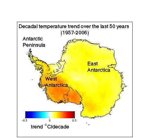 The paper shows that Antarctica has been warming for the last 50 years, and that it has been warming especially in West Antarctica (see the figure). The results are based on a statistical blending of satellite data and temperature data from weather stations. The results don’t depend on the statistics alone. They are backed up by independent data from automatic weather stations, as shown in our paper as well as in updated work by Bromwich, Monaghan and others (see their AGU abstract, here), whose earlier work in JGR was taken as contradicting ours. There is also a paper in press in Climate Dynamics (Goosse et al.) that uses a GCM with data assimilation (and without the satellite data we use) and gets the same result. Furthermore, speculation that our results somehow simply reflect changes in the near-surface inversion is ruled out by completely independent results showing that significant warming in West Antarctica extends well into the troposphere. And finally, our results have already been validated by borehole thermometery — a completely independent method — at at least one site in West Antarctica (Barrett et al. report the same rate of warming as we do, but going back to 1930 rather than 1957; see the paper in press in GRL).