
The Arctic Council’s Arctic Monitoring and assessment Programme (AMAP) recently released a Summary for PolicyMakers’ Arctic Climate Change Update 2024.
[Read more…] about The most recent climate statusClimate science from climate scientists...
The Arctic Council’s Arctic Monitoring and assessment Programme (AMAP) recently released a Summary for PolicyMakers’ Arctic Climate Change Update 2024.
[Read more…] about The most recent climate statusGlaciers are important indicators of climate change. A recent study published in the leading journal Science shows that glaciers in the tropical Andes have now retreated further than at any other time in the entire Holocene – which covers the whole history of human civilisation since the invention of agriculture. These findings are likely to resonate beyond the scientific community, as they strongly support the lawsuit filed by a Peruvian farmer against the energy company RWE, which has returned to court this week.
Paleoclimatologists can determine how long bedrock beneath a glacier has been covered by ice using measurements of specific isotopes. When rock surfaces are exposed, isotopes such as carbon-14 and beryllium-10 form due to bombardment by cosmic radiation. If, however, the rock is covered by an ice sheet, it is shielded from this radiation, and these unstable isotopes gradually disappear through radioactive decay (with half-lives of 5,700 and 1.4 million years, respectively). This method, known as cosmogenic radionuclide dating, has been well-established for decades. I first encountered it myself 23 years ago during an excursion with glacier experts to New Zealand’s Southern Alps.
The new study applied this method to examine several glaciers in the tropical Andes (see Fig. 1).
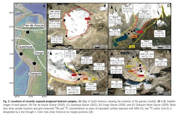
In rock samples collected at the edges of the glaciers, researchers found isotope concentrations close to zero. From this, they conclude that these rocks must have remained covered by ice throughout the entire Holocene, shielding them from cosmic radiation. This indicates that these glaciers are very likely smaller today than at any point in at least the last 11,700 years.
This finding aligns with several previous studies showing that temperatures in the tropical Andes have never been warmer during the Holocene than they are today. For instance, reconstructions of the glacier margin of the Quelccaya Ice Cap demonstrate that it has not been smaller than today at any time in at least the last 7,000 years. Temperature reconstructions based on proxy data further support this conclusion.
The Andes are not an exception: according to current research, global average temperatures today are very likely higher than at any other point during the entire Holocene. Given that an ice age lasted for more than 100,000 years before the Holocene, today’s temperatures are probably the highest experienced in about 120,000 years. This unprecedented warming, which began in the 19th century and has so far reached around 1.3–1.4°C, is almost entirely driven by human activity – primarily the burning of fossil fuels. According to the Intergovernmental Panel on Climate Change (IPCC), natural factors have contributed very little to recent warming, probably even having a slightly cooling effect, due to declining solar activity since the mid-20th century (a fact reflected in the title of former RWE manager Fritz Vahrenholt’s book, Die kalte Sonne – The Cold Sun).
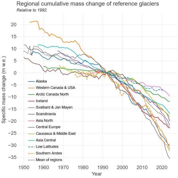
As a result, glaciers worldwide continue to lose mass (see Figure 2). In Germany, only four glaciers remain, following the disappearance of the Southern Schneeferner glacier in September 2022. Soon, there will be no glaciers left in Germany at all.
Implications for the RWE Case
The RWE case addresses, among other things, whether global warming caused by CO₂ emissions is responsible for the severe glacier melt, the substantial retreat of the glacier by approximately 1.5 km over the past 140 years and the thawing of permafrost above the city of Huaraz in Peru. A 2021 attribution study published in the respected journal Nature Geoscience has already conclusively demonstrated this connection; however, RWE appears to continue challenging these findings.
In this context, the new data from Gorin et al. are particularly relevant. The Queshque Glacier, now smaller than at any other time in at least the last 11,700 years, is located only 40 km from Huaraz, in the same mountain range as Lake Palcacocha (see Fig. 3).
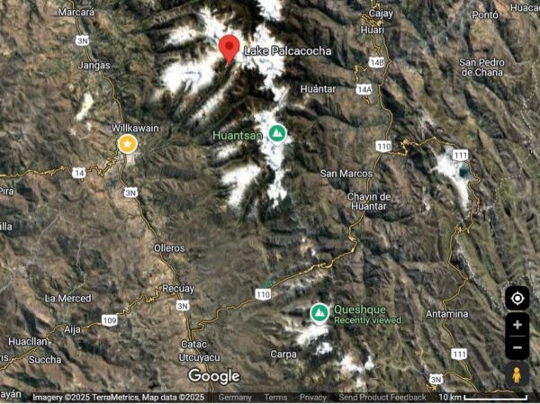
It is highly likely that local climate changes across this area differ minimally at most. Although average climate conditions can vary over short distances due to local topography, climate warming typically has a correlation radius of more than 1,000 km. Therefore, there is no meaningful difference in climate change effects between Queshque Glacier and Lake Palcacocha.
This region is already experiencing the most significant climate warming in the history of human civilisation. It will undoubtedly continue until the global economy achieves climate neutrality, essentially, net-zero CO₂ emissions.
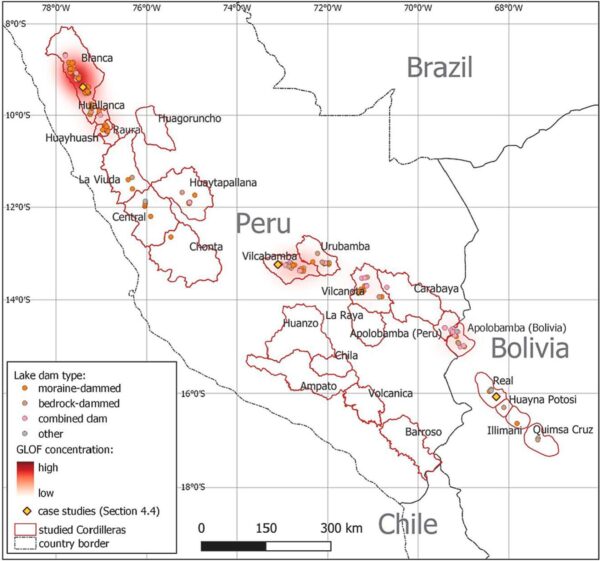
In the RWE trial, the central issue will be whether, and to what extent, the city of Huaraz and the plaintiff would be affected by a glacier flood. A systematic analysis of past glacial lake outburst floods (GLOFs) in the region has examined 160 such events based on satellite imagery. The findings clearly identify the Andes around Huaraz as a hotspot for this risk (see Fig. 4).
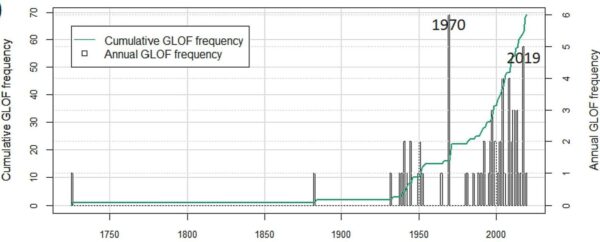
Additionally, this study shows that the frequency of such floods has increased significantly since 1980 (see Fig. 5). Before 1980, there was only one year with more than two recorded GLOFs: 1970 due to a severe earthquake. However, there are now repeatedly years with 3, 4 or even 5 glacial lake outbursts.
One thing is clear: given the existing research, it would be absurd to assume that the risk of a Lake Palcacocha outburst could be calculated based solely on historical data, without explicitly accounting for global warming caused by fossil fuels. Anyone who suggests that climate change is not happening in Huaraz – that there is no human fingerprint, and therefore no connection to RWE’s share of CO₂ emissions – may have their reasons for doing so. But the evidence clearly shows otherwise.
[latexpage]
While there have been some recent set-backs within science and climate research and disturbing news about NOAA, there is also continuing efforts on responding to climate change. During my travels to Mozambique and Ghana, I could sense a real appreciation for knowledge, and an eagerness to learn how to calculate risks connected to climate change.
[Read more…] about Climate change in AfricaThere is a need to make climate science more agile and more responsive, and that means moving (some of it) from research to operations.
[Read more…] about Operationalizing Climate ScienceThis year’s (2023) tropical cyclone season in the North Atlantic and Caribbean witnessed a relatively high number of named tropical cyclones: 20. In spite of the current El Niño, which tends to give lower numbers. But it appears to follow a historical trend for named tropical cyclones with an increasing number over time.
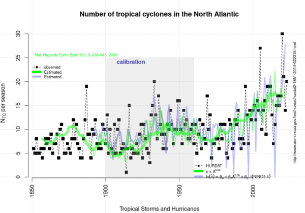
The curve presented above is an update of the analysis presented in 2020 and posted here on RealClimate.
[Read more…] about 2023 appears to follow an upward trend in the North Atlantic/Caribbean named tropical cyclone countThis month’s open thread on climate science topics. It’s been a warm summer, dontcha know? Expect ERA5, the satellite data and then the surface data products to confirm this in the next week or so. Sea ice minimum in the Arctic will also occur soon, as will a record low maximum in the Antarctic. El Niño still building in the tropical Pacific. Interesting times…
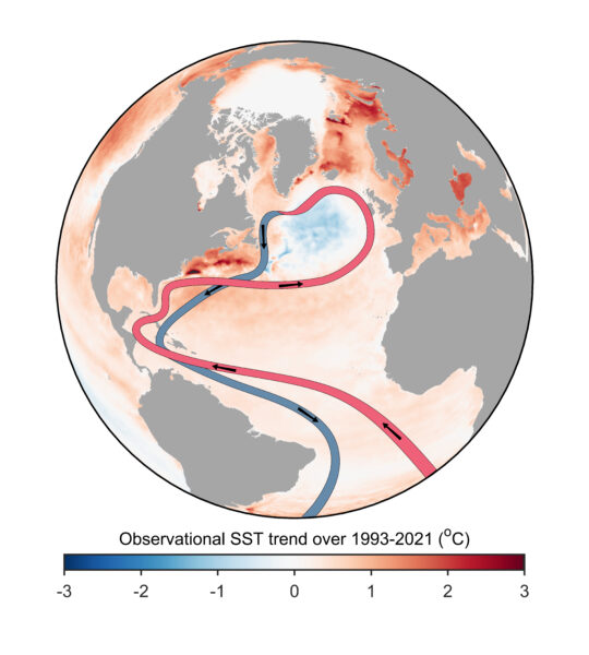
For various reasons I’m motivated to provide an update on my current thinking regarding the slowdown and tipping point of the Atlantic Meridional Overturning Circulation (AMOC). I attended a two-day AMOC session at the IUGG Conference the week before last, there’s been interesting new papers, and in the light of that I have been changing my views somewhat. Here’s ten points, starting from the very basics, so you can easily jump to the aspects that interest you.
You can tell how worried the climate deniers are by how many fields of science they have to trash to try and have people not see what’s happening.
it will not have escaped most people’s notice that global temperatures are heading into uncharted territory. The proximate cause of this week’s headlines is the Climate Reanalyzer website at the U. Maine which provides a nice front end to the NOAA NCEP CFS forecast system and reanalysis and shows absolute daily temperatures in early July clearly exceeding the highest pre-existing temperatures from August 2016. It’s an arresting graphic, and follows in from the record high ocean surface temperatures that were being reported a month ago.
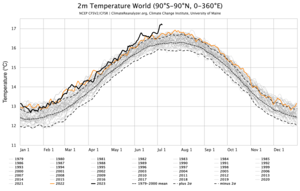
This is however a relatively new resource and was not online the last time that we set absolute temperature records (in summer 2016). So this has both salience and novelty – a potent combination!
The ultimate cause of these patterns is of course the ongoing global warming, driven almost entirely by human activities.
As we’ve explained before, all global temperature products are based on some kind of model – statistical, physical etc. There is no direct measurement of the global temperature – not from satellites, stations, or from the one random person who happens to be in most average place on Earth (where might that even be?). But that doesn’t mean the products aren’t useful!
In this particular instance we are looking at the output of a weather forecast model (NCEP CFS) that ingests multiple sources of in situ and satellite data every 3 hours which is then averaged over a day and over the surface of the planet. These calculations are precise reflections of what is in the model, but for multiple reasons this might not be a perfect reflection of what the real world is doing.
We looked at the coherence of different products, including the reanalyses, before and found that while they are highly correlated in terms of annual anomalies, they differ in their absolute magnitude (graphic from 2017).
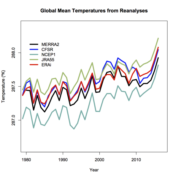
Differences will depend on resolution – higher resolution models have better (and higher topography) and then will have slightly cooler temperatures (all else being equal – which it isn’t!), tuning, model structure etc. and can’t really be discriminated using the pure (sparse) observations.
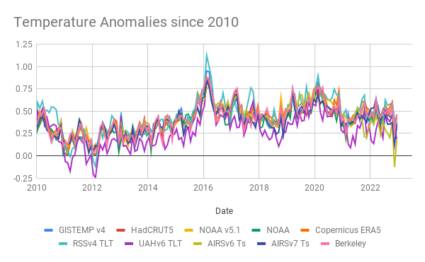
Coherence at the monthly scale is also quite good (though a little noisier), and I haven’t (yet) seen a good comparison of the coherence of the different products at the daily scale (note that the standard products (like GISTEMP, HadCRUT5 and NOAAv5) don’t produce a daily product). One might anticipate that there is a similarity, but perhaps not a one-to-one correspondence on exactly which days were the warmest.
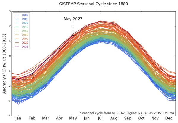
For the global temperature, it’s well established that the maximum is during the Northern Hemisphere summer. This sometimes comes as a surprise to people (why doesn’t the opposing seasonality in the Southern Hemisphere cancel this out?), but it relates to the fact that there is a lot more land in the Northern Hemisphere. Since the seasonal cycle over land is much larger than over the ocean (smaller heat capacity, and less evaporation), that means that the seasonal variations in the north outweigh the variations in the south.
Thus the months of July and August are generally the warmest in the year, and consequently we expect the warmest days during those months – and this is reflected in the CFS output (and in the ERA5 output also). The monthly variations are also reflected in the GISTEMP product which allows you to see the shifts from 1880 onward (about a 1ºC warming in each month since the late 19th C):
The station-based products are a little delayed with respect to the reanalyses, but they generally reflect the same patterns – thus one should expect the June temperatures in NOAA, GISTEMP and HadCRUT5 to be the warmest June on record. Given too, that these temperatures are being driven by persistent warming in the oceans, increasingly juiced by the growing El Niño event in the tropical Pacific, records in July and August are also likely. This is of course increasing the odds for 2023 to be a record year (I would estimate about 50% at this point).
Well, they would say that wouldn’t they. [Narrator: there is, in fact, a perfectly well defined global mean of any two-dimensional field defined on the sphere, including temperature].
More generously, one might think that their argument (such as it is), is that the global mean isn’t directly relevant for anyone. That is, no-one lives in the global mean, all impacts are local and driven by weather variations. But we’ve known for decades that the global mean change is a really good predictor (not perfect, but pretty good) of local impacts on heat waves, intense rainfall, drought intensity etc.
But let’s be honest, it’s basically pure distraction and attempts to complicate something that is pretty basic:
The climate is warming, records are being broken, and we are increasingly seeing the impacts.
I know why the WSJ doesn’t want you to realise this, but it’s not hard to see past their obfuscation.
The world is full of climate dashboards (and dashboards of dashboards), and so you might imagine that all datasets and comparisons are instantly available in whatever graphical form you like. Unfortunately, we often want graphics to emphasize a particular point or comparison, and generic graphs from the producers of the data often don’t have the same goal in mind. Dashboards that allow for more flexibility (like WoodForTrees) are useful, but aren’t as visually appealing as they could be. Thus, I find myself creating bespoke graphics of climate and climate model data all the time.
Some of these are maintained on the Climate model-observations comparison page but many of the graphs that I make (often to make a point on twitter) aren’t saved there and often their provenance is a bit obscure. Given that twitter will not last forever (though it might be around for slightly longer than a head of lettuce), it’s probably useful to have a spot to upload these graphics to, along with some explanation, to serve as a reference.
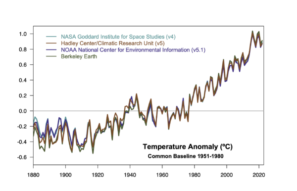
I have therefore created a couple of ‘pages’ (in wordpress speak) with fixed URLs where I will be curating relevant graphics I make (and findable at the bottom of the page under “DATA AND GRAPHICS”). The first is focused on the surface temperature records. I often update relevant graphics associated with this in early January (when we get another dot on the graphs), but there are associated graphs that I’ve made that don’t make it into those updates, so this is a place for them too. This includes the impacts of ENSO, comparisons across different platforms, or the impact of homogenization.
The second page is bit more eclectic. These are graphs that are relevant to some trope or talking point that often pops up, and my graphs are an attempt to provide context (usually), or to debunk it entirely. This is where you’ll find maps of where the climate is warming faster than the global average, time-series of river ice break-up dates, and an example of sensible scaling of CO2 changes and temperature.
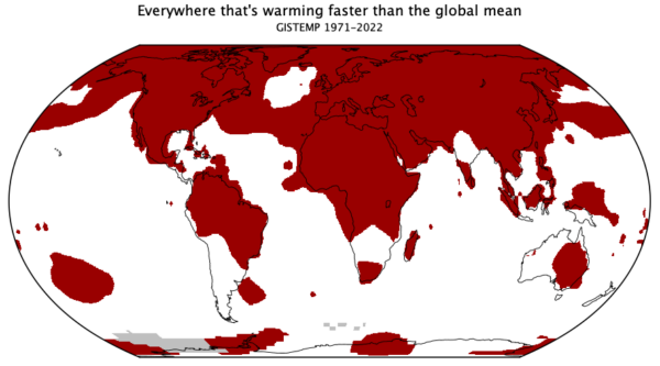
To start with, I’m just going to upload some graphs I’ve made recently (with any updates that are needed), and I’ll add content as I make something new. If there are any other ideas (that aren’t too involved!), I’ll be happy to look at adding those too. Let me know if this is useful.
The detection and the attribution of climate change are based on fundamentally different frameworks and shouldn’t be conflated.
We read about and use the phrase ‘detection and attribution’ of climate change so often that it seems like it’s just one word ‘detectionandattribution’ and that might lead some to think that it is just one concept. But it’s not.
[Read more…] about Watching the detections