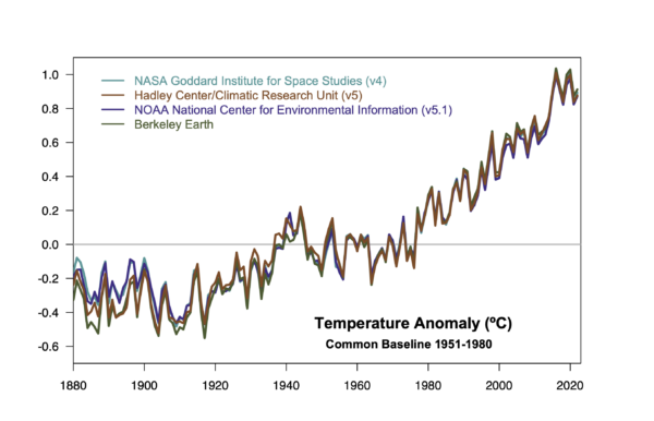
As the climate monitoring groups add an additional dot to their graphs this week, there is some disquiet among people paying attention about just how extraordinary 2023 really was.
[Read more…] about Not just another dot on the graph?Annual GMSAT predictions and ENSO
For the last few years (since at least 2016), I’ve shared predictions for the next annual global mean surface air temperature (GMSAT) anomaly based on the long term trend and the state of ENSO at the start of the year. Generally speaking, this has been quite skillful compared to persistence or just the long term trend alone – the eventual anomaly was consistently within the predicted bounds. Until 2023.
[Read more…] about Annual GMSAT predictions and ENSOClauser-ology: Cloudy with a chance of meatballs
John Clauser’s theory of climate explained.

Some of you will have heard of John Clauser because he was an awardee of the 2022 Nobel Prize in Physics for his role in the experimental verification of quantum entanglement. Some of you will have heard of him because the first thing that he did after winning the Nobel was join a climate denial organization and make some rather odd claims about climate science. And some of you will never have heard of him (in which case, feel free to skip this post!).
At no point in his long and, by all accounts, successful, career has he ever published a paper on climate[1]. He has not penned an article, nor even a blog post or a tweet on the topic, and so any scientific basis for his opinions (if any) has been opaque… until recently. In the last few months he has given two interviews in which he goes into to detail about what he describes as a ‘missing element’ in climate science and what he imagines the consequences are for climate change. The first interview was for the Epoch Times (a far right-wing newspaper and media organization affiliated with Falun Gong). The second was a podcast with the somewhat troubled Chris Smith, an Australian journalist. (The material is somewhat similar in each). And more comprehensively, it was repeated in a recent video lecture as well.
And what is this supposed ‘missing element’? Clouds.
[Read more…] about Clauser-ology: Cloudy with a chance of meatballsThe Scafetta Saga
It has taken 17 months to get a comment published pointing out the obvious errors in the Scafetta (2022) paper in GRL.
Back in March 2022, Nicola Scafetta published a short paper in Geophysical Research Letters (GRL) purporting to show through ‘advanced’ means that ‘all models with ECS > 3.0°C overestimate the observed global surface warming’ (as defined by ERA5). We (me, Gareth Jones and John Kennedy) wrote a note up within a couple of days pointing out how wrongheaded the reasoning was and how the results did not stand up to scrutiny.
[Read more…] about The Scafetta SagaReferences
- N. Scafetta, "Advanced Testing of Low, Medium, and High ECS CMIP6 GCM Simulations Versus ERA5‐T2m", Geophysical Research Letters, vol. 49, 2022. http://dx.doi.org/10.1029/2022GL097716
As Soon as Possible
The latest contrarian crowd pleaser from Soon et al (2023) is just the latest repetition of the old “it was the sun wot done it” trope[1] that Willie Soon and his colleagues have been pushing for decades. There is literally nothing new under the sun.
[Read more…] about As Soon as PossibleReferences
- W. Soon, R. Connolly, M. Connolly, S. Akasofu, S. Baliunas, J. Berglund, A. Bianchini, W. Briggs, C. Butler, R. Cionco, M. Crok, A. Elias, V. Fedorov, F. Gervais, H. Harde, G. Henry, D. Hoyt, O. Humlum, D. Legates, A. Lupo, S. Maruyama, P. Moore, M. Ogurtsov, C. ÓhAiseadha, M. Oliveira, S. Park, S. Qiu, G. Quinn, N. Scafetta, J. Solheim, J. Steele, L. Szarka, H. Tanaka, M. Taylor, F. Vahrenholt, V. Velasco Herrera, and W. Zhang, "The Detection and Attribution of Northern Hemisphere Land Surface Warming (1850–2018) in Terms of Human and Natural Factors: Challenges of Inadequate Data", Climate, vol. 11, pp. 179, 2023. http://dx.doi.org/10.3390/cli11090179
Back to basics
You can tell how worried the climate deniers are by how many fields of science they have to trash to try and have people not see what’s happening.
it will not have escaped most people’s notice that global temperatures are heading into uncharted territory. The proximate cause of this week’s headlines is the Climate Reanalyzer website at the U. Maine which provides a nice front end to the NOAA NCEP CFS forecast system and reanalysis and shows absolute daily temperatures in early July clearly exceeding the highest pre-existing temperatures from August 2016. It’s an arresting graphic, and follows in from the record high ocean surface temperatures that were being reported a month ago.
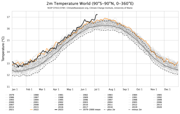
This is however a relatively new resource and was not online the last time that we set absolute temperature records (in summer 2016). So this has both salience and novelty – a potent combination!
The ultimate cause of these patterns is of course the ongoing global warming, driven almost entirely by human activities.
What are we looking at?
As we’ve explained before, all global temperature products are based on some kind of model – statistical, physical etc. There is no direct measurement of the global temperature – not from satellites, stations, or from the one random person who happens to be in most average place on Earth (where might that even be?). But that doesn’t mean the products aren’t useful!
In this particular instance we are looking at the output of a weather forecast model (NCEP CFS) that ingests multiple sources of in situ and satellite data every 3 hours which is then averaged over a day and over the surface of the planet. These calculations are precise reflections of what is in the model, but for multiple reasons this might not be a perfect reflection of what the real world is doing.
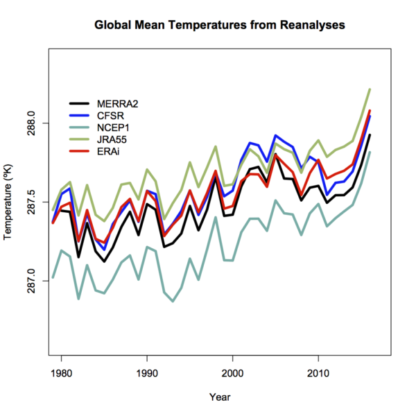
We looked at the coherence of different products, including the reanalyses, before and found that while they are highly correlated in terms of annual anomalies, they differ in their absolute magnitude (graphic from 2017).
Differences will depend on resolution – higher resolution models have better (and higher topography) and then will have slightly cooler temperatures (all else being equal – which it isn’t!), tuning, model structure etc. and can’t really be discriminated using the pure (sparse) observations.
Coherence at the monthly scale is also quite good (though a little noisier), and I haven’t (yet) seen a good comparison of the coherence of the different products at the daily scale (note that the standard products (like GISTEMP, HadCRUT5 and NOAAv5) don’t produce a daily product). One might anticipate that there is a similarity, but perhaps not a one-to-one correspondence on exactly which days were the warmest.
What are we seeing?
For the global temperature, it’s well established that the maximum is during the Northern Hemisphere summer. This sometimes comes as a surprise to people (why doesn’t the opposing seasonality in the Southern Hemisphere cancel this out?), but it relates to the fact that there is a lot more land in the Northern Hemisphere. Since the seasonal cycle over land is much larger than over the ocean (smaller heat capacity, and less evaporation), that means that the seasonal variations in the north outweigh the variations in the south.
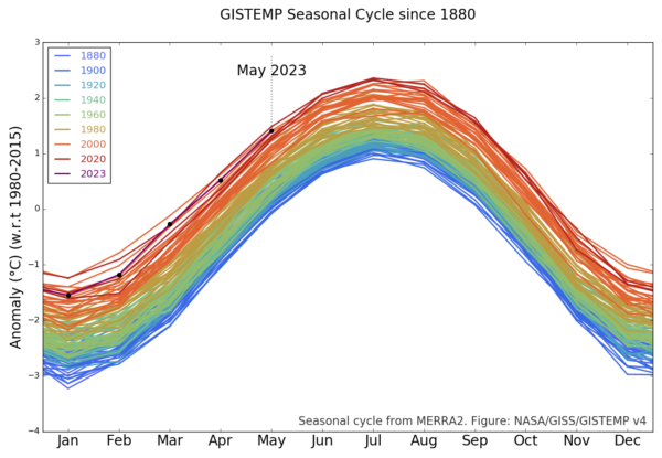
Thus the months of July and August are generally the warmest in the year, and consequently we expect the warmest days during those months – and this is reflected in the CFS output (and in the ERA5 output also). The monthly variations are also reflected in the GISTEMP product which allows you to see the shifts from 1880 onward (about a 1ºC warming in each month since the late 19th C):
The station-based products are a little delayed with respect to the reanalyses, but they generally reflect the same patterns – thus one should expect the June temperatures in NOAA, GISTEMP and HadCRUT5 to be the warmest June on record. Given too, that these temperatures are being driven by persistent warming in the oceans, increasingly juiced by the growing El Niño event in the tropical Pacific, records in July and August are also likely. This is of course increasing the odds for 2023 to be a record year (I would estimate about 50% at this point).
But the WSJ Opinion page says that there’s no such thing as the global temperature!
Well, they would say that wouldn’t they. [Narrator: there is, in fact, a perfectly well defined global mean of any two-dimensional field defined on the sphere, including temperature].
More generously, one might think that their argument (such as it is), is that the global mean isn’t directly relevant for anyone. That is, no-one lives in the global mean, all impacts are local and driven by weather variations. But we’ve known for decades that the global mean change is a really good predictor (not perfect, but pretty good) of local impacts on heat waves, intense rainfall, drought intensity etc.
But let’s be honest, it’s basically pure distraction and attempts to complicate something that is pretty basic:
The climate is warming, records are being broken, and we are increasingly seeing the impacts.
I know why the WSJ doesn’t want you to realise this, but it’s not hard to see past their obfuscation.
Turning a new page[s]
The world is full of climate dashboards (and dashboards of dashboards), and so you might imagine that all datasets and comparisons are instantly available in whatever graphical form you like. Unfortunately, we often want graphics to emphasize a particular point or comparison, and generic graphs from the producers of the data often don’t have the same goal in mind. Dashboards that allow for more flexibility (like WoodForTrees) are useful, but aren’t as visually appealing as they could be. Thus, I find myself creating bespoke graphics of climate and climate model data all the time.
Some of these are maintained on the Climate model-observations comparison page but many of the graphs that I make (often to make a point on twitter) aren’t saved there and often their provenance is a bit obscure. Given that twitter will not last forever (though it might be around for slightly longer than a head of lettuce), it’s probably useful to have a spot to upload these graphics to, along with some explanation, to serve as a reference.
I have therefore created a couple of ‘pages’ (in wordpress speak) with fixed URLs where I will be curating relevant graphics I make (and findable at the bottom of the page under “DATA AND GRAPHICS”). The first is focused on the surface temperature records. I often update relevant graphics associated with this in early January (when we get another dot on the graphs), but there are associated graphs that I’ve made that don’t make it into those updates, so this is a place for them too. This includes the impacts of ENSO, comparisons across different platforms, or the impact of homogenization.
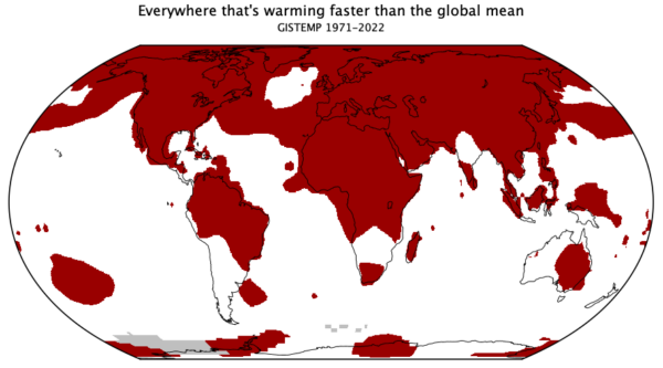
The second page is bit more eclectic. These are graphs that are relevant to some trope or talking point that often pops up, and my graphs are an attempt to provide context (usually), or to debunk it entirely. This is where you’ll find maps of where the climate is warming faster than the global average, time-series of river ice break-up dates, and an example of sensible scaling of CO2 changes and temperature.
To start with, I’m just going to upload some graphs I’ve made recently (with any updates that are needed), and I’ll add content as I make something new. If there are any other ideas (that aren’t too involved!), I’ll be happy to look at adding those too. Let me know if this is useful.
CMIP6: Not-so-sudden stratospheric cooling
As predicted in 1967 by Manabe and Wetherald, the stratosphere has been cooling.
A new paper by Ben Santer and colleagues has appeared in PNAS where they extend their previous work on the detection and attribution of anthropogenic climate change to include the upper stratosphere, using observations from the Stratospheric Sounding Units (SSUs) (and their successors, the AMSU instruments) that have flown since 1979.
[Read more…] about CMIP6: Not-so-sudden stratospheric coolingReferences
- B.D. Santer, S. Po-Chedley, L. Zhao, C. Zou, Q. Fu, S. Solomon, D.W.J. Thompson, C. Mears, and K.E. Taylor, "Exceptional stratospheric contribution to human fingerprints on atmospheric temperature", Proceedings of the National Academy of Sciences, vol. 120, 2023. http://dx.doi.org/10.1073/pnas.2300758120
A NOAA-STAR dataset is born…
What does a new entrant in the lower troposphere satellite record stakes really imply?
At the beginning of the year, we noted that the NOAA-STAR group had produced a new version (v5.0) of their MSU TMT satellite retrievals which was quite a radical departure from the previous version (4.1). It turns out that v5 has a notable lower trend than v4.1, which had the highest trend among the UAH and RSS retrievals. The paper describing the new version (Zou et al., 2023) came out in March, and with it the availability of not only updated TMT and TLS records (which had existed in the version 4.1), but also a new TLT (Temperature of the Lower Troposphere) record (from 1981 to present). The updated TMT series was featured in the model data comparison already, but we haven’t yet shown the new TLT data in context.
[Read more…] about A NOAA-STAR dataset is born…References
- C. Zou, H. Xu, X. Hao, and Q. Liu, "Mid‐Tropospheric Layer Temperature Record Derived From Satellite Microwave Sounder Observations With Backward Merging Approach", Journal of Geophysical Research: Atmospheres, vol. 128, 2023. http://dx.doi.org/10.1029/2022JD037472
Some new CMIP6 MSU comparisons
We add some of the CMIP6 models to the updateable MSU [and SST] comparisons.
After my annual update, I was pointed to some MSU-related diagnostics for many of the CMIP6 models (24 of them at least) from Po-Chedley et al. (2022) courtesy of Ben Santer. These are slightly different to what we have shown for CMIP5 in that the diagnostic is the tropical corrected-TMT (following Fu et al., 2004) which is a better representation of the mid-troposphere than the classic TMT diagnostic through an adjustment using the lower stratosphere record (i.e.  ).
).
References
- S. Po-Chedley, J.T. Fasullo, N. Siler, Z.M. Labe, E.A. Barnes, C.J.W. Bonfils, and B.D. Santer, "Internal variability and forcing influence model–satellite differences in the rate of tropical tropospheric warming", Proceedings of the National Academy of Sciences, vol. 119, 2022. http://dx.doi.org/10.1073/pnas.2209431119
- Q. Fu, C.M. Johanson, S.G. Warren, and D.J. Seidel, "Contribution of stratospheric cooling to satellite-inferred tropospheric temperature trends", Nature, vol. 429, pp. 55-58, 2004. http://dx.doi.org/10.1038/nature02524