A bimonthly open thread for discussions related to climate solutions. Note that open discussions of climate science are here. Possible topics of interest are the trial carbon-capture effort in Iceland and the discussions in the lead up to COP26. Please be constructive and substantive.
Archives for 2021
Unforced Variations: Sep 2021
This month’s open thread for climate science topics. Not sure about you, but we are still reading the details of the IPCC report. We are watching the unfolding hurricane season with trepidation, with particular concern related to the impacts of compound events (and not just those associated with climate), and anticipating another low, if not record, Arctic sea ice minimum.
PS. At some point this month we will be switching Internet service providers, so don’t be surprised if there are some oddities as we switch everything over.
Sea level in the IPCC 6th assessment report (AR6)
My top 3 impressions up-front:
- The sea level projections for the year 2100 have been adjusted upwards again.
- The IPCC has introduced a new high-end risk scenario, stating that a global rise “approaching 2 m by 2100 and 5 m by 2150 under a very high greenhouse gas emissions scenario cannot be ruled out due to deep uncertainty in ice sheet processes.”
- The IPCC gives more consideration to the large long-term sea-level rise beyond the year 2100.
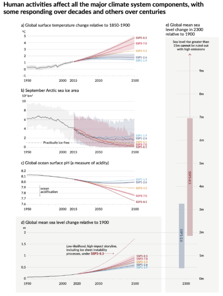
And here is the key sea-level graphic from the Summary for Policy Makers:
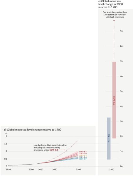
This is a pretty clear illustration of how sea level starts to rise slowly; but in the long run, sea-level rise caused by fossil-fuel burning and deforestation in our generation could literally go off the chart and inundate many coastal cities and wipe entire island nations off the map. But first things first.
Observed Past Rise
Let’s dive a little deeper into the full report and start with the observed sea level change. Since 1901 sea level has risen by 20 cm, a rise unprecedented in at least 3,000 years (disclosure: I co-authored some of the research behind the latter conclusion).
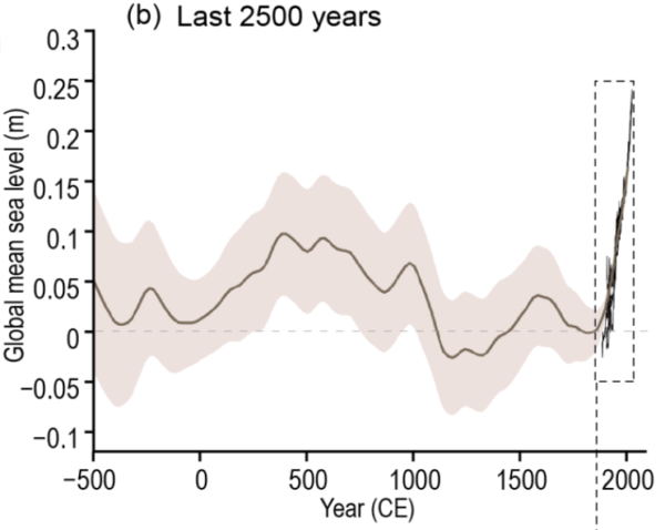
Since 1900 the rise has greatly accelerated. During the most recent period analyzed, 2006-2018, it’s been rising at a rate of 3.7 mm/year – nearly three times as fast as during 1901-1971 (1.3 mm/year). The IPCC calls this a “robust acceleration (high confidence) of global mean sea level rise over the 20th century”, as did the SROCC in 2019.
The finding of sea-level acceleration is not new. The AR4 already concluded in 2007: “There is high confidence that the rate of sea level rise has increased between the mid-19th and the mid-20th centuries.” And the AR5 found in 2013 that “there is high confidence that the rate of sea level rise has increased during the last two centuries, and it is likely that global mean sea level has accelerated since the early 1900’s.” (Which has not stopped “climate skeptics” from repeatedly claiming a lack of acceleration.)
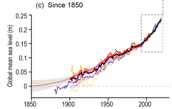
The reason for earlier hedged wording by the IPCC was the possibility of natural decadal variability affecting the trend estimates, but the AR6 now concludes “that the main driver of the observed global mean sea-level rise since at least 1970 is very likely anthropogenic forcing”. That is the result of so-called “attribution studies” – attempts to differentiate with the help of a combination of data, models, pattern detection and statistics between all possible human-caused and natural factors in the observed changes. However, on the level of basic physical reasoning, it is of course a no-brainer that warming will cause land-ice to melt (and melt faster as it gets hotter) and ocean waters to expand, so sea-level rise is the inevitable result.
And there is this:
New observational evidence leads to an assessed sea level rise over the period 1901 to 2018 that is consistent with the sum of individual components contributing to sea level rise, including expansion due to ocean warming and melting of glaciers and ice sheets (high confidence).
IPCC AR6
That’s an important consistency check; the independent data add up to the overall observed rise.
The Future Until 2100
It is virtually certain that global mean sea level will continue to rise over the 21st century in response to continued warming of the climate system.
IPCC AR6
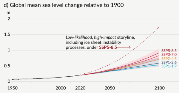
By how much? That depends on our emissions and is shown in the following figure. The take-away message is: for high emissions we’d likely get close to a meter, sticking to the Paris agreement would cut that down to half a meter.
And how does that compare to the recent previous reports? Here is the comparison the IPCC shows:
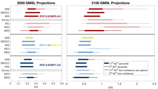
If you look at the 2100 projections for the last three reports (AR5, SROCC, AR6) you can see that the numbers have increased each time – and remember that the AR5 numbers had already increased by ~60% compared to the AR4. This illustrates the fact that IPCC has been too “cautious” in the past (which is not a virtue in risk assessment), having to correct itself upward again and again (all the while “climate skeptics” try to paint the IPCC as “alarmist”, for want of any better arguments to play down the climate crisis).
Related to that are notable changes in grappling with uncertainty and risk. The IPCC is now showing very likely (5-95 percentile) as well as likely (17-83 percentile) ranges. In the AR5, it had made the rather ad-hoc argument that “global mean sea level rise is likely (medium confidence) to be in the 5 to 95% range of projections from proces-based models”. So their likely range was actually the modelled very likely range.
The IPCC now splits the uncertainty into two types, hence the two different shadings in the uncertainty bars, in an attempt to also cover uncertainty in processes which we still cannot confidently model. They write:
Importantly, likely range projections do not include those ice-sheet-related processes whose quantification is highly uncertain or that are characterized by deep uncertainty. Higher amounts of global mean sea level rise before 2100 could be caused by earlier-than-projected disintegration of marine ice shelves, the abrupt, widespread onset of Marine Ice Sheet Instability (MISI) and Marine Ice Cliff Instability (MICI) around Antarctica, and faster-than-projected changes in the surface mass balance and dynamical ice loss from Greenland. In a low-likelihood, high-impact storyline and a high CO2 emissions scenario, such processes could in combination contribute more than one additional meter of sea level rise by 2100.
Note that this uncertainty goes to one side: up. For estimating this uncertainty they use an expert survey as well as a smaller but more detailed structured expert judgement. I co-authored the survey (see also 7-minute video about it) with Ben Horton and others, as well as a predecessor survey published in 2014, and I am happy to see that the IPCC now includes this type of expert judgement to assess risks that can’t yet be modelled reliably, but cannot be just ignored either. In dealing with the climate crisis, it simply is not enough to consider what is likely to happen – it is even more important to understand what the risks are.
Think about it: If someone builds a nuclear facility near to your house, would you be satisfied with knowing that it is “likely” to work well (say, 83% certain)? Or would you like to know about a few percent chance that it could blow up like Chernobyl in your lifetime?
With the high-end risk scenarios, the IPCC is catching up with other assessments such as the US National Climate Assessment of 2017, which already showed a “high” scenario of 2 meters and an “extreme” scenario of 2.5 meters of rise by 2100.
The Long Term Future
One of the headline statements of the AR6 is:
Many changes due to past and future greenhouse gas emissions are irreversible for centuries to millennia, especially changes in the ocean, ice sheets and global sea level.
IPCC AR6
That’s because huge ice sheets take a long time to melt in a warmer climate, and the ocean waters take a long time to warm up as you go further down, away from the surface. So by what we are doing now in the next couple of decades we determine the rate and amount of sea-level rise for millennia to come, condemning many generations to continually changing coastlines and forcing them to abandon many coastal cities, large and small. That we cannot turn this back is the reason why the precautionary principle should be applied to the climate crisis.
Just look at the ranges expected by the year 2300, in the right-hand panel of the first image above. Even in the blue mitigation scenario, which limits warming to well below 2 °C, our descendants may well have to deal with 2-3 meters of sea-level rise, which would be catastrophic for the people living at the world’s coastlines. Not only would it be extremely hard and costly – if possible at all – to defend cities like New York during a storm surge with a so much higher sea level. We would see massive coastal erosion happening all around. And remember that “nuisance flooding” is already causing real problems after just 20 cm of sea-level rise, for example along the eastern seaboard of the US!
At least with this Paris scenario and a good portion of sheer luck, we may get away with less than a meter rise. But with further unmitigated increase in emissions, a desastrous 2 meter rise is about as likely as an utterly devastating 7 meter rise. What would our descendants think we were doing?
A deep dive into the IPCC’s updated carbon budget numbers
Guest post by Joeri Rogelj (Twitter: @joerirogelj)
Since temperature targets became international climate goals, we have been trying to understand and quantify the implications for our global emissions. Carbon budgets play an important role in this translation.
Carbon budgets tell us how much CO2 we can emit while keeping warming below specific limits. We can estimate the total carbon budget consistent with staying below a given temperature limit. If we subtract the CO2 emissions that we emitted over the past two centuries, we get an estimate of the remaining carbon budget.
I have been involved in the estimation of carbon budgets since the IPCC Fifth Assessment Report in the early 2010s. And since the first IPCC estimates published in 2013, we have learned a lot and have gotten much better at estimating remaining carbon budgets. In the 2018 IPCC Special Report on Global Warming of 1.5°C (SR1.5), the latest insights were integrated in a simple framework that allowed to estimate, track, and understand updates to these carbon budgets.
The most recent Working Group 1 Report of the IPCC Sixth Assessment Cycle (WG1 AR6) provides an updated assessment of the remaining carbon budget. Here’s an insider’s view providing a deep dive into how they differ from previous reports.
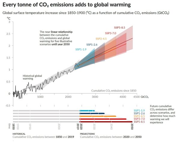
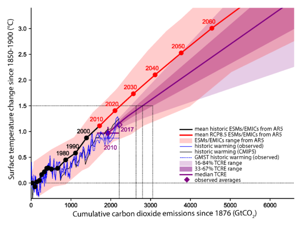
The scientific basis underlying a carbon budget is our robust scientific understanding that global warming is near-linearly proportional to the total amount of CO2 we ever emit as a society. This is illustrated in Fig. SPM10 of the WG1 AR6 report, both for the past and for future projections.
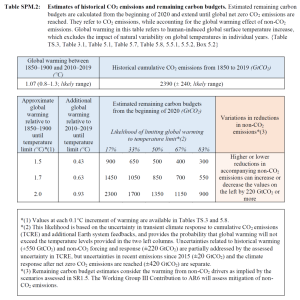
The estimates of remaining carbon budgets also made it into the Summary for Policymakers – the most prominent place that can be given for any finding of the report. Table SPM.2 gives an overview of the latest estimates, for different temperature limits and different probability levels.
How have these estimates changed since previous reports?
IPCC reported carbon budgets for the first time in 2013. And since, important advances have been made in how we estimate these. Five puzzle pieces combine to give carbon budget estimates, and allow us now to understand subsequent updates.
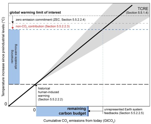
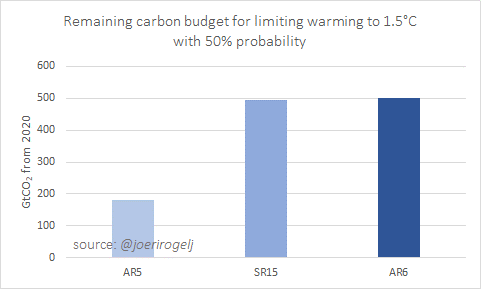
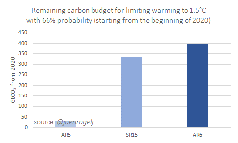
Starting with the key message of the AR6 carbon budget update: carbon budget estimates in AR6 are very similar to those published in the SR1.5 in 2018, but they represent a significant update since AR5 in 2013.
When adjusting for the emissions since AR5 and SR1.5, AR6 remaining carbon budget for limiting warming to 1.5C with 50% chance is about 300 GtCO2 larger than in AR5, but virtually the same as in SR1.5.
For 66% probability, the AR6 budget is about 60 GtCO2 larger than in SR1.5.
The budget is so much larger than in AR5, because since 2013 more accurate methods have been published that ensure that model uncertainties over the historical period are not accumulated into the future. This is best illustrated by this technical figure from SR1.5.
Between SR1.5 and AR6 every piece of the carbon budget was reassessed:
- warming to date
- how much warming we expect to get per tonne of CO2
- how much warming would still occur once we reach net zero CO2
- how much non-CO2 warming we can expect
- Earth system feedback otherwise not covered
Let’s dive into each piece of this puzzle to understand what has changed between SR1.5 and AR6.
Warming to date – SR1.5 used a 0.97°C warming estimate between 1850-1900 and 2006-2015. This estimate already included corrections for the incomplete global coverage of observations and the different ways in which global surface temperature can be estimated. The AR6, based on a full reassessment of all available data, assesses 0.94°C of global surface temperature increase for the same period.
In isolation, this update results in central estimates being about 65 GtCO2 larger in AR6 than in SR15. For the 33% and 67% estimates that’s about 110 and 50 GtCO2 higher, respectively.
Warming per tonne of CO2 – The next piece of the puzzle is the warming we project per tonne of CO2. SR1.5 used an estimate of 0.8-2.5°C per 1000 GtC (=3664 GtCO2). AR6 assessed this quantity, also known as the Transient Climate Response to Cumulative Emissions of CO2 (or TCRE), to fall in the 1.0-2.3°C range.
Having the same central estimate, the update in TCRE causes no shift in 50% estimates, but the higher and lower percentiles are narrowed. For a 67% chance, AR6 estimates are about 50 and 100 GtCO2 larger compared to SR1.5 for 1.5°C and 2°C of global warming, respectively.
Warming after net zero CO2 – The third piece of the puzzle is the how much warming is expected to still occur once global CO2 emissions reach (and remain at) net zero. This is known as the Zero Emissions Commitment to emissions of CO2 (or ZEC).
The AR6 estimate confirms the SR1.5 estimate of no further CO2-induced warming or cooling once global CO2 emissions reach and stay at next zero. The uncertainty surrounding this value are reported separately. ZEC therefore causes no changes between SR1.5 and AR6.
Non-CO2 warming contribution – The fourth puzzle piece is the projected warming from non-CO2 emissions. As SR1.5, AR6 uses deep mitigation pathways assessed by SR1.5 (Rogelj et al, 2018; Huppmann et al, 2018), but with climate projections updated entirely with dedicated climate emulators that integrate the scientific information across chapter.
By coincidence (and it is really coincidence), the updates in radiative forcing from tens of different gases, climate sensitivity, and carbon-cycle uncertainties result in no net shift in the estimate of non-CO2 warming for the remaining carbon budget.
Pure luck, given the many updated pieces of scientific knowledge that were integrated in AR6, but convenient for explaining differences in carbon budget estimates.
Updated non-CO2 warming estimates lead to no change in remaining carbon budget estimates compares to SR1.5.
Other Earth system feedbacks – The last piece is to account for Earth system feedbacks that would otherwise not be covered. SR1.5 assumed an additional blanket reduction of 100 GtCO2 for this century for these feedbacks. This was a crude estimate and therefore not included as a central part of the remaining carbon budget numbers in SR1.5 AR6 updates this assessment entirely and includes this contribution in its main estimates.
Taking into account not only permafrost thaw, but also a host of other biogeochemical and atmospheric feedbacks, the AR6 estimates to appropriately include the effect of all these feedbacks, remaining carbon budgets have to be reduced by 26 ± 97 GtCO2 per degree Celsius of additional warming.
Altogether these updates mean AR6 remaining carbon budget estimates are very similar compared to SR1.5, while they additionally include the effect of Earth system feedbacks that would otherwise not be covered.
Selecting a remaining carbon budget requires two normative choices as a minimum: the global warming level that is to be avoided, and the likelihood or chance with which this is achieved. Further choices involve how deeply non-CO2 emissions can be reduced.
In addition to updates to science underlying carbon budget estimates, the AR6 also provides a larger set of likelihood levels for its remaining carbon budget estimates (see Table SPM.2 above). As in previous reports, AR6 provides remaining carbon budget estimates for a 33%, 50%, and 67% chance of keeping warming to a given temperature limit. In addition, however, the AR6 also provides the bracketing percentiles for the central 66% range (the range covered between 17% and 83%), so that the uncertainty of the central estimate can be adequately understood.
These values can be used in a variety of ways. For example, the central estimate for the remaining carbon budget for keeping warming to 1.5°C is now 500 GtCO2 starting from the beginning of 2020, with a 66% uncertainty range of 300–900 GtCO2.
Designing a policy for limiting warming to 1.5°C with this global 500 GtCO2 number in mind means that in 1-out-of-2 cases warming will end up below and in 1-out-of-2 cases it will end up above 1.5°C. Alternatively, it can also be understood to mean that in 1-out-of-2 cases policy measures will have to be sharpened beyond the policies consistent with a 500 GtCO2 budget over the coming decades if warming is effectively to be kept to 1.5°C. Similar examples can be given for 1.7°C or other levels (see Table 5.8 in the underlying chapter; Canadell et al (2021)).
A last item affecting the selection of remaining carbon budgets is the expectation of how deeply non-CO2 emissions can be reduced. All remaining carbon budget estimates in AR6 assume that non-CO2 emissions such as methane are reduced consistent with a deep decarbonisation pathway that reaches net zero CO2 emissions. Depending on how effectively these non-CO2 emissions can be reduced, the remaining carbon budgets can vary by 220 GtCO2 or more.
Bottom line of this technical explanation remains, however, that these budgets are small, our current annual global CO2 emissions of about 40 GtCO2/yr are reducing them rapidly, and all budgets require CO2 to decline to net zero while global emissions have not yet shown to decline.
It’s nice to have remaining carbon budgets, but now we need to get on with it and make sure that global CO2 emissions start to decline.
If you would like to know all the ins and outs of AR6 remaining carbon budgets have a look at Section 5.5 in Canadell et al (2021). The entire section describes the assessment of TCRE and remaining carbon budgets, while Box 5.2 presents a more technical comparison with carbon budget estimates from previous reports.
Joeri Rogelj is Director of Research, Grantham Institute Climate Change & Environment, Imperial College London, UK, and Senior Research Scholar, International Institute for Applied Systems Analysis (IIASA), Laxenburg, Austria
Parts of this post have been published earlier as a twitter thread.
References
Huppmann, D., Rogelj, J., Kriegler, E., Krey, V., et al. (2018) A new scenario resource for integrated 1.5 °C research. Nature Climate Change. [Online] 8 (12), 1027–1030. Available from: doi:10.1038/s41558-018-0317-4.
Josep G. Canadell, J. G., P. M.S. Monteiro, M. H. Costa, L. Cotrim da Cunha, P. M. Cox, A. V. Eliseev, S. Henson, M. Ishii, S. Jaccard, C. Koven, A. Lohila, P. K. Patra, S. Piao, J. Rogelj, S. Syampungani, S. Zaehle, K. Zickfeld, 2021, Global Carbon and other Biogeochemical Cycles and Feedbacks. In: Climate Change 2021: The Physical Science Basis. Contribution of Working Group I to the Sixth Assessment Report of the Intergovernmental Panel on Climate Change [Masson-Delmotte, V., P. Zhai, A. Pirani, S. L. Connors, C. Péan, S. Berger, N. Caud, Y. Chen, L. Goldfarb, M. I. Gomis, M. Huang, K. Leitzell, E. Lonnoy, J. B. R. Matthews, T. K. Maycock, T. Waterfield, O. Yelekçi, R. Yu and B. Zhou (eds.)]. Cambridge University Press. In Press.
IPCC (2014) Climate Change 2014: Synthesis Report. Contribution of Working Groups I, II and III to the Fifth Assessment Report of the Intergovernmental Panel on Climate Change.
IPCC, 2021: Summary for Policymakers. In: Climate Change 2021: The Physical Science Basis. Contribution of Working Group I to the Sixth Assessment Report of the Intergovernmental Panel on Climate Change [MassonDelmotte, V., P. Zhai, A. Pirani, S. L. Connors, C. Péan, S. Berger, N. Caud, Y. Chen, L. Goldfarb, M. I. Gomis, M. Huang, K. Leitzell, E. Lonnoy, J. B. R. Matthews, T. K. Maycock, T. Waterfield, O. Yelekçi, R. Yu and B. Zhou (eds.)]. Cambridge University Press. In Press
Rogelj, J., Shindell, D., Jiang, K., Fifita, S., et al. (2018) Mitigation pathways compatible with 1.5°C in the context of sustainable development. In: Greg Flato, Jan Fuglestvedt, Rachid Mrabet, & Roberto Schaeffer (eds.). Global Warming of 1.5 °C: an IPCC special report on the impacts of global warming of 1.5 °C above pre-industrial levels and related global greenhouse gas emission pathways, in the context of strengthening the global response to the threat of climate change, sustainable development, and efforts to eradicate poverty. [Online]. Geneva, Switzerland, IPCC/WMO. pp. 93–174. Available from: http://www.ipcc.ch/report/sr15/.
Deciphering the ‘SPM AR6 WG1’ code
I followed with great interest the launch of the sixth assessment report Working Group 1 (The Physical Science Basis) from the Intergovernmental Panel on Climate Change (IPCC) on August 9th.
The main report is quite impressive (see earlier posts here, here, here, and here) but the press conference didn’t come across as being focused and well-prepared. In my opinion the press conference on 9 August 2021 didn’t do justice to the vast effort that went into it.
[Read more…] about Deciphering the ‘SPM AR6 WG1’ code#NotAllModels
The biggest contribution scientists can make to #scicomm related to the newly released IPCC Sixth Assessment report, is to stop talking about the multi-model mean.
[Read more…] about #NotAllModelsA Tale of Two Hockey Sticks
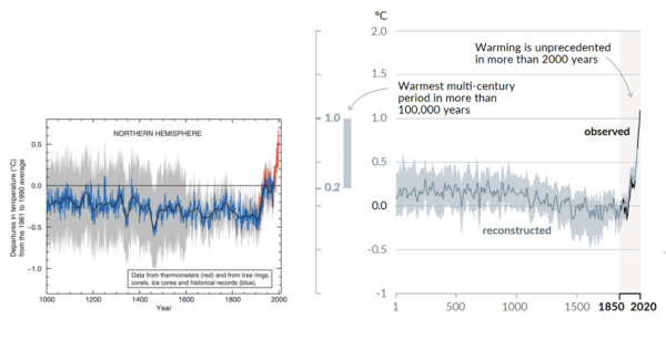
Two decades ago, the so-called “Hockey Stick” curve, published in 1999 by me and my co-authors (Mann, Bradley and Hughes, 1999), was featured in the all-important “Summary for Policy Makers” (SPM) of the 2001 IPCC Third Assessment report. The curve, which depicted temperature variations over the past 1000 years estimated from “proxy data such as tree rings, corals, ice cores, and lake sediments”, showed the upward spiking of modern temperatures (the “blade”) as it dramatically ascends, during the industrial era, upward from the “handle” that describes the modest, slightly downward steady trend that preceded it.
The Hockey Stick became an icon in the case for human-caused climate change, and I found myself at the center of the contentious climate debate (I’ve described my experiences in “The Hockey Stick and the Climate Wars”).
Featured two decades later now in the AR6 SPM is a longer Hockey Stick with an even sharper blade. And no longer just for the Northern Hemisphere, it now covers the whole globe. The recent warming is seen not only to be unprecedented over the past millennium, but tentatively, the past hundred millennia.
The relevant statements in the SPM and Technical Summary are:
A.2.2 Global surface temperature has increased faster since 1970 than in any other 50-year period over at least the last 2000 years (high confidence). Temperatures during the most recent decade (2011–2020) exceed those of the most recent multi-century warm period, around 6500 years ago13 [0.2°C to 1°C relative to 1850– 1900] (medium confidence). Prior to that, the next most recent warm period was about 125,000 years ago when the multi-century temperature [0.5°C to 1.5°C relative to 1850–1900] overlaps the observations of the most recent decade (medium confidence). {Cross-Chapter Box 2.1, 2.3, Cross-Section Box TS.1}
SPM AR6
Global surface temperature has increased by 1.09 [0.95 to 1.20] °C from 1850–1900 to 2011–2020, and the last decade was more likely than not warmer than any multi-centennial period after the Last Interglacial, roughly 125,000 years ago.
Cross Section Box TS.1
As the new IPCC report lays bare (you can find my full commentary about the new report at Time Magazine), we are engaged in a truly unprecedented and fundamentally dangerous experiment with our planet.
References
- M.E. Mann, R.S. Bradley, and M.K. Hughes, "Northern hemisphere temperatures during the past millennium: Inferences, uncertainties, and limitations", Geophysical Research Letters, vol. 26, pp. 759-762, 1999. http://dx.doi.org/10.1029/1999GL900070
AR6 of the best
Half a dozen takeaways from a first read of the new IPCC AR6 report.
As climate scientists we tend to look at the IPCC reports a little differently than the general public might. Here are a few things that mark this report out from previous versions that relate to issues we’ve discussed here before:
- Extreme events are increasingly connected to climate (duh!)
- Sea level rise is a big deal
- Use, abuse and misuse of the CMIP6 ensemble
- The radiative forcing bar chart has gone full circle
- Droughts and floods are complicated
- Don’t mention the hiatus
There are other things that will get the headlines (the expected time before we get to 1.5ºC or 2ºC, the headline SLR numbers, the ‘unprecedented rate’ statement, constraints on climate sensitivity, carbon cycle feedbacks, the implications for the carbon budgets etc.), and other things worth noting – for instance, the much better and more direct graphics that they have clearly worked on a lot. As usual, most of the headlines will also focus on the Summary For Policy Makers (SPM) which was approved word by word by the governments over the last two weeks (full disclosure, I was advising the US delegation), but the full report will be worth dipping into over the next few months (there is a lot there to digest!).
1. Extremes: Back in 2012, the literature assessed by AR5 connecting changes in extremes to climate change was scant. As we wrote at the time, attribution of single events was difficult and experimental. But as was exemplified by the recent reaction to the PNW heatwave, things have moved on considerably. This has allowed the IPCC authors to produce regional assessments of past changes in heat extremes, intense precipitation and agricultural/ecological drought in drying regions (see below for a discussion on what that means), and produce assessed projections of a whole suite of what they call Climate-impact Drivers (CIDs) – which includes floods, marine heatwaves etc. People who (even a couple of weeks ago) were quoting the AR5 statements on extremes as if that was current are going to have to update their talking points (that is, of course, if they care about correctly reflecting the most up-to-date science…).
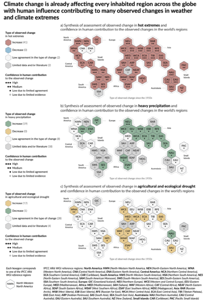
For example, IPCC finds that Northern Europe, Western Central Europe and Eastern Europe all show an observed increase in heavy precipitation events, such as the one causing the recent massive flooding in Germany and Belgium. Western Central Europe is one of the few regions where both an increase in extreme precipitation and in drought have already been documented. The IPCC notes that it’s the most rare and severe extremes which are expected to show the biggest percentage increase in frequency (see this past RealClimate post).
2. Sea Level Rise: The previous IPCC reports, notably AR4 and AR5 (to a lesser extent), have had a hard time dealing with SLR. This has been due to multiple issues, including a historical lack of comprehensive literature to assess, very uncertain observations of ice sheets, and difficultlies in blending different lines of evidence. In this report they’ve tried much harder to put the data together more coherently, there is more evidence, and they haven’t shied away from being explicit about the low-likelihood/high-impact possibilities (mostly associated with a collapse of WAIS). Literally, the sea level projection runs off the page… (Stefan will have a more detailed assessment later).
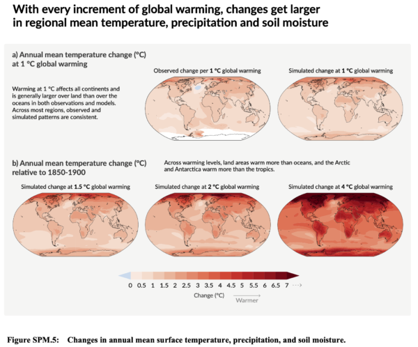
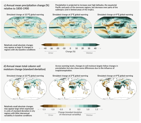
3. Use, Abuse and Misuse of the CMIP6 ensemble: I’ll discuss this in more detail in another post, but I want to commend the IPCC authors for dealing with the increased spread in the CMIP6 ensemble climate sensitivity in two very sensible ways. Firstly, the use constrained projections for all the temperature (and sea level) time series out to 2100 allows them to downweight (effectively to zero) the high (and low) ECS models that are outside of the assessed range (note this would not have made much (if any) difference in CMIP5). Secondly, they choose to focus on the patterns of change, not for certain time-periods, but for specific “Global Warming Levels” (GWLs). That is to say, what the expected pattern of rainfall (for instance) might be when the global mean temperature reaches 1.5ºC, or 2ºC or 4ºC etc. This allows them to include all the models (including good models with improved climatologies that happen to have high ECS like the NCAR CESM2 or the HadGEM3 models). Additionally, the GWL impacts plots neatly divorce the limited scenarios that were used in CMIP6 from the ability to assess impacts. Thus if policy-makers or others want to explore the impacts of other scenarios that might reach specific warming levels earlier or later than any one of the SSPs, they can do so easily, without having to rerun the models.
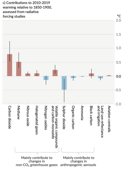
4. The radiative forcing bar chart has gone full circle: Almost every IPCC report has a version of the radiative bar chart showing the contributions over the historical period of all the different forcings (greenhouse gases, aerosols, solar, etc.). Every iteration has changed in trivial and sometimes substantive ways (I wrote a history of this a few years back), for instance, it’s oscillated from a vertical or horizontal presentation for no apparent reason, and the individual components have followed the scientific views of what was important. In this SPM it appears in Fig. SPM 2c and has gone back to being vertical. They have stuck with the contributions by emission (as opposed to concentration – something we pushed for last time), but the novelty here is that they are plotting the estimated temperature impact from each of the contributions (using the radiative forcing, the assessed climate sensitivity and an simple impulse-response model). Oddly enough this is most reminiscent of the very first bar chart that appeared in Hansen et al. (1981) which can be seen here.
5. Droughts and floods are complicated: The picture on droughts and floods is more complicated than most people think. First, there is a great deal of regional variation, second the historical metrics we use to assess drought (such as the Palmer Drought Severity Index) don’t perform very well in a changing climate, and third the attribution of meteorological or agricultural or ecological drought varies as well. Analyses that average over too wide an area, or that look at the wrong metrics, will come to erroneous conclusions. The IPCC authors went to a lot of trouble to disentangle this and the assessment in Fig. SPM3 of evidence for observed drought changes focuses specifically on agricultural and ecological drought (based on soil moisture), as opposed to hydrological drought (runoff) or meteorological drought (based on rainfall). This is because we don’t see strong attribution in total rainfall amounts, but we do in evaporative demand (which depends on temperature). Thus when we have a longterm precipitation anomaly (such as in the American South West (WNA in the hexagon plot above)), we can’t (yet) attribute the rainfall change, but we can attribute the soil moisture change. Floods are also complicated because they too don’t solely depend on a single factor (such as intense precipitation) – but instead are a function of prior state of soil moisture, water management practices and other hyper-local effects. Work here will continue to advance, but the picture is clear only in a few regions so far.
6. Don’t mention the hiatus: Readers will probably remember the prominence of the ‘hiatus’ in the discussions around the AR5 report (written in 2013) (see here, here, or here). Due in part to (IMO) an over-reliance on a single temperature record (HadCRUT4), and (it turns out) non-climatic biases in the ocean temperature records, the trends from 1998-2012 got a specific call out in the AR5 SPM:
In addition to robust multi-decadal warming, global mean surface temperature exhibits substantial decadal and interannual variability (see Figure SPM.1). Due to natural variability, trends based on short records are very sensitive to the beginning and end dates and do not in general reflect long-term climate trends. As one example, the rate of warming over the past 15 years (1998–2012; 0.05 [–0.05 to 0.15] °C per decade), which begins with a strong El Niño, is smaller than the rate calculated since 1951 (1951–2012; 0.12 [0.08 to 0.14] °C per decade)5. {2.4}
Section B.1, SPM AR5
The observed reduction in surface warming trend over the period 1998 to 2012 as compared to the period 1951 to 2012, is due in roughly equal measure to a reduced trend in radiative forcing and a cooling contribution from natural internal variability, which includes a possible redistribution of heat within the ocean (medium confidence). The reduced trend in radiative forcing is primarily due to volcanic eruptions and the timing of the downward phase of the 11-year solar cycle. However, there is low confidence in quantifying the role of changes in radiative forcing in causing the reduced warming trend. There is medium confidence that natural internal decadal variability causes to a substantial degree the difference between observations and the simulations; the latter are not expected to reproduce the timing of natural internal variability. There may also be a contribution from forcing inadequacies and, in some models, an overestimate of the response to increasing greenhouse gas and other anthropogenic forcing (dominated by the effects of aerosols). {9.4, Box 9.2, 10.3, Box 10.2, 11.3}
Section D.1, SPM, AR5
Now however, the updates to the historical warming, the use of four datasets instead of one, and of course, the series of record breaking years subsequently (2014, 2015, 2016/2020), the issue of variability in decadal trends is no longer so salient. The shifts in the quoted trends (1998-2012 is now 0.12ºC/decade, 1951-2012 is 0.13ºC, HadCRUT5) underlines the trivialness of the issue. To be fair, there is one mention of the hiatus in the AR6 Technical Summary:
The observed slower global surface temperature increase (relative to preceding and following periods) in the 1998–2012 period, sometimes referred to as ‘the hiatus’, was temporary (very high confidence). The increase in global surface temperature during the 1998–2012 period is also greater in the data sets used in the AR6 assessment than in those available at the time of AR5. Using these updated observational data sets and a like- for-like consistent comparison of simulated and observed global surface temperature, all observed estimates of the 1998–2012 trend lie within the very likely range of CMIP6 trends. Since 2012, global surface temperature has warmed strongly, with the past five years (2016–2020) being the hottest five-year period between 1850 and 2020 (high confidence). {2.3.1, 3.3.1, 3.5.1, Cross-Chapter Box 3.1}
AR6 Cross-Section Box TS.1
Let this episode stand as a clear reminder for assessment reports not to get ahead of the science…
And so to bed…
Finally, let me finish up with a couple of personal observations. This was the first IPCC report where I was involved in the SPM approval process, and while that was frustrating at times, the vast majority of delegates were obviously focussed on getting the best summary consistent with the science that they could. Obviously, some countries had specific sensitivities, but seeing the negotiations on how those issues could be finessed while sticking to language that the authors approved of was impressive. In particular, the chairing of the meeting by Valerie Masson-Delmotte was a masterclass in effective meeting strategies. The virtual nature of the proceedings means that this was undoubtedly the SPM approval session with the lowest carbon footprint which might serve as a model for future efforts. However, the ‘all time zone’ nature of the proceedings and the very interrupted nature of my resulting sleep patterns has left a mark on pretty much everyone involved. Forgive me if I sleep in for the rest of this week…
References
- J. Hansen, D. Johnson, A. Lacis, S. Lebedeff, P. Lee, D. Rind, and G. Russell, "Climate Impact of Increasing Atmospheric Carbon Dioxide", Science, vol. 213, pp. 957-966, 1981. http://dx.doi.org/10.1126/science.213.4511.957
We are not reaching 1.5ºC earlier than previously thought
Guest commentary by Malte Meinshausen, Zebedee Nicholls, and Piers Forster
Of all the troubling headlines emerging from the release of the Intergovernmental Panel on Climate Change (IPCC) WG1 report, one warning will surely dominate headlines in the next days and weeks: Earth is likely to reach the crucial 1.5℃ warming limit in the early 2030s.
In 2018, the IPCC Special Report on 1.5C warming stated in its summary for policy makers that the world was likely to cross the 1.5℃ threshold between 2030 and 2052, if current warming trends continue.
In this latest AR6, a more comprehensive assessment was undertaken to estimate when a warming level of 1.5℃ might be reached. As a result, some early media reports suggest 1.5ºC warming is now anticipated 10-years earlier than previously assumed (AFR, THE TIMES).
We want to explain here why that is not backed up by a rigorous comparison of the SR1.5 and AR6 reports. In fact, the science in the previous SR1.5 report and the new AR6 report are remarkably consistent.
[Read more…] about We are not reaching 1.5ºC earlier than previously thoughtThe IPCC Sixth Assessment Report
Climate scientists are inordinately excited by the release of a new IPCC report (truth be told, that’s a bit odd – It’s a bit like bringing your end-of-(seven)-year project home and waiting anxiously to see how well it will be received). So, in an uncharacteristically enthusiastic burst of effort, we have a whole suite of posts on the report for you to read.
- AR6 of the Best. Half a dozen takeaways from the report from Gavin
- New (8/13): Sea Level Rise in AR6 from Stefan
- A Tale of Two Hockey Sticks by Mike
- #NotAllModels discusses the use (and mis-use) of the CMIP6 ensemble by Gavin
- We are not reaching 1.5ºC earlier than previously thought from guest authors Malte Meinshausen, Zebedee Nicholls and Piers Forster
- New (8/12): Deciphering the SPM AR6 WG1 Code by Rasmus
- New (8/12): A deep dive into the IPCC’s updated carbon budget numbers from guest author Joeri Rogelj
If/when we add some more commentary as we digest the details and we see how the report is being discussed, we’ll link it from here. Feel free to discuss general issues with the report in the comments here, and feel free to suggest further deep dives we might pursue.