The global temperature data for 2013 are now published. 2010 and 2005 remain the warmest years since records began in the 19th Century. 1998 ranks third in two records, and in the analysis of Cowtan & Way, which interpolates the data-poor region in the Arctic with a better method, 2013 is warmer than 1998 (even though 1998 was a record El Nino year, and 2013 was neutral).
The end of January, when the temperature measurements of the previous year are in, is always the time to take a look at the global temperature trend. (And, as the Guardian noted aptly, also the time where the “climate science denialists feverishly yell […] that global warming stopped in 1998.”) Here is the ranking of the warmest years in the four available data sets of the global near-surface temperatures (1):
|
Rank
|
||||
|
1
|
2010
|
2010
|
2010
|
2010
|
|
2
|
2005
|
2005
|
2005
|
2005
|
|
3
|
2007
|
1998
|
1998
|
2007
|
|
4
|
2002
|
2013
|
2003
|
2009
|
|
5
|
1998
|
2003
|
2006
|
2013
|
New this year: for the first time there is a careful analysis of geographical data gaps – especially in the Arctic there’s a gaping hole – and their interpolation for the HadCRUT4 data. Thus there are now two surface temperature data sets with global coverage (the GISTEMP data from NASA have always filled gaps by interpolation). In these two data series 2007 is ranked 3rd. Their direct comparison looks like this:
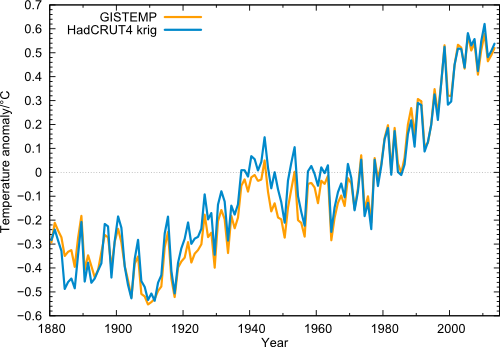
Figure 1 Global temperature (annual values) in the data from NASA GISS (orange) and from Cowtan & Way (blue), i.e. HadCRUT4 with interpolated data gaps.
One can clearly see the extreme year 1998, which (thanks to the record-El Niño) stands out above the long-term trend like no other year. But even taking this outlier year as starting point, the linear trend 1998-2013 in all four data sets is positive. Also clearly visible is 2010 as the warmest year since records began, and the minima in the years 2008 and 2011/2012. But just like the peaks are getting higher, these minima are less and less deep.
In these data curves I cannot see a particularly striking or significant current “warming pause”, even though the warming trend from 1998 is of course less than the long-term trend. Even in Nature, there was recently a (journalistic) contribution that in its introduction strongly overstated this alleged “hiatus”. It makes a good story that perhaps some cannot resist. (“Warming trend is somewhat reduced, but within the usual range of variation” simply does not make good headline.)
The role of El Niño and La Niña
The recent slower warming is mainly explained by the fact that in recent years the La Niña state in the tropical Pacific prevailed, in which the eastern Pacific is cold and the ocean stores more heat (2). This is due to an increase in the trade winds that push water westward across the tropical Pacific, while in the east cold water from the depths comes to the surface (see last graph here). In addition, radiative forcing has recently increased more slowly (more on this in the analysis of Hansen et al. – definitely worth a read).
NASA shows the following graphic, where you can see that the warmer years tend to be those with an El Niño in the tropical Pacific (red years), while the particularly cool years are those with La Niña (blue years).
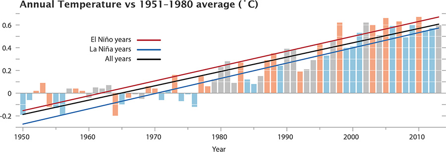
Figure 2 The GISS data, with El Niño and La Niña conditions highlighted. Neutral years like 2013 are gray. Source: NASA .
Quality of the interpolation
How good is the interpolation into regions not regularly covered by weather stations? In any case, of course, better than simply ignoring the gaps, as the HadCRUT and NOAA data have done so far. The truly global average is important, since only it is directly related to the energy balance of our planet and thus the radiative forcing by greenhouse gases. An average over just part of the globe is not. The Arctic has been warming disproportionately in the last ten to fifteen years.
But how well the interpolation works we know only since the important work of Cowtan and Way. These colleagues have gone to the trouble of carefully validating their method. Although there are no permanent weather stations in the Arctic, there is intermittent data from buoys and and from weather model reanalyses with which they could test their method. For the last few decades and Cowtan & Way also make use of satellite data (more on this in our article on underestimated warming). I therefore assume that the data from Cowtan & Way is the methodologically best estimate of the global mean temperature which we currently have. This correction is naturally small (less than a tenth of a degree) and hardly changes the long-term trend of global warming – but if you look deeper into shorter periods of time, it can make a noticeable difference. The comparison with the uncorrected HadCRUT4 data looks like this:
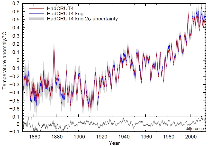
Figure 3: Comparison of interpolated and non-interpolated HadCRUT4 data, as moving averages over 12 months. Source: Kevin Cowtan, University of York.
And here’s a look at the last years in detail:
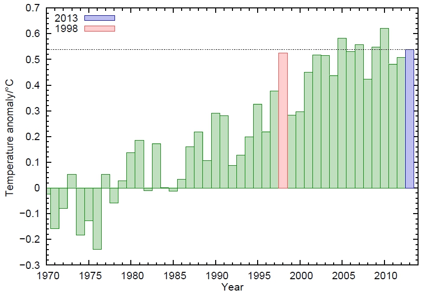
Figure 4: The interpolated HadCRUT4 data (annual average) from 1970. Source: Kevin Cowtan, University of York.
Following this analysis, 2013 was thus even warmer than the record El-Niño-year 1998.
Conclusion
- In all four data series of the global near-surface air temperature, the linear trend even from the extreme El Niño year 1998 is positive, i.e. shows continued warming, despite the choice of a warm outlier as the initial year.
- In all four data series of the global near-surface air temperature, 2010 was the warmest year on record, followed by 2005.
- The year 1998 is, at best, rank 3 – in the currently best data set of Cowtan & Way, 1998 is actually only ranked 7th. Even 2013 is – without El Niño – warmer there than 1998.
The German news site Spiegel Online presents these facts under the headline Warming of the air paused for 16 years (my translation). The headline of the NASA news release, NASA Finds 2013 Sustained Long-Term Climate Warming trend, is thus completely turned on its head.
This will not surprise anyone who has followed climate reporting of Der Spiegel in recent years. To the contrary – colleagues express their surprise publicly when a sensible article on the subject appears there. For years, Der Spiegel has acted as a gateway for dubious “climate skeptics” claims into the German media whilst trying to discredit top climate scientists (we’ve covered at least one example here).
Do Spiegel readers know more (as their advertising goes) – more than NASA, NOAA, Hadley Centre and the World Meteorological Organization WMO together? Or are they simply being taken for a ride for political reasons?
Footnotes
(1) In addition to the data of the near-surface temperatures, which are composed of measurements from weather stations and sea surface temperatures, there is also the microwave data from satellites, which can be used to estimate air temperatures in the troposphere in a few kilometers altitude. In the long-term climate trend since the beginning of satellite measurements in 1979, the tropospheric temperatures show a similar warming as the surface temperatures, but the short-term fluctuations in the troposphere are significantly different from those near the surface. For example, the El Niño peak in 1998 is about twice as high as in the surface data in the troposphere, see Foster and Rahmstorf 2011 . In their trend from 1998 , the two satellite series contradict each other: UAH shows +0.05 ° C per decade (a bit more than HadCRUT4), RSS shows -0.05 ° C per decade.
(2) Another graphic to illustrate the change between El Niño and La Niña: the Oceanic Niño Index ONI, the standard index of NOAA to describe the seesaw in the tropical Pacific.
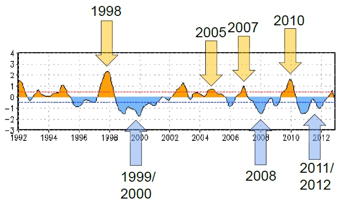
Figure 5 The ONI index. The arrows added by me point to some globally warm or cool years (compare Figure 1 or 4). Source: NOAA .
Weblinks
Kevin Cowtan has a neat online trend calculator for all current global temperature data series.
The global temperature jigsaw (an overview over the “pause” debate)
What ocean heating reveals about global warming
#47–“I know, I know, some of you will repeat the oft heard “ya can’t get a trend in only a decade”, but of course you can.”
I can calculate a trend based on observations from 9 AM this morning, too. Doesn’t make it meaningful.
(Hey, I got a Captcha box… without going to Firefox!)
I think that there is one thing wrong with this article: You say something like “climate change cannot be understood by studying short timescales but even if that were the case the denialists would still be wrong.”
I wonder if you see the flaw that I am trying to point out.
Ray Ladbury, you’ve got the sanity gene.
Patrick: “Ray Ladbury, you’ve got the sanity gene.”
Yes, fortunately, it is recessive. ;-)
Not to mention that no record shows any change in warming slope. And if you need to add warming in such a small area as the Arctic to make your case, my point has already been made.
I’m not saying there’s no “dangerous” GHG warming (I’ve written entire reviews on the subject). But I am cautioning that there is growing evidence for the lower end of our estimates of Climate sensitivity, and certainly below what the models get (btw, my career was in computer modeling and I helped get Los Alamos Nat. Lab. into modeling of oceans resulting in one of the best, so I’m not anti-modeling). But, having been in modeling for decades, I have a healthy respect for the constant need to improve simulations. bottom line–it ain’t warmin as much as we thought it would, and the oceans (with their multi-decadal cycles) may be the reason why.
I can’t help wondering if the Arctic adjustments would have still been used if they pushed the trend the other way. Does this data extend back to 1880 so it applies over the whole range?
Why is 2012 listed as a La Nina year? Looking at the chart 2012 started as a La Nina and then switched to a mild El Nino. It seems to be an error often repeated.
[Response: It’s based on DJF of the ONI index. – gavin]
Yes that is a neat online trend calculator at the end of the post. Ditto, the other two. Thanks again.
Ron Manley:
Quasi-periodic oscillations in the oceans have been included as random variation in models, but not at their observed timing. That was recently addressed by Kosaka and Xie. John Nielsen-Gammon summarizes their results:
Looking past the Walt-Kelly-esque acronyms, it’s convincing evidence that when the tropical central and eastern Pacific returns to El Nino conditions, we’ll see warming like nothing we’ve seen before.
Chick Kellar,
Foster and Rahmstorf 2011.
‘Nuff said.
“…it’s convincing evidence that when the tropical central and eastern Pacific returns to El Nino conditions, we’ll see warming like nothing we’ve seen before.”
A couple of years ago I was inclined to say something along the lines of -just you wait ’til the next El Nino – to Australians who were crowing about all the water in the Murray and no drought. Sort of self-righteous, sort of a joke.
Now, Adelaide’s just had its hottest ever February day, and one of our towns in the south east has had its hottest ever, ever, day. I’m simply dreading the next El Nino. And if the IOD gets in on the act as well, we’re in for a simply awful time.
I do think people need to look at the tamino link that bigbass posted at #37. Here it is again: http://tamino.wordpress.com/
There is no shift in the slope of even atmospheric warming. Warming has proceeded after 1998 at exactly the rate it had been going before that date. We are mostly arguing about nothing (and giving the pseudo-skeptics lots of fuel in the meantime).
> bigbass 37, wili 62
They’re both referring to:
http://tamino.wordpress.com/2014/01/30/global-temperature-the-post-1998-surprise/
#62 – I thought the tamino post was excellent (and Gavin had done something very similar before here). However when comparing models vs observations, the observations are still at the bottom of the model spread for both AR4 and AR5 (I don’t necessarily conclude that this means the climate sensitivity is at the lower end of the IPCC range but this is one possibility)
Thanks, Hank.
I wonder if gavin could clarify how confident we can be at this point that we are heading into an El Nino later this year… “An El Nino trend is likely to develop this year, Gavin Schmidt, deputy director of NASA’s Goddard Institute for Space Studies in New York, said this month.”
http://www.bloomberg.com/news/2014-01-28/el-nino-may-develop-as-most-models-predict-pacific-ocean-warming.html
Mal Adapted #59
It seems to me that the links you point to provide, at best, a partial explanation.
Any explanation of the current hiatus which does not cover the longer hiatuses (hiati ?) of 1945 to 1975 and 1870 to 1910 cannot be considered definitive.
did you figure 2 separating Earth and oceans?
Are the developments comparable?
thank you
Ron Manley
That’s Science for you. The evidence suggests that ocean oscillations affect the shape of the global surface temperature curve over time. Just how they do is an area of active research. There may not be a “definitive” explanation of the current slope of the curve so far, but stay tuned.
@Stefan:
Only a linear analisis ?
http://idata.over-blog.com/1/23/41/67/000solaire/o/Image3-copie-2.jpg
For Wili:
http://iri.columbia.edu/climate/ENSO/currentinfo/technical.html
Folks,
this is all very instructive for me. I’ll look at those papers, but one point you may wish to keep in the back of your heads. Say the 60 yr cycle is in fact real. It would nicely explain the two earlier hiatuses mentioned above. Thanks again for the references which I’ll read up on.
“What did the IPCC say about aerosols?” Aerosol update by Will Morgan tweeted by Gavin #EGUblogs:
http://blogs.egu.eu/hazeblog/2014/02/11/what-did-the-ipcc-say-about-aerosols/
The state-of-the-process of the science of aerosols rivets interest but adds no uncertainty to the big takeaway: the moral hazard of masking our climate debt.
Here’s “The Entire IPCC Report in 19 Illustrated Haiku”:
http://daily.sightline.org/2013/12/16/the-entire-ipcc-report-in-19-illustrated-haiku/
ow.ly/tvy8x
pic.twitter.com/RPNKnfEr1f
regarding “The truly global average is important, since only it is directly related to the energy balance of our planet and thus the radiative forcing by greenhouse gases.”
Would someone be kind enough to point me to the ‘official’ ‘accepted’ ‘consensus’ as what the GMST was for 2013 please?
eg say the IPCC was to do a report in a few years time, what ‘number’ would they use for 2013 to plot that on their graphs?
Is there one?
Thanks
If it was steady warming after the nasty cold patch that ended in ~1850, every year would be hotter than the previous year but the warming has a cyclical or saw-tooth pattern which allows different selections of data to suggest we are experiencing catastrophically rapid warming whilst other selections of data suggests we have moved into a “flatline” or below-trend warming rate in the last 10 to 15 years. Both are poor science.
There is a 66-year cyclicity in the global temperature data that can’t be caused by atmospheric CO2. This focus on CO2 may be diverting our eyes from a more significant understanding of this dynamic planet.
Re- Comment by Ian Levy — 16 Feb 2014 @ 5:01 AM
Without a plausible and testable physical mechanism that could explain a 66 year cycle in global temperature it is just a statistical coincidence and pseudoscience. Further, to even consider the idea requires several cycles. There are usually very many up-down-ups at varying scales in any natural data set, but to get any attention there must be several complete cycles that are both consecutive and have the same period.
Steve
Discussing thek next El Nino:
http://www.climatecentral.org/news/study-sounds-el-nino-alarm-for-2014-17052
http://www.pnas.org/content/111/6/2064
These figures were shocking. You would think that when receiving evidence such as this, and such as #50 and the destructive course we are on, that everyone would be moved to action. Energy efficient practices and conservation are musts for our future. Let’s hope we all wake up soon.
> sixty-something year cycle
Much talked about, but few agree that the cycle they’re talking about is the same one as others are talking about, it seems.
E.g. http://link.springer.com/article/10.1007/s00704-011-0499-4
Global, even just northern hemisphere, oscillations of, say, a 60 year quasiperiod would show up in the southern Greenland ice cores. Not there in that the signal is (well) below statistical significance:
Greenland ice core evidence for spatial and temporal variability of the Atlantic Multidecadal Oscillation
Petr Chylek, Chris Folland, Leela Frankcombe, Henk Dijkstra, Glen Lesins, Manvendra Dubey
DOI: 10.1029/2012GL051241
Geophysical Research Letters
Volume 39, Issue 9, May 2012
#73 was obviously a dumb question. Good to know.
Can someone give me a climate scientists response to “global warming has flat-lined since 1998”
I know they cherry pick 1998. I know they don’t take into account the ocean. I’d like to take something else back. Thanks
freemike,
Tamino has pretty much eviscerated this particular meme.
http://tamino.wordpress.com/2014/01/30/global-temperature-the-post-1998-surprise/
#81–Mike, I’d recommend this:
http://www.skepticalscience.com/global-warming-stopped-in-1998.htm
You can also use their search box to find related posts (of which there are many.)
I have a relevant article as well:
http://hubpages.com/hub/When-Did-Global-Warming-Stop
Points up the fact that this cherry-picking is nothing new.
Re- Comment by freemike — 26 Feb 2014 @ 8:15 AM
Check out the analysis linked by Hank Roberts, comment ~#63 above. Here- https://www.realclimate.org/?comments_popup=16736#comment-453991
Steve
freemike, just give them a pointer to this topic.
Tell them to read what appears at the top of the page.
Anyone who doesn’t want to read the information at the top of the page isn’t going to understand a shorter answer in the comments.
I appreciate all the help but did well with ‘skeptical science’ and other things here. The problem is an absolute refusal to accept facts. It gets nauseating to see even basic climate science questioned even after mountains of evidence to the contrary. There are people (few) who do actually learn something and can shed their conservative armor and listen to reason.
This site is doing amazing work and there are people like me taking this information to echochambers where it normally wouldn’t be seen and it does make a difference. Thanks again.