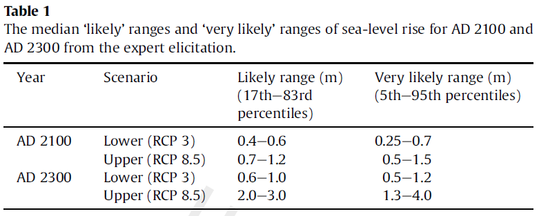
In the long run, sea-level rise will be one of the most serious consequences of global warming. But how fast will sea levels rise? Model simulations are still associated with considerable uncertainty – too complex and varied are the processes that contribute to the increase. A just-published survey of 90 sea-level experts from 18 countries now reveals what amount of sea-level rise the wider expert community expects. With successful, strong mitigation measures, the experts expect a likely rise of 40-60 cm in this century and 60-100 cm by the year 2300. With unmitigated warming, however, the likely range is 70-120 cm by 2100 and two to three meters by the year 2300.
 Complex problems often cannot simply be answered with computer models. Experts form their views on a topic from the totality of their expertise – which includes knowledge of observational findings and model results, as well as their understanding of the methodological strengths and weaknesses of the various studies. Such expertise results from years of study of a topic, through ones own research, through following the scientific literature and through the ongoing critical discussion process with colleagues at conferences.
For many topics it would be interesting for the public to know what the expert community thinks. If I had a dangerous disease, I would give a lot to learn what the best specialists from around the world think about it. Mostly, however, this expertise is not transparent to outsiders. The media only offer a rather selective window into experts’ minds.
More transparency can be achieved through systematic surveys of experts. The International Council of Scientific Academies (InterAcademy Council, IAC) in its review of IPCC procedures recommended in 2010: “Where practical, formal expert elicitation procedures should be used to obtain subjective probabilities for key results”. We took this advice and last November conducted a broad expert survey on future sea-level rise, in the context of a research project funded by NOAA. Lead author is Ben Horton (Rutgers University), the further authors are Simon Engelhart (University of Rhode Island) and Andrew Kemp (Tufts University).
The credibility of such surveys stands and falls with the selection of experts (see Gavin’s article A new survey of scientists). It is important to identify relevant experts using objective criteria. For us, formal criteria such as professorships were not relevant; our objective was to reach active sea-level researchers. To this end we used the scientific publication database Web of Science of Thomson Reuters and let it generate a list of the 500 researchers who had published the most papers for the search term “sea level” in the last five years in the peer-reviewed literature. It was found that at least 6 publications were required for a scientist to make it onto this list. For 360 of those experts we were able to find email addresses. We asked those for their estimates of the sea-level rise from 2000 to 2100 and 2300, both the “likely” rise (17th to 83rd percentile) and the range of the 5th to the 95th percentile (the 95th percentile is the increase which with 95 % probability will not be exceeded, according to the expert). 90 experts from 18 countries provided their responses.
Sea-level: a bit of context
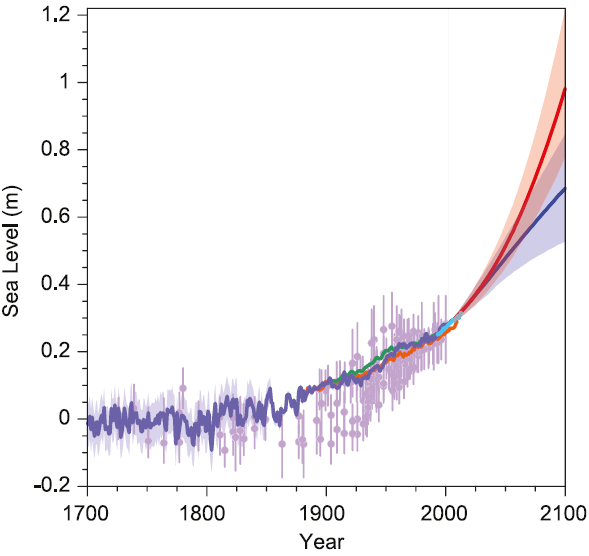
For context, the following figure from the current IPCC report summarizes the sea-level evolution:
Figure 1: Sea level rise according to the IPCC report of 2013. Shown is the past history of sea level since the year 1700 from proxy data (sediments, purple) and multiple records from tide gauge measurements. Light blue are the satellite data (from 1993). The two future scenarios mentioned in the text (RCP8.5 and RCP2.6) are shown in red and blue, with their “likely” uncertainty range according to the IPCC (meaning a 66 % probability to remain inside this range). Source: IPCC AR5 Fig. 13.27.
A more detailed discussion of the IPCC sea level numbers can be found here. The red and blue future scenarios correspond (to good approximation) to the two climate scenarios on which we surveyed the experts: blue a scenario with effective climate mitigation, red a scenario with a further unabated growth of emissions into the 22nd Century.
The survey results
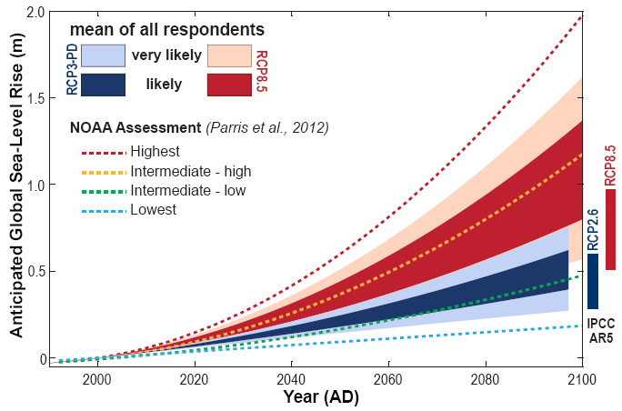
The following graph shows what the surveyed experts expect for these two scenarios up to the year 2100:
Figure 2: Sea level rise over the period 2000-2100 for two warming scenarios (red RCP8.5, blue RCP3). The ranges show the average numbers given across all the experts. The inner (darker) range shows the 17 to 83 percentile values, the outer range the 5 to 95th percentiles. For comparison we see the NOAA projections of December 2012 (dashed lines) and the new IPCC projections (bars on the right). Since this graph shows the increase from the year 2000, about 25 cm should be added for a direct numerical comparison with the previous graph.
The experts gave a median rise of 40-60 cm for the blue climate scenario and 70-120 cm for the red scenario. Most of the experts thus expect a higher rise than the IPCC – about two-thirds (65%) give the upper limit for the red ‘likely’ range a higher value than the IPCC, even though the IPCC has increased its projections by ~60% since its last report of 2007. In expert circles the IPCC reports are widely considered to be conservative; this is empirical confirmation.
The following table shows all the median values:
Highly relevant for coastal protection is a “high-end” value that with high probability will not be exceeded – let’s say the 95th percentile in the table above, below which the rise will remain with 95 percent probability. For the red scenario, about half of the experts (51%) gave 1.5 meters or higher for this, a quarter (27%) even 2 meters or higher. This is for the increase from 2000 to 2100. In the longer term, for the increase from 2000 to the year 2300, the majority of experts (58%) give this high-end value as 4 meters or higher.
These numbers reflect the fact that experts (including myself) have become more pessimistic about sea-level rise in recent years, in the light of new data and insights mainly concerning the dynamic response of the ice sheets.
Two camps?
Experts quoted in the media are often chosen according to media needs – quite popular is the presentation of topics as a controversy with one expert pro and one against. In this way the experts are portrayed as divided into “two camps”, regardless of whether this reflects the reality. This “two-camps theory” is then used as a justification to cite (in the name of supposed balance) counter-arguments by “climate skeptics” with doubtful expertise. Especially in the US this “false balance” phenomenon is widespread.
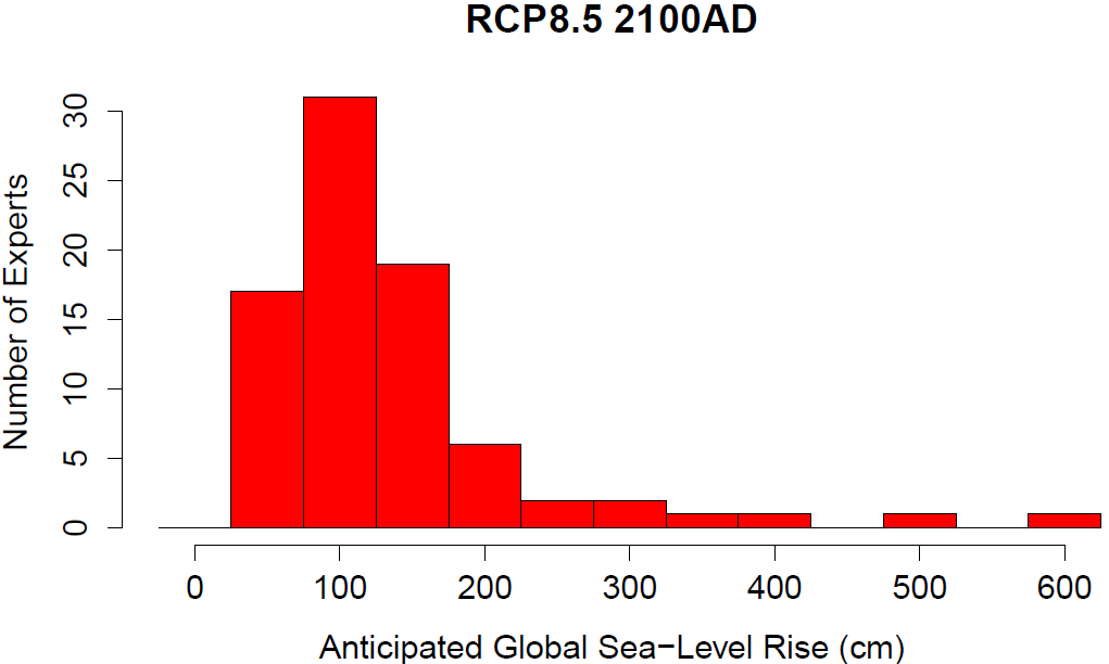
In the distribution of expert estimates we find no evidence in support of the two-camps theory, as shown in the following graph.
Figure 3. Distribution of the experts’ answers to the upper limit of the ‘likely’ range for the RCP8.5 scenario by the year 2100. (These numbers can be compared to the value of 98 cm given in the IPCC report.)
There is no split into two groups that could be termed “alarmists” and “skeptics” – this idea can thus be regarded as empirically falsified. That is consistent with other surveys, such as that of continental ice experts by Bamber & Aspinell (Nature Climate Change 2013). Instead, we see in the distribution of responses a broad scientific “mainstream” with a normal spread (the large hump of three bars centered on 100 cm, in which I also find myself), complemented with a long tail of about a dozen “pessimists” who are worried about a much larger sea-level rise. Let’s hope these outliers are wrong. At least I don’t see a plausible physical mechanism for such a rapid rise.
Weblinks
A study on the regional differences in sea-level rise: A scaling approach to project regional sea level rise and its uncertainties
A study on impacts on cities: Future flood losses in major coastal cities
Huffington Post on our sea-level survey
And the Washington Post: How high will sea levels rise? Let’s ask the experts.
Reference
My “skeptical” position is that the experts can’t model things with really complex dynamics that are unprecedented in human experience, and simply leave them out. For example: much of the Antarctic ice sheet is grounded below sea level, and some of the deepest parts are connected all the way to the open ocean by ice grounded below sea level. Does anyone know how to model the mechanism by which warming from below lubricates the ice and allows it do dislodge a lot faster than warming from above would melt it? Is there any way to model the effect of a very large chunk coming away and isostatic rebound causing a domino effect where even bigger chunks break away?
To make things even more difficult, the current rate of warming is not comparable with previous periods, where greenhouse gas increases were much slower.
Just because can’t model this doesn’t mean it can’t happen. Which means all estimates on sea level rise have a large unknown fudge factor missing.
Wouldn’t it be nice to be the other kind of “skpetic” who believes all errors are on the side of making reality better than predicted?
Philip,
I agree with you that “Just because can’t model this doesn’t mean it can’t happen.” In Fig 2 the IPCC AR5 curve is the lowest and is obviously very optimistic and so very doubtful. What annoys me is that the IPCC claim that they are being scientific because they claim there is not enough evidence to give a definitive answer. But their estimate appears to be very inaccurate, and they could have given a truer answer by saying that they are 50% sure that it will be greater than 1 m.
It is quite easy to model how the grounding line will retreat. If sea level rises by 1 m then the grounding line will be raised by 1 m. The distance it will travel into the continent will depend on the gradient of the sea bed.
Cheers, Alastair.
I do worry about the evolution of the summer albedo of the GIS. If significant area becomes an ablation zone, then once the previous winters snow has melted, the surface is composed of old ice, which every year becomes older than the last. Is there any good data on the fate on embedded contaminants in the ice (dust, volcanic ash, black carbon etc.)? Does it tend to get washed down moulins, or does it accumulate from year to year? If the summer albedo gets much lower, melting could accelerate dramatically.
Alastair @52.
Isn’t the grounding line the point where the ice can float? This depends upon both the thickness of the ice, as well as the depression below sea level. The later should be well known (assuming we already know the basal topography), but the ice thickness will be a dynamic time dependent variable. In general thinning leads to a movement of the grounding line towards the interior, which likely leads to more dynamical thinning.
“Is there any good data on the fate on embedded contaminants in the ice (dust, volcanic ash, black carbon etc.)? Does it tend to get washed down moulins, or does it accumulate from year to year? If the summer albedo gets much lower, melting could accelerate dramatically.”
Good question, Thomas. I suspect that in many places all those contaminants stay on or near the surface and accelerate warming and melting as they concentrate more and more. Classic feedback. You can see it on most snowbanks in the spring in regions that get snow–the once-white snowbanks become nearly solid black as they shrink and expose more of the dust etc. that has accumulated over the winter.
There is also the issue of increased biological activity in melt ponds decreasing albedo (beyond that of the melt ponds themselves). Plus the loss of altitude mentioned above (and I’ve probably missed some others). So there are lots of feedbacks in play ready to accelerate the rate of ice loss far beyond what it is today.
AFAICS, the only negative feedbacks are: 1) the increase in precipitation of snow with increased global humidity levels; and 2) the physical fact that as snow melts and water evaporates, those endothermic processes cool the surrounding area (but again I am doubtless missing a few).
Re contamination: Antarctic Melt Releasing DDT, Tainting Penguins
willi, I doubt that seasonal (and urban) snowbanks are a very good analogy for a melting ice sheet. They are very dirty -polar ice tends to be pretty clean because it is a long distance from sources of dust/dirt. Also first year snow is pretty prous, so the meltwater can percolate through the snow, rather than flowing on a hard icy surface. Alpine glaciers, which often get very dirty even black in their ablation zones may also not be a good analogy, as the amount of dirt is orders of magnitude higher than for polar ice sheets. Also the time span that an abalation zone exists is likely to be much longer on the ice sheep, than on an alpine glacier. Thats, why I question whether we have the data to answer the question.
Re- Comment by Thomas — 28 Nov 2013 @ 11:27 AM
Dark Snow Project- http://en.wikipedia.org/wiki/Dark_Snow_Project
Steve
http://www.sciencedaily.com/releases/2009/10/091021100742.htm is about persistent organic pollutants melting out of the Swiss alps.
Thomas, I appreciate that they are imperfect things to compare, but have you ever seen pictures of the ice pack near the edge of the ice sheet where the melting is happening fastest? It looks very much like the snow banks around here in spring.
https://www.google.com/search?q=greenland+ice+sheet+edge&client=firefox-a&hs=PGW&rls=org.mozilla:en-US:official&source=lnms&tbm=isch&sa=X&ei=ecKXUqOLJ9DcoATsk4HwBQ&ved=0CAkQ_AUoAQ&biw=1376&bih=727#facrc=_&imgdii=_&imgrc=jdsmoWW2ycQGCM%3A%3BiBuSAgbwi6WWTM%3Bhttp%253A%252F%252Fwww.polartrec.com%252Ffiles%252Fmembers%252Fbetsy-wilkening%252Fimages%252Fimg_0353.jpg%3Bhttp%253A%252F%252Fwww.polartrec.com%252Fexpeditions%252Focean-atmosphere-sea-ice-and-snowpack-interactions%252Fjournals%252F2013-09-24%3B500%3B279
You’re right though; I don’t know if what happens at the margins has any relation to what happens in the interior. I don’t see why there wouldn’t be some areas where a similar process may take hold. And remember that there doesn’t have to be a huge shift in albedo for it to have an affect on the melt rate. Thanks toe Steve and Hank for linking to actual studies. I’ll come back after I’ve perused them further.
Thomas @54
Yes, the grounding line is the line where floating begins and ice resting on the solid earth ends. And you are correct that it depends on the thickness of the ice and the depression below sea level. But if sea level rises then the depression will increase and the grounding line will retreat. This assumes that the thickness remains unchanged, which will surely be true in the short term.
In fact, with less ice resting on the solid earth, then the mass and friction will decrease, speeding the flow of ice and reducing its thickness. So you have a double whammy positive feedback.
One reason I mention this is that I have not seen any evidence that the ice sheet scientists are aware of these facts :-(
During Heinrich Events, there seems to have been simultaneous ice surges in North America, Scandinavia and possibly Antarctica, which can be explained if you accept that sea level rise from one surge will cause the other ice sheets to surge as well.
Alastair: I’m sure it is included in their models. They weren’t born yesterday. Being that SLR is much slower than thinning, I think SLR barely registers as a cause of retreat.
Your faith in the modellers is rather touching :-)
So pray tell us, what is the rate of thinning?
Cheers, Alastair.
Thomas & Alastair: Depends which models. The process models don’t seem to capture this well. Other models & observations indicate the rate of progress and the consequences for SLR. Plenty of material on this at the open access ‘The Cryosphere’ (Copernicus.org) & elsewhere. For several of the key ice sheets the elevation is below sea level for considerable distances, so grounding line retreat dynamics have different forcings, such as mid-level ‘warm’ water penetration.
If SLR has been 3.2 cm/decade for 2 decades, how can doubling the temperature increase, or more, lead to SLR of as little as 40 cm this century? Are we running out of glacier and not yet into ice sheet?
I hope I am not repeating a question already addressed, didn’t see it.
Stefan,
Following up on my question and your response in my comment 9 (on the worst-case for 2300 in RCP 8.5), how about the worst-case for 2100 in RCP 3.0?
According to table 1 above about half of the experts apparently think there’s a 5% chance it could be more than 0.7 meters in that case. But what are the upper estimates of individual experts for this 95th percentile?
Now that I’ve been able to study figure 2 of the paper better, I see that 3 experts think even in the best case there’s about a 5% chance of more than about 1.5 meters of SLR by 2100, with about 2 meters as highest estimate.
Form the sea level chart shown above, visually, it looks like there has been little change in the rate of rise since 1800 when CO2 was obviously of no concern. This strongly implies that the rise in Sea Level is a natural non-anthropogenic event.
Re- Comment by CptWayne — 9 Dec 2013 @ 7:46 PM
Would you be so kind as to identify what “chart” you are referring to and what about it indicates natural causal mechanisms and which mechanisms.
Steve
#68–Perhaps you should check your eyes. I presume you are referring to Figure 1; but there is a clear ‘cupping’ of the curve from 1800 to 2000–ie., it bends upwards, meaning an acceleration of sea level rise.
The size of the ‘bend’ may look small on the graph scale, but they had to leave room to accommodate the acceleration still to come. In fact, if memory serves, we’ve gone from something 1.7 mm/yr to the current mean increase of 3.1. Not trivial, and it won’t stop at that.
Who is the author of this essay? (The person who refers to himself/herself as “I” and “me”.)