I just came across an interesting way to eliminate the impression of a global warming. A trick used to argue that the global warming had stopped, and the simple recipe is as follows:
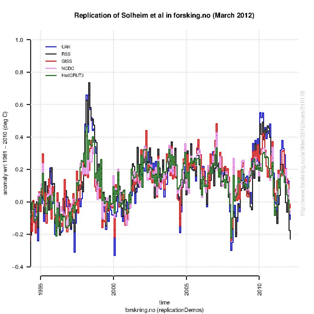
I’ve tried to reproduce the plot below (here is the R-script):

At least, many different global analyses were shown – not just the one which indicates weakest trends since year 2000. The data presented in this case included both surface analyses (GISTEMP, NCDC, and HadCRUT3) in addition to satellite products for the lower troposphere (Microwave Sounding Unit – MSU). The MSU data tend to describe more pronounced peaks associated with the El Nino Southern Oscillation.
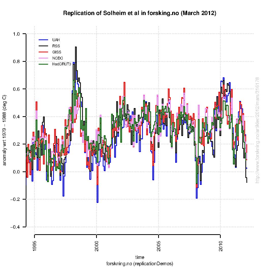
A comparison between the original version of this plot and my reproduction (based on the same data sources) is presented below (here is a link to a PDF-version). Note, my attempt is very close to the original version, but not identical.
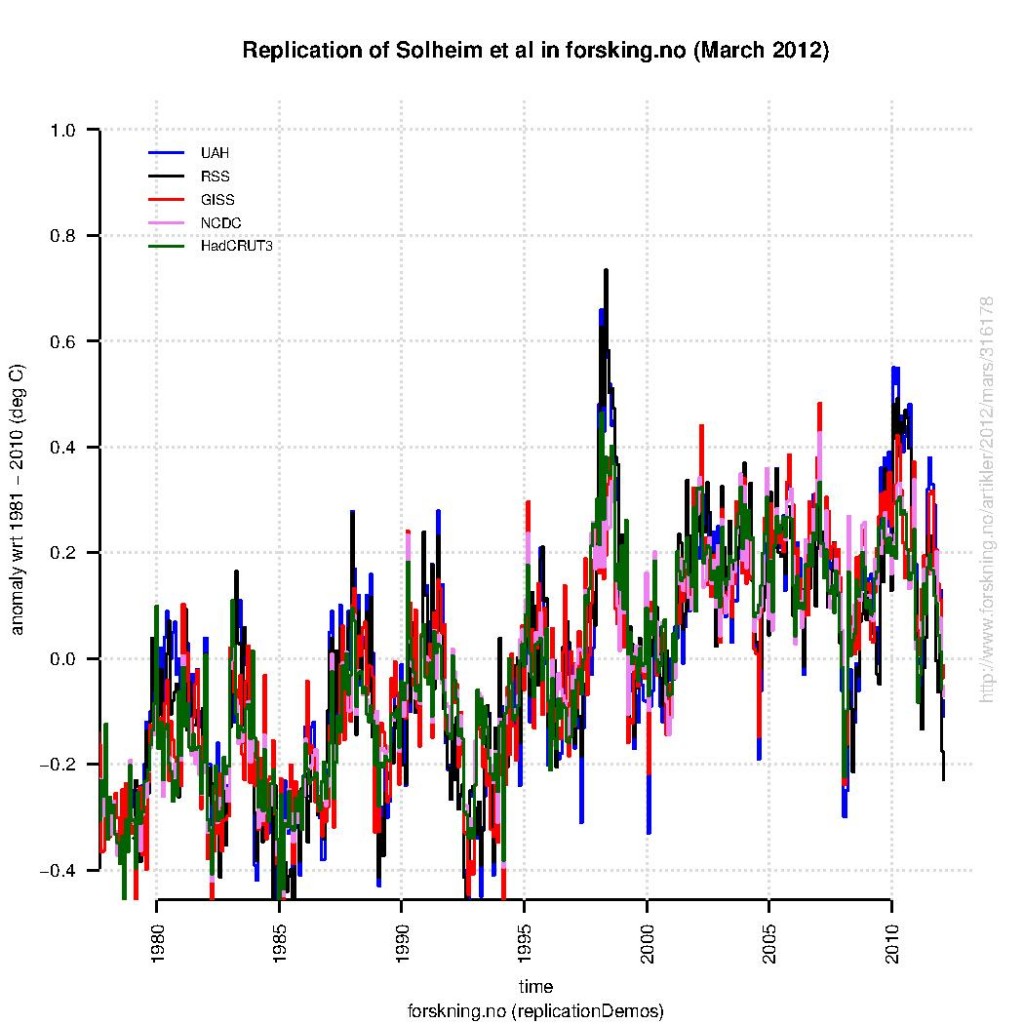
One should note that plotting the same data over the their entire length (e.g. from the starting date of the satellites in 1979) will make global warming trends more visible (see figure below). Hence, the curves must be cropped to give the impression that the global warming has disappeared.
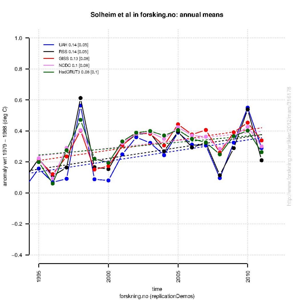
The real trick, however, is to show all the short-term variations. Hourly and daily values would be an over-kill, but showing monthly values works. Climate change involves time scales of many years, and hence if emphasis is given to much shorter time scales, the trends will drown in noisy variations. This can be seen if we show annual mean anomalies (as shown below for exactly the same data), rather than the monthly anomalies (again, done with the same R-script)
A linear trend fit to the annual mean anomalies the last 17 years suggest similar warming rates as reported by Grant Foster and Stefan Rahmstorf. These trends are derived from exactly the same data as those used in the original figure, that was used to argue that the global warming had stopped – by two professors and a statistician, the very same who performed curve-fitting and removed data not fitting their conclusion.
References
- G. Foster, and S. Rahmstorf, "Global temperature evolution 1979–2010", Environmental Research Letters, vol. 6, pp. 044022, 2011. http://dx.doi.org/10.1088/1748-9326/6/4/044022


90 Brian Dodge says, “Often what is loosely called “noise”is not only not normally distributed(thank you tamino), but is in fact an interfering signal from a known source. ”
Quite true. I’d even lose the “known”. As science advances, more and more “noise” will become “forcings” and “feedbacks”.
91 Tom said, “What happens over the next few years is going to be very interesting as to whether the growth snaps back or trends indicate a peak in global temps.”
If you ignore what Brian said along with the rest of the science, then such a conclusion could appeal, but if you reduce some of that “noise” by attributing it to ENSO, solar forcing, and volcanoes, you’d reach a completely different conclusion. Read about Foster and Rahmstorf 2011 (and related stuff) here:
https://www.realclimate.org/index.php/archives/2011/12/global-temperature-news/
and here
https://www.realclimate.org/index.php/archives/2012/02/2011-updates-to-model-data-comparisons/
92 Dan H said, “Agreed. I have done the same calculations, and arrived at the same conclusion.”
Dan, I’m quite certain that you know about F&R2011, and fairly confident you can understand the basic concepts behind it and are able to read the main graph. Thus, your comment puzzles me. It’s almost as if you’re being deliberately tunnel-visioned.
So, please explain your comment in light of F&R2011. Is it that their data is “inconvenient” and so should be discarded since this is a political issue for you, or do you have data or analysis which refutes them? (I’m assuming nobody could come to your conclusion while believing F&R2011 is worth more than fire starting material.)
Since you’ve done calculations, I’m sure everyone here would love to see them. Please provide a link.
Hank,
Tom’s comment concerns the CRU data. Calculating the 17-year trend yields a current value of 0.06C/decade, the lowest since the 17-year period 12/63-11/80. The period 2/78-1/05 is the next lowest interval, registering 0.1C/decade.
When using the GISS dataset, the previous two intervals are similar to the CRU data, but the most recent is higher, resulting in the ’78-’05 interval being lower than the present.
Using the RSS data, which Santer used in determining his 17-yr minimum time needed for a human global warming signal, the most recent 17-yr trend is the lowest in the entire data series.
Dan H
claims to cite the specific result discussed here:
http://www.skepticalscience.com/print.php?n=1005
Dan H
falsely claims that cite supports his broad general statement
asserting “a 17-yr minimum time needed for a global warming signal”
Dan H
his claim, in an animated GIF:
http://www.skepticalscience.com/pics/MSU_cherries.gif
Dan H, if you’re not getting paid for this, you’ve missed your calling.
Hank,
PLease explain the differences between these two statements:
1. “Using the RSS data, which Santer used in determining his 17-yr minimum time needed for a human global warming signal”
and
2. “Our results show that temperature records of at least 17 years in length are required for identifying human effects on global-mean tropospheric temperature.”
BTW, Thanks for the compliment.
Also, any comments on CRU showing the lowest 17-yr trend in almost three decades? or RSS showing the lowest 17-yr trend ever?
> 92 Dan H said, “Agreed. I have done the same calculations,
> and arrived at the same conclusion.”
Dan says Tom’s comment concerns CRU data;
Dan says “I have done the same calculations ….”
Dan talks about GISS, then RSS, and the fog thickens.
What calculations did you do that you are relying on for your statements?
A magical sequence to flesh out this thread. Dan H has helpfully stepped up, again, to demonstrate in real time how to misuse trend analysis to make one’s preferred point.
He argues from personal authority (rhetoric tool used in lieu of logic or substance), without citation or discussion of how he chose his data start and end points. He takes the “17-year minimum” notion as a standard fixed-dimension template, ignoring the implied: “more years would be better” qualifier. He fits that template to graphed data looking for fortuitous matches, and calculates slopes for the ones he really likes, out of a nearly infinite series of potential 17-year intervals.
He describes his results minimally, from authority as a couple numbers in the air, when a graph might be much more convincing. However, that graph might also look familiar to many, suggesting another version, The Escalator, which can be seen at Skeptical Science.
Do you suppose Dan has an animated version? I also wonder if he gets a stipend from our moderators when he does a really good job as straight man…
Since you mention in, here’s the Escalator for any neutral readers tending towards believing the insistent drumbeat of technical sounding language supporting erroneous conclusions:
http://www.skepticalscience.com/graphics.php?g=47
And while we’re doing simple and persuasive, this:
http://www.nasa.gov/topics/earth/features/2011-temps.html
captcha can be amazing: escapap
This is all good clean fun (if your tastes run toward teaching pigs to sing, in spite of the doubtful success and the annoyance for the pigs), but could we step back for a bit?
Everyone here knows, or should, that 10 years GT data is too short for climate conclusions, that 20 is barely enough, and that 30 is way better.
Stipulate a moment for the sake of argument that the 2010-19 average turns out about the same as 2000-09. (No volcano issue.) Or even that the next decade follows suit, so we have 30 years of flattish temps. Somewhere in there, we would need, as we haven’t so far (!), significant changes in mainstream climate science. There would be lots of shouting and political fallout. Embarrassment for many.
But would it be enough to convince anyone with sober judgment that (to pick a convenient benchmark opinion) Lindzen is about right? That AGW exists, a bit, but just isn’t a big deal? Not at all necessarily. Maybe by that time most of the field would be convinced that the 60-70-year quasi-kinda-periodic “cycle” was real, with some nice hypotheses about the underlying physics, and the coming decades would warm again. Maybe multi-decade variation is bigger than we thought, and sensitivity to CO2 doubling is on the low side, and we have longer to react than we fear today, but it wouldn’t put us out of the woods.
To get to the shoulder-shrugging, no-big-deal stage, we would need serious cooling and/or reasonable confidence that the 21st and subsequent centuries will warm at a rate *well lower* than the 20th. Six tenths of a K per century is less alarming than 2 or 3 K, but it is still enough to pose a challenge at the level of world civilization.
And, of course, to get to even the 2030 assumption, we had to posit 2 decades of temperature records drawn from Marc Morano’s dreams.
About 17 years trends, here is plotted all 17 year trends and 95% CI in
a) GISTEMP Land-ocean index
http://i42.tinypic.com/vpdt1f.jpg
b) RSS
http://i39.tinypic.com/10dbqbr.jpg
Trends are plotted versus starting time. So the data point for 1995.0833 is the trend for the 17 year period from january 1995 to January 2012.
Confidence intervals are corrected for autocorrelation in the same way as in Foster&Rahmstorf 2011.
My figure b agrees with Dan’s observation that for RSS the recent trend is the lowest – . Regarding GISTEMP and CRU I am confused about what periods he refers to, he writes 2/78-1/05. That is 27 years, not 17.
However, instead of arguing over how many years to calculate linear trends over, I would suggest another way to approach this.
Gavin Simpson suggests at his blog fitting a local model to the entire time series. That model can then be used to evaluate over which periods the time series show significant changes. Then there is no need to discuss when to start the analysis since all data is used from the time series discussed. However, the approach described only deals with annual data. Follow the link to se more detalis and plots.
@SRJ (Comment 109) Thanks for the mention.
The additive model approach I outline on my blog can easily be extended to monthly or daily data. The seasonal aspects of the data are modelled via a cyclic smoother on day-of-year or numeric month-of-year. The autocorrelation structure might need a bit more work to accommodate long and short term serial correlation in residuals. But the basic principles apply. I just didn’t get round to showing an example — the models take somewhat longer to fit as the number of data points increases. But perhaps I should?
If somebody was to redo The Escalator animation,
http://www.skepticalscience.com/graphics.php?g=47
– using a series of overlapping 17 year trends, it might be a good visual aid to show that specified time span is maybe a little better at prediction than the original sequence of shorter 6-8 year periods, but just as prone to cherry picking. It would be cool in animation, though, with the 17-yr lead point dancing around the long term trend line, dragging its streaming tail along behind in blurring definition of some weird confidence interval…not so much science, but fun to watch.
Looks like several folks here (@91 and @92) already did the math for a selected bunch of flat and downward segments, so someone would just have to add a balancing upward collection. Could be a collaborative effort!
(but would have to be some other of yall – recaptcha is “vacurry look”, which would describe my face after all that calculating…)
SRJ,
Thanks for the graph. Yes, I made an addition mistake on the previous post. The appropriate time frame should be 78-05. I agree that we should not become fixed on a particular length of time for temperature trends. Maybe this will put an end to the 17-yr interval made popular by the Santer paper.
I heartily endorse using the entire dataset, rather than picking and choosing over which time intervals we perform our analyses. This would be the only way to determine which inputs have resulted in which results.
“Using the [cherry flavored &;>) RSS data, which Santer used in determining his 17-yr minimum time needed for a human global warming signal, the most recent 17-yr trend is the lowest in the entire data series.” DanH
“Here we show that trends in MSU channel 2 temperatures are weak because the instrument partly records stratospheric temperatures whose large cooling trend offsets the contributions of tropospheric warming.” http://www.nature.com/nature/journal/v429/n6987/abs/nature02524.html
Using the UAH data, the slope for 1995-2012 is 0.013, almost identical to the HadCRUT trend of 0.012 since 1950.
It might be worthwhile to compare how UAH and RSS differ in their handling of channel crosstalk, and what the trends of the various levels are; is the lower trend of RSS tropospheric temperatures reflective of greater stratospheric cooling?
DanH – what you are doing is a sort of seat-of-the-pants Exploratory Data Analysis – which is OK, but is an incomplete way to understand science, especially something as complicated and comprehensive as climatology(there’s a reason most papers have multiple authors, and still have to pass peer review). You might find it useful and interesting to study a more formal way of approaching this – see http://www.itl.nist.gov/div898/handbook/eda/eda.htm
Note the following:
“Classical techniques serve as the probabilistic foundation of science and engineering; the most important characteristic of classical techniques is that they are rigorous, formal, and “objective”.
EDA [Exploratory Data Analysis] techniques do not share in that rigor or formality…EDA techniques are subjective and depend on interpretation….” http://www.itl.nist.gov/div898/handbook/eda/section1/eda124.htm
“In the real world, data analysts freely mix elements of all of the above three approaches[Classical, EDA, Bayesian] (and other approaches).” http://www.itl.nist.gov/div898/handbook/eda/section1/eda12.htm
But the final result has to be rigorous, formal, and objective.
these charts can be made more meaningful by incorporating the known short term effects of el nino and volcanos.
Brian,
The UAH data has shown greater warming recently than either the RSS or CRU data. The discussion was concerning the recent changes in temperature trends. Yes, the most recent 17-year UAH trend (0.012) is higher than RSS (0.04), it is the lowest since 1/81 -12/97.
It is quite likely that the lower RSS trend is due to greater stratospheric cooling. The UAH data is showing a decreased trend, similar to RSS in timing, but less in magnitude.
The difficulty in using particular year trend lines is that they are one dimensional. Any changes which occur over smaller intervals become lost in larger trendlines. It would be best to examine the overall appearance of the temperature data, rather than focus on linear trends.
Hank (#94), thanks for the tip on searching but I’ve never got anything from that site search for quite some time (just a blank results panel, not even a “zero results” message). However, as you confirmed that it had been covered before, I did a search on Google, adding the site parameter (site:realclimate.org) and found the reference. However, it was only covered in a brief news item, then referenced, even more briefly, in another article last month. Here is the news item https://www.realclimate.org/index.php/archives/2011/12/global-temperature-news/
https://www.realclimate.org/index.php/archives/2012/02/2011-updates-to-model-data-comparisons/ (site search for “foster and rahmstorf” finds that one )
scholar search for the DOI number finds
http://iopscience.iop.org/1748-9326/7/1/011002
Thanks, Hank. Still no results on my Firefox under Linux. However, your reply prompted me to try a little harder, so I installed the Chromium browser and, lo and behold, I got results.
Thanks, again.
Tony, yeah, searches are peculiar.
Speaking of data presentation, it’s always possible your search provider is ‘personalizing’ your results; erase the cache and browser cookies, sign out of ‘oogle, try duckduckgo, or search as you did by starting with a fresh browser that hasn’t accumulated any cookies.
The claim that the personalization will “improve” your browsing by giving you more of what you want to find really sucks when you’re looking for facts.
Compare just for example this:
https://duckduckgo.com/?q=which+browsers+personalize+results%3F
to this:
https://encrypted.google.com/search?q=which+browsers+personalize+results%3F
Yet another reason I trust a good librarian more than I trust myself.