And so it goes – another year, another annual data point. As has become a habit (2009, 2010), here is a brief overview and update of some of the most relevant model/data comparisons. We include the standard comparisons of surface temperatures, sea ice and ocean heat content to the AR4 and 1988 Hansen et al simulations.
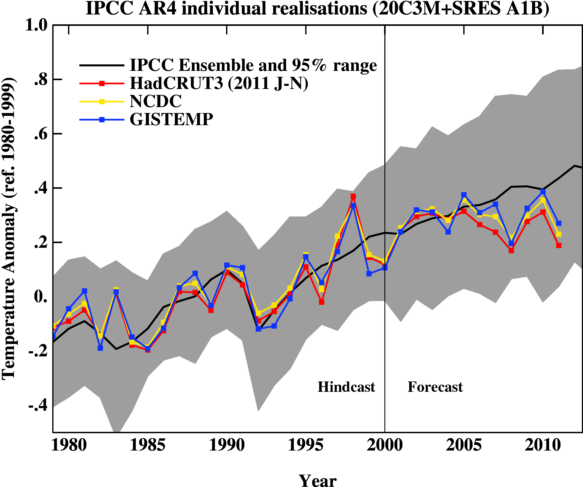
First, a graph showing the annual mean anomalies from the IPCC AR4 models plotted against the surface temperature records from the HadCRUT3v, NCDC and GISTEMP products (it really doesn’t matter which). Everything has been baselined to 1980-1999 (as in the 2007 IPCC report) and the envelope in grey encloses 95% of the model runs.

The La Niña event that emerged in 2011 definitely cooled the year a global sense relative to 2010, although there were extensive regional warm extremes. Differences between the observational records are mostly related to interpolations in the Arctic (but we will check back once the new HadCRUT4 data are released). Checking up on our predictions from last year, I forecast that 2011 would be cooler than 2010 (because of the emerging La Niña), but would still rank in the top 10. This was true looking at GISTEMP (2011 was #9), but not quite in HadCRUT3v (#12) or NCDC (#11). However, this was the warmest year that started off (DJF) with a La Niña (previous La Niña years by this index were 2008, 2001, 2000 and 1999 using a 5 month minimum for a specific event) in the GISTEMP record, and the second warmest (after 2001) in the HadCRUT3v and NCDC indices. Given current indications of only mild La Niña conditions, 2012 will likely be a warmer year than 2011, so again another top 10 year, but not a record breaker – that will have to wait until the next El Niño.
People sometimes claim that “no models” can match the short term trends seen in the data. This is not true. For instance, the range of trends in the models for 1998-2011 are [-0.07,0.49] ºC/dec, with MRI-CGCM (run5) the laggard in the pack, running colder than observations.
In interpreting this information, please note the following (repeated from previous years):
- Short term (15 years or less) trends in global temperature are not usefully predictable as a function of current forcings. This means you can’t use such short periods to ‘prove’ that global warming has or hasn’t stopped, or that we are really cooling despite this being the warmest decade in centuries.
- The AR4 model simulations were an ‘ensemble of opportunity’ and vary substantially among themselves with the forcings imposed, the magnitude of the internal variability and of course, the sensitivity. Thus while they do span a large range of possible situations, the average of these simulations is not ‘truth’.
- The model simulations use observed forcings up until 2000 (or 2003 in a couple of cases) and use a business-as-usual scenario subsequently (A1B). The models are not tuned to temperature trends pre-2000.
- Differences between the temperature anomaly products is related to: different selections of input data, different methods for assessing urban heating effects, and (most important) different methodologies for estimating temperatures in data-poor regions like the Arctic. GISTEMP assumes that the Arctic is warming as fast as the stations around the Arctic, while HadCRUT3v and NCDC assume the Arctic is warming as fast as the global mean. The former assumption is more in line with the sea ice results and independent measures from buoys and the reanalysis products.
- Model-data comparisons are best when the metric being compared is calculated the same way in both the models and data. In the comparisons here, that isn’t quite true (mainly related to spatial coverage), and so this adds a little extra structural uncertainty to any conclusions one might draw.
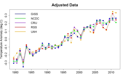
Foster and Rahmstorf (2011) showed nicely that if you account for some of the obvious factors affecting the global mean temperature (such as El Niños/La Niñas, volcanoes etc.) there is a strong and continuing trend upwards. An update to that analysis using the latest data is available here – and shows the same continuing trend:

There will soon be a few variations on these results. Notably, we are still awaiting the update of the HadCRUT (HadCRUT4) product to incorporate the new HadSST3 dataset and the upcoming CRUTEM4 data which incorporates more high latitude data (Jones et al, 2012). These two changes will impact the 1940s-1950s temperatures, the earliest parts of the record, the last decade, and will likely affect the annual rankings (and yes, I know that this is not particularly significant, but people seem to care).
Ocean Heat Content
Figure 2 is the comparison of the ocean heat content (OHC) changes in the models compared to the latest data from NODC. As before, I don’t have the post-2003 AR4 model output, so I have extrapolated the ensemble mean to 2012 (understanding that this is not ideal). New this year, are the OHC changes down to 2000m, as well as the usual top-700m record, which NODC has started to produce. For better comparisons, I have plotted the ocean model results from 0-750m and for the whole ocean. All curves are baselined to the period 1975-1989.
I’ve left off the data from the Lyman et al (2010) paper for clarity, but note that there is some structural uncertainty in the OHC observations. Similarly, different models have different changes, and the other GISS model from AR4 (GISS-EH) had slightly less heat uptake than the model shown here.

Update (May 2012): The figure has been corrected for an error in the model data scaling. The original image can still be seen here.
As can be seen the long term trends in the models match those in the data, but the short-term fluctuations are both noisy and imprecise [Update: with the correction in the graph, this is less accurate a description. The extrapolations of the ensemble give OHC changes to 2011 that range from slightly greater than the observations, to quite a bit larger]. As an aside, there are a number of comparisons floating around using only the post 2003 data to compare to the models. These are often baselined in such a way as to exaggerate the model data discrepancy (basically by picking a near-maximum and then drawing the linear trend in the models from that peak). This falls into the common trap of assuming that short term trends are predictive of long-term trends – they just aren’t (There is a nice explanation of the error here).
Summer sea ice changes
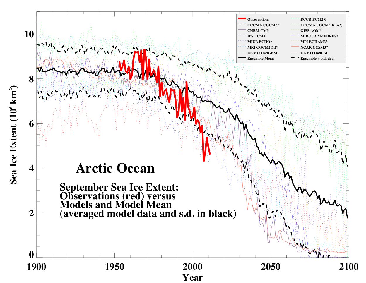
Sea ice changes this year were dramatic, with the Arctic September minimum reaching record (or near record) values (depending on the data product). Updating the Stroeve et al, 2007 analysis (courtesy of Marika Holland) using the NSIDC data we can see that the Arctic continues to melt faster than any of the AR4/CMIP3 models predicted.

This may not be true for the CMIP5 simulations – but we’ll have a specific post on that another time.
Hansen et al, 1988
Finally, we update the Hansen et al (1988) comparisons. Note that the old GISS model had a climate sensitivity that was a little higher (4.2ºC for a doubling of CO2) than the best estimate (~3ºC) and as stated in previous years, the actual forcings that occurred are not exactly the same as the different scenarios used. We noted in 2007, that Scenario B was running a little high compared with the forcings growth (by about 10%) using estimated forcings up to 2003 (Scenario A was significantly higher, and Scenario C was lower).

The trends for the period 1984 to 2011 (the 1984 date chosen because that is when these projections started), scenario B has a trend of 0.28+/-0.05ºC/dec (95% uncertainties, no correction for auto-correlation). For the GISTEMP and HadCRUT3, the trends are 0.18+/-0.05 and 0.17+/-0.04ºC/dec. For reference, the trends in the AR4 models for the same period have a range 0.21+/-0.16 ºC/dec (95%).
As we stated before, the Hansen et al ‘B’ projection is running warm compared to the real world (exactly how much warmer is unclear). As discussed in Hargreaves (2010), while this simulation was not perfect, it has shown skill in that it has out-performed any reasonable naive hypothesis that people put forward in 1988 (the most obvious being a forecast of no-change). However, the use of this comparison to refine estimates of climate sensitivity should be done cautiously, as the result is strongly dependent on the magnitude of the assumed forcing, which is itself uncertain. Recently there have been some updates to those forcings, and so my previous attempts need to be re-examined in the light of that data and the uncertainties (particular in the aerosol component). However, this is a complicated issue, and requires more space than I really have here to discuss, so look for this in an upcoming post.
Overall, given the latest set of data points, we can conclude (once again) that global warming continues.
References
- G. Foster, and S. Rahmstorf, "Global temperature evolution 1979–2010", Environmental Research Letters, vol. 6, pp. 044022, 2011. http://dx.doi.org/10.1088/1748-9326/6/4/044022
- P.D. Jones, D.H. Lister, T.J. Osborn, C. Harpham, M. Salmon, and C.P. Morice, "Hemispheric and large‐scale land‐surface air temperature variations: An extensive revision and an update to 2010", Journal of Geophysical Research: Atmospheres, vol. 117, 2012. http://dx.doi.org/10.1029/2011JD017139
- J.C. Hargreaves, "Skill and uncertainty in climate models", WIREs Climate Change, vol. 1, pp. 556-564, 2010. http://dx.doi.org/10.1002/wcc.58
Ken,
I agree that the ‘delayed Pinitubo rebound effect’ is rather bizarre. The effects of Chinese aerosols (indeed aerosols in general) are largely understood. I find Trenberth’s deep ocean theory without corresponding surface warming to rather bizarre also. Even scenario ‘C’ is running a little high, but closest to actual readings.
[Response: Did you read the Hansen et al paper? It isn’t that complicated and it isn’t bizarre. – gavin]
> Dan H
> … The effects of Chinese aerosols (indeed aerosols in
> general) are largely understood.
“The details of aerosol indirect effects are only partially understood, as most instruments cannot measure aerosols within clouds. Climatologists consider the role of clouds to be the largest single uncertainty in climate prediction.”
http://earthobservatory.nasa.gov/Features/Aerosols/page4.php
http://testing.turinghub.com/
It is also above Dan H’s payscale … just sayin’.
Hansen said in his 2011 paper that the flat energy imbalance of the past decade is largely due “to the fact that the growth rate of the GHG forcing stopped increasign about 1980 and then declined to a lower level about 1990.” His graph showed any Pinatubo effect ended almost 10 years ago, which is before his 6-year period of 2005-2010. He shows no Pinatubo contribution to present day measurements, and makes no mention of how the Pinatubo rebound effect could be delayed so long .
> Hansen says
12.4. p.26
“This rebound is most clearly defined after the Pinatubo eruption, being noticeable for more than a decade, because of the absence of other volcanoes in that period.”
Just curious .. what exactly does an “IPCC 95% range” in your first figure mean? I would expect that it would start from a zero at the beginning of a model run, but it is never less than 0.5 degrees (what degrees, please?). How come?
[Response: These are anomalies from the baseline of 1980-1999 (following the IPCC report convention), and the range is from calculating the mean and sd of the model anomalies and fitting a gaussian distribution, so that the 2.5% and 97.5% bounds can be estimated. The bulk of this range is related to weather noise, which is uncorrelated across models. Note that the models all started sometime in the 19th Century. – gavin]
I was wondering if you guys could also produce the model/observation figure for the A2 scenario. I had generated such a figure by digitizing the 17 A2 model runs from Fig 10.5 in AR4. One issue is that figure shows 3-year means so it’s hard to compare recent values. As A2 and A1B temp projections are pretty much the same at this period I wouldn’t expect the A2 model comparison to be any different. However, it would be useful to have such a figure as A2 is the scenario that Monckton always refers to.
[Response: Try climateexplorer.nl for all this and more… – gavin]
Thanks Gavin. For some reason, the A2 runs that I’ve looked at only begin in 2000 and so I can’t get the 1980-1999 baseline. It seems like it’s a no go there for using A2 scenarios. (unless I’m missing something)
Looking at the IPCC Ensemble vs observations we can see that 2011 was about 1.5 standard deviations below the ensemble mean. If it ever breaches the grey boundary in the future we will be more than 2sd below the mean which would be a bit of a concern for the models validity. Would it be possible to have an additional dark grey zone in the future showing the extremities of the model runs?
Apologies Gavin,
I’ve been told that the model ensemble forecasts aren’t a useful tool for verifying the CO2 driven AGW theory as they cannot be falsified. Just eyeballing the AR4 IPCC model ensemble graph above, the range of uncertainty is ~0.7C, which is near equivalent to the entire warming over the last 100yrs!
Very much a thought experiment I’m afraid, but if there was no further warming this century and taking the average temp since the turn of century, in what year could it be said that the theory had been falsified? If it is quick to do I’d be interested to know. Thanks.
[Response: Zero trend from 2000 will be outside the CMIP3 ensemble by ~2015. It would be longer (~2020) for the uncertainty bounds to no longer overlap. If that occurs it will indicate a model-obs mismatch – and that can be resolved in one of three ways: that the model projections are wrong, that the data is wrong, or that the comparison is inappropriate. Note too that the model projection error is a conflation of scenario error and model response error. Thus if such a thing comes to pass, understanding why would be complex. But let’s wait and see. – gavin]
@Gavin #110
That’s a straight forward answer to the question gavin. Much Appreciated!
;)