Confusion has continued regarding trends in global temperatures. The misconception ‘the global warming has stopped’ still lives on in some minds. We have already discussed why this argument is flawed. So why have we failed to convince ;-) ?
Una traduzione in italiano è disponibile qui.
The confused argument hinges on one data set – the HadCRUT 3V – which is only one of several estimates, and it is the global temperature record that exhibits the least change over the last decade. Other temperature analyses suggest greater change (warming). Thus, one could argue that the HadCRUT 3V represents the lower estimate, if a warming could be defined for such a short interval.
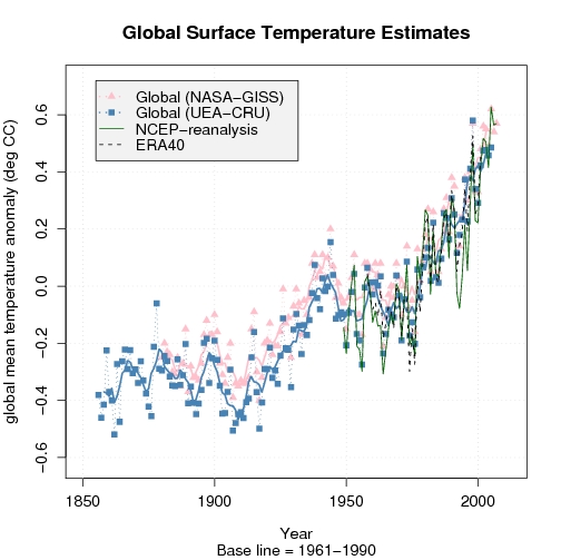
A comparison with other temperature analyses, such as the NASA/GISS (pink in the figure on the left), reveals differences. We can also compare with model-generated data (re-analyses), keeping in mind that one must be very careful with these data since they are not appropriate for studying long-term climate change (they give a misrepresentation of trends – at least on a local scale). Nevertheless, information from independent data suggest an increase in global mean temperatures even over the last decade.
All scientific questions involve some degree of uncertainties (error bars), and these can only be reduced if one can prove that they are influenced by an external factor (‘contamination’) or if some of the data are not representative for the study. Hence, if some of the data are incorrect, then it’s fair to exclude these to reduce the error bars. But this requires solid and convincing evidence of misrepresentation, and one cannot just pick the low values and claim that these describe the upper limit without proving that all the data with higher values are wrong. In other words, arguing that a lower limit is the upper bound is utter nonsense (even some who claim they are ‘statisticians’ have made this mistake!).
Another issue is that some of the data – i.e. the data from the Climate Research Unit (CRU) – have incomplete coverage, with large gaps in the Arctic where other data suggest the greatest increases in temperature. The figure below reveals the holes in the data knowledge. The figure compares the HadCRUT 3V data with the NCEP re-analysis.
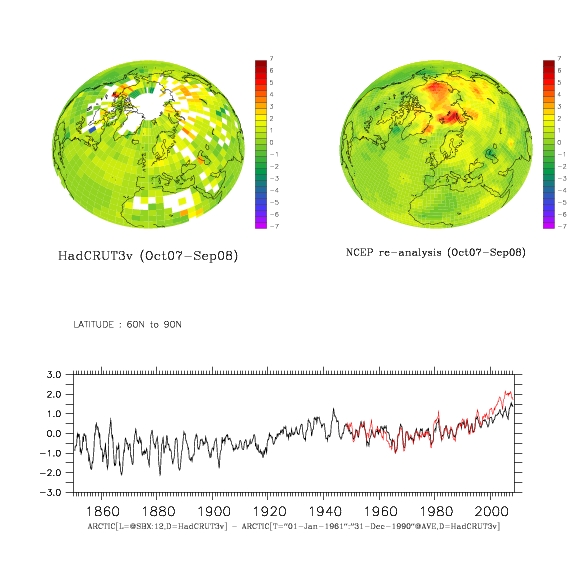
Figure caption: The difference between Oct. 2007 – Sep. 2008 temperature average and the 1961-1990 mean temperature for HadCRUT 3V (upper left) and NCEP re-analysis (upper right). Below is a comparison between the 12-month 60N-90N mean temperature evolution (red=NCEP, black = HadCRUT 3v)). (click on figures for PDF-version)
Re-analysis data are results from atmospheric models where observed data have been fed into the models and used to correct the simulation in order to try to get a best possible description of the real atmosphere. But it’s important to note that the NCEP re-analysis and other re-analyses (e.g. ERA40) are not regarded as being appropriate for trend studies due to changes in observational systems (new satellites coming in etc). Nevertheless, a comparison between the re-analyses and observations can highlight differences, which may suggest where to look for problems.

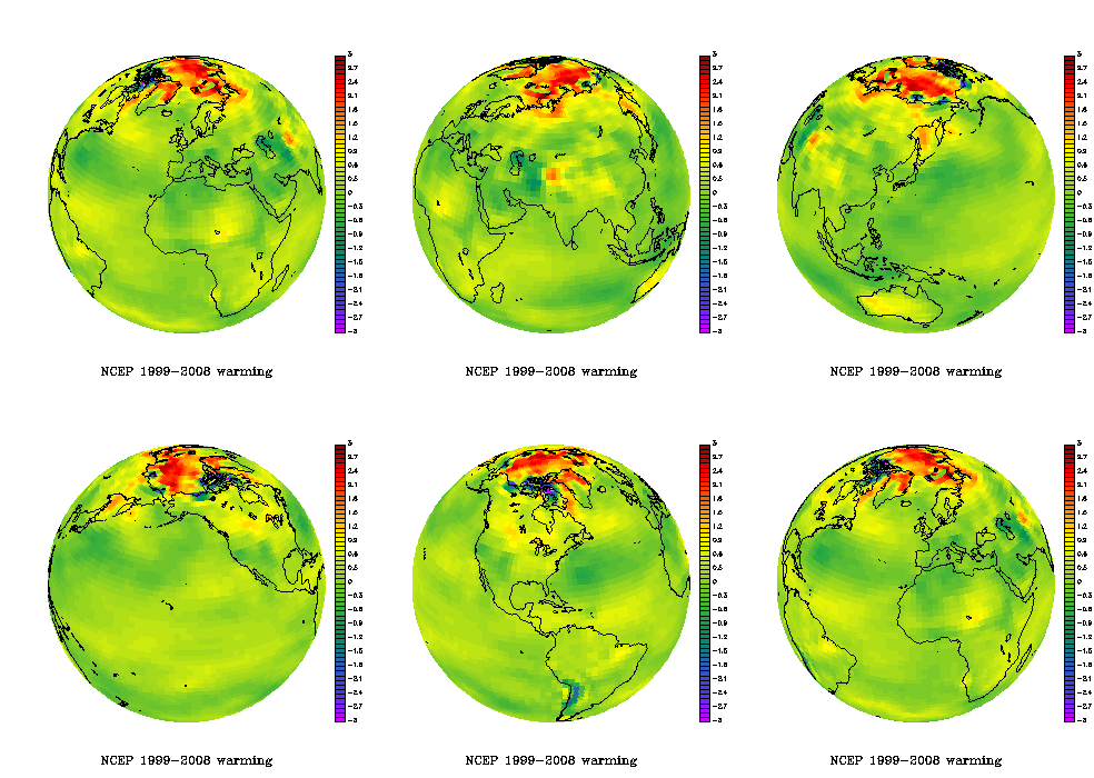
The animated figure shows the temperature difference between the two 5-year periods 1999-2003 and 2004-2008. Such results do not show the long-term trends, but it’s a fact that there have been high temperatures in the Arctic during the recent years.
The recent Arctic warming is visible in the animated plot on the right showing the NCEP re-analysis mean temperature difference between the periods 2004-2008 and 1999-2003.
The NOAA report card on the Arctic was based on the CRUTEM 3v data set (see figure below) which excludes temperatures over the ocean – thus showing an even less complete picture of the Arctic temperatures. The numbers I get suggest that more than 80% of the grid-boxes north of 60N contain missing values over the most recent decade.
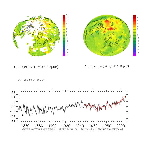
Figure caption: The difference between Nov. 2007 – Oct. 2008 temperature average and the 1961-1990 mean temperature for CRUTEM 3v (upper left) and NCEP re-analysis (upper right). Below is a comparison between the 12-month 60N-90N mean temperature evolution. (click on figures for PDF-version)
The funny thing, however, is that the last decade of the Arctic CRUTEM 3v temperatures are closer to the corresponding estimates from NCEP re-analysis than the more complete HadCRUT 3v data. This may be a coincidence. The re-analyses use additional data to fill in the voids – e.g. satellite measurements and predictions based on the laws of physics. Thus, the temperature in areas with no observations is in principle physically consistent with surrounding temperatures and the state of the atmosphere (circulation).
Below is a figure showing a similar comparison between HadCRUT 3v and GISTEMP (from NASA/GISS). The latter provides a more complete representation of the Arctic by taking spatial correlation into account through an extrapolating/interpolating in space. But GISTEMP does not really have a better empirical basis in the Arctic, but the effect from the extrapolation (the filling in of values where there is missing data) gives the recent high Arctic temperatures more weight.
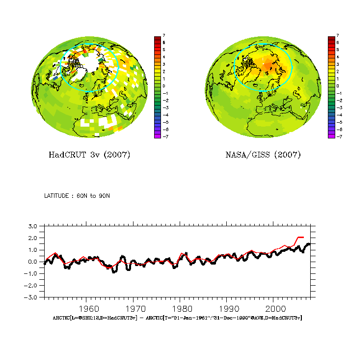
Figure caption: The 2007 mean temperature anomaly wrt to 1961-90: (upper left) HadCRUT 3V, (upper right) GISTEMP, and (lower) temperature evolution for the Arctic (red=GISTEMP, black = HadCRUT 3v).
A comparison between temperatures over the most recent available 30-year period (1978-2007) shows high temperatures over parts of Russia (Figure below – upper left panel), and the difference between the GISTEMP and HadCRUT 3v shows a good agreement apart from around the Arctic rim and in some maritime sectors (upper right panel). The time evolution of the Northern Hemisphere mean for the two data sets is shown in the lower panel, showing a good agreement over most of the record, but with slightly higher GISTEMP estimates over the last 10 years (the global mean was not shown because my computer didn’t have sufficient memory for the complete analysis, but the two data sets also show similar evolution in e.g. the IPCC AR4).
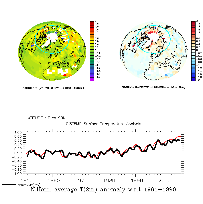
Figure caption: (upper left) HadCRUT 3V mean T(2m) anomaly over 1976-2005 (wrt to 1950-1980) ; (upper right) The GISS – HadCRUT 3V difference in mean T(2m) over 1976-2005; and (lower) the Northern Hemisphere mean temperature variations (red=GISTEMP, black=HadCRUT 3v).
Note, the low Arctic sea-ice extent over the last summers are independent evidence of high Arctic temperatures.
The insufficient observational coverage has also been noted by the IPCC AR4 and by Gillett et al. (Nature Geoscience, 2008), who argue that the observed warming in the Arctic and Antarctic are not consistent with internal climate variability and natural forcings alone, but are directly attributable to increased GHG levels.
They also suggested that the polar warming is likely to have discernable impacts on ecology and society (e.g.).
In their study, there are at least 15 grid boxes with valid data (usually representing one measurement) over 1900-2008 period. Furthermore, the only valid observations they used from the Northern Hemisphere were from the Arctic rim, as opposed to in the high Arctic itself. The situation is slightly better for the Antarctic (with one observation near the South Pole). Nevertheless, the title ‘Attribution of polar warming to human influence’ [my emphasis] is a bit misleading. Parts of the high-latitudes yes, polar no.
The attribution study was based on series of 5-yr-mean temperatures and spatial averages of 90 degree sectors (i.e. to four different sectors), where sectors and periods with no valid data were excluded.
There are some caveats with their study: The global climate models (GCMs) do not reproduce the 1930-1940 Arctic warm event very well, and the geographical differences in a limited number of grid-boxes in the observations and the GCMs may have been erased through taking the average value over the 90-degree sectors.
The 1930-1940 Arctic warming was probably not externally forced, but one could also argue that the models do not capture all of the internal variations because few reproduce similar features. Furthermore, the present GCMs have problems reproducing the Arctic sea-ice characteristics (which tends to be too extensive), ocean heat content, and fail to capture the ongoing decrease in Arctic sea-ice area. Most of these problems are seen in the gap with no CRUTEM 3v data, but there are also some uncertainties associated with the lack of data in the Polar regions.
The optimal fingerprint analysis hinges on the assumption that control simulations with the GCMs realistically reproduce the climate noise. I think that the GCMs do a good job for most of the planet, but independent work suggest local problems in the Arctic associated with a misrepresentation of the sea-ice extent. This may not have affected the analysis much, if the problem is limited to the high Arctic. Furthermore, the results suggested a one-to-one correspondence in trends between simulations and observations, but the analysis also gave a regression coefficient of 2-4 for natural forcings. The latter suggests to me that there may be some problems with the analysis or the GCMs.
Thus, this is probably not the final word on the matter. At least, I’m not convinced about the attribution yet. The whole boils down to insufficient amounts of empirical data (i.e. observations), GCM limitations at the high-latitudes, and too large data gaps. But the pronounced changes in the Arctic are consistent with AGW. The irony seems to be that the real world shows signs of more dramatic changes than the GCMs project, especially if you look at the sea-ice extent.
The lack of data in the polar region is a problem, and the ongoing International Polar Year (IPY) campaign is a huge concerted international effort to improve the data. Data is irreplaceable, regardless of the modelling capability, as science requires the theory to be tested against independent empirical data. The re-analyses provide a physically consistent description of the atmosphere – suggesting high temperatures in the Arctic – but we can only be sure about this when we actually have been there and made the real measurements (some can be done by satellites too)
A glimpse into the technical details
More technically, the complicated analysis involved a technique called ‘optimal fingerprinting‘ or ‘optimal detection’, looking for best signal in the noisy data and puts emphasis on regions where the GCMs give most realistic description of the climate variations. Basically, the optimal fingerprint techniques involved linear least-squares regression, which is familiar to many analysts.
The analysis of Gillett et al. involved ‘time-space’ orthogonal empirical functions (EOF) with truncation of 28 (and up to 78 modes for the Arctic, where the maximum truncation was the number of sectors multiplied with the number of 5-yr means – see supplementary material Fig. S3). These come into the equation through the estimation of the noise (covariance matrix), i.e. the internal variations and their magnitude. The clever thing is that they let each EOFs describe a set of 20 maps of 5-year-mean temperatures, thus representing both the spatial features as well as their chronology.
For the mathematically inclined, EOFs are similar to eigenvectors, and are mainly used to prepare data before further analysis. The purpose of using EOFs is often either to (i) compress the information or (ii) to make the data more ‘well-behaved’ (in mathematical terms: orthogonal). While one typically only use a few of the first EOFs, Gillett et al. experimented with just one up to the whole set because they took advantage of their orthogonal properties to allow the calculation of the inverse of the noise co-variance matrix. This is a neat mathematical trick. But this doesn’t help if the GCMs do not provide a good description of the internal variations.
For some reason I was expecting this article to tie in some way to the London Underground. “Mind the gap!” :P
Gee, Matti, and why did you pick 1998 as your starting point. Could it be that you were cherrypicking the biggest El Nino in recent memory?
Simon Abingdon,
Re 30 years for climate:
“The World Meteorological Organization (WMO) requires the calculation of averages for consecutive periods of 30 years, with the latest covering the 1961-1990 period. However, many WMO members, including the UK, update their averages at the completion of each decade. Thirty years was chosen as a period long enough to eliminate year-to-year variations.”–Met Office website
There’s also the IPCC and lots of others–it is a generally accepted period for long-term climatic trends to emerge with confidence from noise. Of course, you can observe “trends,” on shorter timescales, it’s just that they will not emerge as statistically significant.
Also, look up ad hominem:
http://en.wikipedia.org/wiki/Ad_hominem
My suggestion was motivated by the fact that this is a site about CLIMATE SCIENCE, and you’ve exhibited no interest in either climate or science.
RE #8, Hi Danny. I’ll be giving a presentation on “food rights and climate change” at my university’s International Week tomorrow. You’ve got a case! More later….
Hank Roberts, I do not need to look it up; I was referring to physical chemistry; the why and quantitative analysis of things; what you are referring to is not Pchem. I took and teach Pchem, I understand PH and ocean chemistry; I was inquiring about the five postulates of quantum mechanics and so forth that must be known the first day of class. Pchem assists in virtually everything, but carbonate chemistry is not Pchem, atleast not in the way you mean or are referencing.
> rapid climate change
It’s real, it’s studied, you’ll recognize the names on the site.
http://www.noc.soton.ac.uk/rapid/kt/kt_sov_past.php
This does not help those who want to claim warming has stopped. The changes discussed are rearrangements of the climate system under past natural conditions — unlike the present rapid change due to adding CO2.
__________________
ReCaptcha’s words provided for this posting are:
for Alistair
The oracle is becoming positively sentimental.
Re: #53
Yes 30 years probably is a reasonable minimum time to ensure the trend is not affected by short-term variations, but it doesn’t guarantee that longer term variation isn’t present. For example there is pretty good evidence that there was a climate shift in the pacific just about – 30 years ago! Now I’ve heard some argue that this would simply cause a short term warming then a plateau – but, even if true, this would still create a trend. Do a LSQ fit on the data {0, 0, 0, 1, 1, 1} and it will produce a rising trend even though the last 3 values are the same. For that reason it’s still worth looking at more recent short term trends.
Alaska is probably most vulnerable to changes in the Pacific. These are the temperature records from Fairbanks, Nome and Anchorage respectively.
http://data.giss.nasa.gov/cgi-bin/gistemp/gistemp_station.py?id=425702610000&data_set=1&num_neighbors=1
http://data.giss.nasa.gov/cgi-bin/gistemp/gistemp_station.py?id=425702000000&data_set=1&num_neighbors=1
http://data.giss.nasa.gov/cgi-bin/gistemp/gistemp_station.py?id=425702730000&data_set=1&num_neighbors=1
It’s possible to detect what is virtually a step function around the late 1970s in the data. Then from ~1980 onwards – very little change. Is this CO2 warming? Calculate the linear trend since 1975, say, and you’re sure to find a strong warming trend but I’m not sure it accurately reflects what’s really happening.
John Finn, the “step function” is actually coincident with the imposition of pollution controls in industrialized countries that significantly reduced aerosols. This is well known.
Excellent article and I must admit I do love the graphics as well.
But I find it kind of amusing “delving for a strong signal” from “measurements” when the the signal from the biosphere could not be clearer.
“Ah yup thar used to be jest shrubs along that crick where the 20′ trees are..;-) THAT’s a strong signal in my view when it’s pretty much enveloping the entire mid northern biosphere – land and water.
http://www.sciam.com/article.cfm?id=blowing-in-the-wind-arctic-plants-move-fast-as-climate-changes
http://www.sciencedaily.com/releases/2008/08/080808182238.htm
The measurements can certainly quantify the scale and speed of change as an over all average but surely the biological response is undeniable….and dramatic.
Seems to me we moved away from the observation of actual change in the biosphere to debating numbers that fundamentally only are support for the observations of actual change in the biota.
I’m sort of throwing this out for the benefit of those indicating the “case is not closed for warming”…..I do observe it IS a reality for those plants, critters and even ocean dwellers directly impacted.
Our satellites and stations only quantify what the biota respond to so robustly.
That’s the clear signal right across the northern hemisphere.
Ref 20, 12
Barton Paul Levenson Says:
Try here:
http://cdiac.ornl.gov/trends/co2/lawdome.html
Already been there, but it does not give CO2equivalent. Is there this data?
#35–So, is the difference between “warmer” and “warming” one of your FACTS, Simon?
If so, the bearing this startling FACT has on temperature trends is not very clear. Does a “decadal mean” imply “warming” if one decade is “warmer” than the preceeding one?
And your admonition that “trends change” is almost as gnomic as Captcha can be. Just what are you trying to say?
(This time, Captcha says, “Signora paper.”)
And yet John, the warming trend seems to be even larger than modeled and predicted in the past; also the warming has been looked at and calculated even prior to the last 30 year span with amazing accuracy. It is the proxy data from 10,000 years ago and so forth that is more subject to conservative views or even skepticism. Indeed more empirical data is needed in the Artic, however, most of what is seen reveals a warming trend in addition to what the sattelites show and the models indicate. Granted technology and data collection in the last 30 years is far more advanced than previously, but then again, the data for: 1998, 2005 and 2007 is well intact. Still, the models need more tweaking, the math is solid as are most of the physics considerations, however, dynamic equilibrium changes can throw off models in either direction: underestimating or overestimation, so, more data collection to be sure; the more recent short term trends are important to be sure, especially in light of certain errors that were made and to find out the extent of cooling, essentially in the ‘here and now,’ but I suspect that warming trends will be found, on the rise when more data is compiled and input. Precipitation effects that may cool parts of the Artic are short term as are aerosol trends that contribute. The pitfall may be analyzing too short term and getting a false impression from very isolated trends, this remains to be seen.
The reconciling of localized cooling trends, especially in cold regions, with overall warming trends; here is a challenge to explain to the majority of people, how the attributions are done, in a way that they can have a glimpse of the trends.
> Alaska
Don’t you see the same pattern at more than those three stations? It might be important not to assume they indicate a change in the Pacific Ocean without checking the rest of the world.
I recall one correlation around “the late 1970s in the data” — the final effective date for changes under the Clean Air Act, in 1977. Sulfate dropped very fast thereafter. This was before China and India ramped up coal use obviously.
http://www.tva.gov/environment/reports/envreports/04update/images/emissions.gif
http://science.nefferport.com/image002.png
“… the Clean Air Act Amendments of 1977, … , coincidentally, began the start of global temperature increase.”
______________
reCaptcha: attend Roman
Here may be one of the reasons for the large number of deniers:
Reference: “Google and the myth of universal knowledge” by Jean-Noel Jeanneney 2007 The original is in French.
When you do a Google search, you get “sponsored” links on the right side and “non-sponsored” links on the left. The “NON-SPONSORED” links on Google ARE LISTED IN THE ORDER OF THE HIGHEST BIDDER to lowest bidder. Companies pay dollars to Google to get web sites other than their own that lie in favor of the paying company to be at the top of the “non-sponsored” list. Google search results in your getting nothing but corporate propaganda. Since the coal industry has a $100 Billion per year income at stake, they can and must share a lot of money with Google.
Page 32: 62% of internet users questioned make no distinction whatever between advertising and other information, and only 18% proved capable of telling which data were paid for by companies for their promotion and which were not.”
“92% of users of search engines have full confidence in the results of their search, and 71% (users for less than five years) consider that information from this source [Google] is never biased in any way.”
Suggestion: Use only Google Advanced or Google Scholar. On Google Advanced, specify either the .gov domain or the .edu domain. Otherwise, use only web sites that RealClimate uses.
There should be a law requiring Google to disclose the above and the donors and the dollars for each “non-sponsored” link.
Ray #41 “trends do not change–at least they don’t change as rapidly as the noise” You baffled me by suggesting that changes in “the noise” would somehow outrun changes in the trend. Perhaps you just meant that underlying trends are masked by the noise.
Nice irony in the last two paragraphs of your #53.
The data set (NCEP 1999-2000 warming) shows something very interesting.
Next to the the warming of the artic ocean (red) is a island of cooling (blue).
Looks like Northern Baffin Island. There’s also a string of spots along the artic circle.
Like the Alaska/Yukon coast and 2 spots along the coast of Northern Siberia.
Either the data is wrong, or the general circulation models must show this.
There is something going on with the climate that is producing intense local cooling
right next to all the warming.
Wish I could explain this better!
If somebody wishes, I’ll try.
Edward, non-sponsored links are listed by the highest bidder ? Really ? I just tried “Climate science” – the top link is real climate. I wonder what the realclimate budget is for paying off Google.
[Response: Just to be clear – we don’t pay Google anything. – gavin]
Ray #52, the thing about picking 1998 as a comparison for subsequent temperatures is that 1998 (and 1990s) was bandied about quite a bit as the warmest year (and decade) for centuries, to drive home the reality of global warming. As a media message this was rarely accompanied by caveats about annual/decadal trends, or explanations that the next decade might warm less impressively and still be consistent with AGW.
It seems to me that these kinds of statements to some extent prepared the ground for present denialist gloating. Is there any practically useful lesson in this for communicating the science?
Re: #58
John Finn, the “step function” is actually coincident with the imposition of pollution controls in industrialized countries that significantly reduced aerosols. This is well known.
I’ll tell you what is “well known”, Ray. It’s the fact that any effect aerosols may have on climate is very specific to the region of their source. In other words the industrialised nations should have experienced the greatest warming due to any reduction in aerosols. They didn’t. Aerosols are very short-lived in the atmosphere (10 days max) so there is little chance of dispersal. The largest warming trend since ~1975 is found in the extreme northerly latitudes i.e. the Arctic regions where there is virtually no industrialisation. The reduction in aerosols had very little effect on climate warming.
Those in the know, and I include contributors to this site, are by and large of the opinion that the impact of aerosols is complicated.
But think about it, Ray. Think about the geography of Alaska. Which factor is most likely to effect it’s climate – reductions in aerosols in the USA and Western Europe or a significant warming of the Pacific ocean at exactly the right time (See PDO index).
[Response: Aerosols are complicated – but your simplistic statement that the aerosol effect is specific to their source is not true. Impacts of aerosols spread much further than that (at least hemispheric) and can also have odd effects in the Arctic. You can look at the results of model simulations with aerosol only forcing on the GISS website. – gavin]
Rod (29), you are right, it is not obvious. The atmospheric circulation system has a strong chaotic component, but nevertheless shows some distinct patterns due to external forcing. The most important forcings are the uneven latitudinal distribution of incoming radiation and the rotation of the earth (coriolis force). The former drives a circulation to equalize the latitudinal temperature gradient. The latter inhibits a straight-lined north-south circulation system (note: a different rotation speed of the Earth would produce different circulation systems). The strenght of the coriolis force (or rotation speed respectively) leads to a more or less clear partition of the warm air mass at low latitudes and the cold air mass at high latitudes, where the polar front marks the separating zone (the strong westerly winds within the polar front are due to the strong temperature and pressure gradients). Neither the existance of such a pattern nor the response to changing gradients are self-evident, because the system is too complex. However, taking the picture of a cold and a warm air mass, separated by kind of a flexible wall, it seems plausible that if the cold air mass warms, it will take less room and contract. This is not the only thing that can be imagined to happen physically, but it’s what is observed in reality and in models. Each summer, when the gradient is low and polar air masses warm, the polar front moves poleward. And this is also what climate models project for a stronger warming on the long-term. Thus, it seems very likely that this pattern is what we have to expect in case of a decreasing pole-equator gradient. Does this help?
Mary writes:
Which portions of the globe weren’t covered? In 1880, the sun never set on the British Empire, the American frontier was on the verge of being closed, and Latin America, Africa, and Asia all had their temperature stations. I’m sure the coverage wasn’t as comprehensive as now, but that doesn’t mean they didn’t have enough to find a fairly reliable mean.
I’ve been watching the monthly NOAA temperature maps here: http://www.ncdc.noaa.gov/oa/climate/research/2008/oct/global.html
They seem an authoritative statement of rising temperatures, particularly in the Arctic.
The material here seems to cast doubt on the simple way I’ve been reading them. Can I ask again, “How do they relate to this discussion?”
Here’s a purely subjective opinion on erratic time series; don’t trust any extrapolation of recent values. Because petrol prices have just gone down people aren’t rushing out to buy V8s. While the Australian winter and spring have been decidedly cool the preceding autumn was exceedingly warm. Recall that Adelaide had 13 straight days of 37.8C (100F) or higher in March 2008. I kind of expect another heat wave this southern summer. Thus I’d describe recent annual temperature patterns as neither up nor down but distinctly weird.
The main reason for “the large number of deniers” is the fossil fuel lobby’s public relations budget over the past 30 years. Just as with tobacco and cancer, the industry has spent millions funding dishonest “scientific think tanks” to muddy the water by any means available – whether it be pressuring NASA to not launch their Triana/DSCOVR satellite, pressuring the DOE to only fund fossil fuel research, pressuring the press to give positive spin to any fossil fuel related story, lobbying members of Congress (such as John Dingell) to prevent any real reduction in fossil fuel use – that’s what hundreds of millions of dollars a year buys you. It’s hardly due to Google’s search ranking system.
Oceanic temperature trends show that the oceans have been warming for decades now. See Levitus et al 2000, Warming of the world ocean”:
In the 1990s alone, the energy imbalance in ocean heat storage and top-of-atmosphere radiative budget were similar, ~1.5 W/m^2. Of course, with direct continuous measurements from Triana’s Lagrange position, there wouldn’t be any question. That’s the real reason that politicians in the pay of the fossil fuel lobby intervened and made sure that Triana wasn’t launched.
Take this quote by “Mary”, in the comments above: “If you cannot say with certainty what the 1880 temperature was then how can you say with certainty that 2008 is warmer in comparison?”
That’s an example of why the fossil fuel lobby has an ongoing effort to NOT collect data – so that they can continue to make the very same argument. Thus, NASA spends billions on an international space station of very questionable usefulness that seems mostly intended to serve some kind of promotional role for the space program, as does the “return to the moon” agenda – and yet they can’t come up with $100 million to launch a satellite that was already built?
It’s political interference in science by fossil fuel interests who don’t want to see the data. It’s been covered extensively, even if the print press in the U.S. will barely touch it, and the main theme is the recruitment of scientists who are willing to repeat the talking points, or who even believe them:
http://www.desmogblog.com/climate-scientists-shred-hurricane-skeptic-grays-citing-of-inhofe-crichton
http://www.guardian.co.uk/world/2008/sep/30/uselections2008.sarahpalin1
However, such efforts are less and less believable, as more predictions made by climate models come true – for example, the water vapor increase predicted by models has now been measured in detail:
http://www.sciencedaily.com/releases/2008/11/081117193013.htm
“Water vapor confirmed as major player in climate.”
Simon Abingdon, Perhaps you would care to show me where I am wrong in my characterization of you–that is where you have expressed any interest in learning about or understanding climate science. All I’ve seen you do is make reference to very short time series (
Kevin #61 You question the difference between “warmer” and “warming” and describe as gnomic the phrase “trends change”. We’re worlds apart.
Ray, would the imposition of aerosol (sulfur stuff) controls make a precipitous change and almost immediately spread itself around the globe? I recall there being a concern (don’t know if it was realized or not) if stopping sulfur emissions in one state would have much of an imminent effect a on states a couple of states removed, let alone interior Alaska.
MacDoc (59) seriously puts forth arguments that I throw out cynically and derisively. One of us has to be wrong. I contend the 20 trees replacing the shrubs along the crick (or any other local phenomena) is no indication of global warming, let alone anything near a proof.
Re Andrw @67; “There’s also a string of spots along the artic circle. Like the Alaska/Yukon coast and 2 spots along the coast of Northern Siberia.”
On the coastal cool spots, there has been much discussion recently of increased freshwater river flow into the Arctic basin due to rapid spring melt of deeper snow packs. (Due to increased precipitation, due to overall milder winter temps, i.e. another feedback.)
The deniers will probably jump on this – “Water Vapor Confirmed As Major Player In Climate Change,” from ScienceDaily; saw it at: http://www.climateark.org/shared/reader/welcome.aspx?linkid=110791
And we know how they’ll interpret it (even though it says the study’s empirical evidence basically confirms the models, and nothing new).
But I just thought of an argument I never used against the “water vapor is the biggest greenhouse gas” crew. And that would be:
Most people don’t understand search engine result presentation
nor how the various search engines differ in what they do and don’t sell. (Most people don’t use Firefox, AdBlock, NoScript, RefControl, etc.; I’m always astonished by what most people accept.)
One study from Pew is referenced here:
http://www.linksandlaw.com/news-update27-searchers-feel.htm
“84% of online American adults have used search engines….
Most [62%]… unaware of the distinction between paid and unpaid results: … . Among the 38% … who are aware …, some 47% … say they can always tell which …[So] one in six internet searchers can consistently distinguish between paid and unpaid search results.”
Updates for that website: http://www.linksandlaw.com/newsarchive.htm
Similar numbers here, albeit buried in an article that is fairly uncritical: “Consumers Union, 60 percent of Internet users interviewed did not know that search sites take fees to list some Web sites more prominently than others …”
http://pcworld.about.com/magazine/2007p115id97431.htm
______________________________
“fiscal Lieut” says ReCaptcha. Well as long as ReCaptcha doesn’t start presenting advertising words …. uh, oh …..
I had wanted to ask one question at a time but here’s the one that really worries me. Are there ANY global climate models (GCMs) that incorporate the methane feedbacks. These are being reported:
Methane bubbles climate trouble (http://news.bbc.co.uk/1/hi/sci/tech/5321046.stm)
Arctic ‘methane chimneys’ raise fears of runaway climate change (http://www.guardian.co.uk/environment/2008/sep/23/climatechange.scienceofclimatechange1)
Hundreds of methane ‘plumes’ discovered (http://www.independent.co.uk/news/science/hundreds-of-methane-plumes-discovered-941456.html)
I have been told these are missing from the “Earth Systems Models” (GCMs) from the Hadley Centre. Weren’t these an important part of IPCC AR4?
How much should we worry?
PS, I agree something on search tools is worth having in a FAQ.
I’ve never liked the results from the dedicated search link at the top of the RC page, either internal or custom Google option, compared to writing my own careful searches in ordinary Google or, preferably, Scholar, then searching within those results.
(Gavin, if a ‘search within results’ choice could be added within the site search, and if site searches could ignore the sidebar text on the “page” in favor of only the specific topic’s thread, that’d help; dunno if Google’s custom search has any support for improvement.)
Re 52. Two reasons for posting that graph: It shows the temp anomaly for the past ten years (most people use the decimal system). And secondly, it is not my work, but from Nasa GISS, which is one authority on these issues. And yes, it shows no significant warming.
I know it is a small thing but is there any reason your globe is rotating in the wrong direction?
Thanks for a very informative site and article.
ooh pretty graphics!
i’m not just being girly, it makes it easier to get other, non scientist folk interested in your site ;-)
thanks.
Edward, non-sponsored links are listed by the highest bidder ? Really ? I just tried “Climate science” – the top link is real climate. I wonder what the realclimate budget is for paying off Google.
[Response: Just to be clear – we don’t pay Google anything. – gavin]
So, who does pay then?
[Response: For what? Our google ranking is because a lot of people link to us. That’s how it works. – gavin]
Regarding the water vapour study linked to by Lynn in #81
The same researchers published a study a few years ago which said there was much less water vapour response than expected.
http://www.sciencedaily.com/releases/2004/03/040316073820.htm
Obviously, we need to nail this down better.
[Response: The studies are of two different things. The new one is the overall water vapour feedback (which is the real practical issue), while the first was for a specific layer in the upper troposphere where they found that wate vapour was increasing in any case (just not enough to keep relative humidity constant). Both papers show positive water vapour feedbacks.- gavin]
Ray #76 “All I’ve seen you do is make reference to very short time series” “show me where I am wrong in my characterization of you”
Paucity of evidence perhaps?
John Finn, look at the patterns of acid rain to disprove the notion that aerosol effects are “very specific to the region of their source” — you’re thinking of open burning or primitive plants with low stack velocities (like those in China and India when they industrialized). The Clean Air Act 1977 compliance led to much taller stacks and higher stack velocities so the output went far higher and was spread wider.
#77–Simon, I’m not questioning the difference between “warming” and “warmer.” Everybody knows that!
But what do you mean by it in your response, and what do you mean by “trends change?” There was nowhere near enough context to tell.
You asked why some people think that the FACTS (as you put it) support AGW. I gave what I fondly imagined to be a helpful reply, to which you brought up this weirdness about “-ing” vs. “-est.”
Now you say we are worlds apart. I must say, I’m rather inclined to agree. But if you would care to explain your point further, I would be interested.
Re #80
Jim; I can appreciate that there is a lot more fresh
water flowing into the arctic ocean. But as far as
I know, that does not explain how there could be the
large region of cooling temperatures in the arctic.
That the NCEP dataset shows this cooling, suggest to me
that either the data is wrong, or that there is an
aspect of the climate response that a good GCM should
be able to discern.
The cooling appears most pronounced near the north end
of Baffin Island and extends towards the Alaska coast.
There are also a few cooling locations near siberia, but
these could be flukes.
What I suspect is happening is that the polar jet stream
is growing stronger and is pushing the coldest air from the
geographic north pole southward towards Canada.
Would hope that most CGMs are detecting that. If not, then
either they need serious help or the data set is in error.
You folks will definitely want to check this out. Note Russian grammar habit in the abstract. I pulled it from sci.physics etc. and don’t have a direct link yet:
Energy Sources, Part A, 30:1-9, 2008
Cooling of Atmosphere Due to CO2 Emission
G. V. CHILINGAR,1 L. F. KHILYUK,1, and O. G. SOROKHTIN2
1Rudolf W. Gunnerman Energy and Environment Laboratory, University of Southern California, Los Angeles, California, USA
2Institute of Oceanology of Russian Academy of Sciences, Moscow, Russia
Address correspondence to George Chilingar, Russian Academy of Natural Sciences, USA Branch, 101 S. Windsor Blvd., Los Angeles, California 90004.
E-mail: gchiling at usc dot edu
Abstract
The writers investigated the effect of CO2 emission on the temperature of atmosphere. Computations based on the adiabatic theory of greenhouse effect show that increasing CO2 concentration in the atmosphere results in cooling rather than warming of the Earth’s atmosphere.
[Response: These guys are hilarious. Check out their model of the greenhouse effect which doesn’t take radiation into account. Citation of this (or of any of their other papers) is prima facie evidence that someone is talking out of their a*. – gavin]
Re #87: Did you compare the numbers in the two studies? I very much doubt that there’s a conflict.
Gavin,
. Citation of this (or of any of their other papers) is prima facie evidence that someone is talking out of their a*. – gavin]
Wow! Why not the advice, as so often happens here to publish some peer reviewed science that rebuts their arguments?
[Response: Not every argument can be taken seriously. Chilingar and Khilyuk are on a par with claiming the moon is made of green cheese. Where’s the peer reviewed rebuttal of that? – gavin]
In regard to the rotating globe graphic, how were the two five year periods picked to generate it?
If we look at this graphic,
http://en.wikipedia.org/wiki/Image:Amo_timeseries_1856-present.svg
It seems that the “warm” time period is a particularly strong upswing in the Atlantic Multidecadal Oscillation which some suspect exaggerates the effects of human induced warming.
RE #4, PHE: “The observation that temperatures have not been rising since 1998 is generally raised as a ‘tongue-in-cheek’ comment. Its not seriously presented as proof that AGW is not real. Its more to teasingly counter the continual selective use of data to ‘prove’ that AGW is certain. Hansen had only about 10 years of a rising trend when he first (most publicly) declared AGW is a big threat.”
Decent people don’t do ‘tongue-in-cheek’ comments about a possible false positive (AGW is not happening, tho scientists say it is), when the harms from a false negative (saying AGW is not happening & failling to mitigate it when in fact it is happening) are so very grave, and when a false positive would only hurt scientific reputations, but actually help our pocketbooks and the economy greatly thru energy/resource conservation/efficiency (& solve a host of other real problems as well). Hansen did right. I only wish people had been on this problem well before the late 80s. We would have done very well to continue Amory Lovins’s soft energy path (see http://www.rmi.org & http://www.natcap.org ) from the 70s on when we had our 1st oil shortage shock. Then by 1990 most houses would have had solar panels and geothermal, and we would have been driving electric cars powered by alt energy….
There was a series of similar articles Chilingar published in Environmental Geology a few years ago. Someone else published a comment in Env. Geol. that if the journal kept publishing his papers on this topic, it would become bring down the journal’s reputation. It was an amusing exchange.
Re the abstract quoted in # 94
“Computations based on the adiabatic theory of greenhouse effect show that increasing CO2 concentration in the atmosphere results in cooling rather than warming of the Earth’s atmosphere.”
If so, then Venus ought to be a ball of ice!