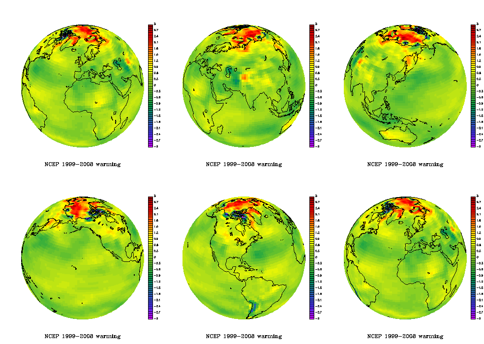
Confusion has continued regarding trends in global temperatures. The misconception ’the global warming has stopped’ still lives on in some minds. We have already discussed why this argument is flawed. So why have we failed to convince ;-) ?
Una traduzione in italiano è disponibile qui.
The confused argument hinges on one data set – the HadCRUT 3V – which is only one of several estimates, and it is the global temperature record that exhibits the least change over the last decade. Other temperature analyses suggest greater change (warming). Thus, one could argue that the HadCRUT 3V represents the lower estimate, if a warming could be defined for such a short interval.
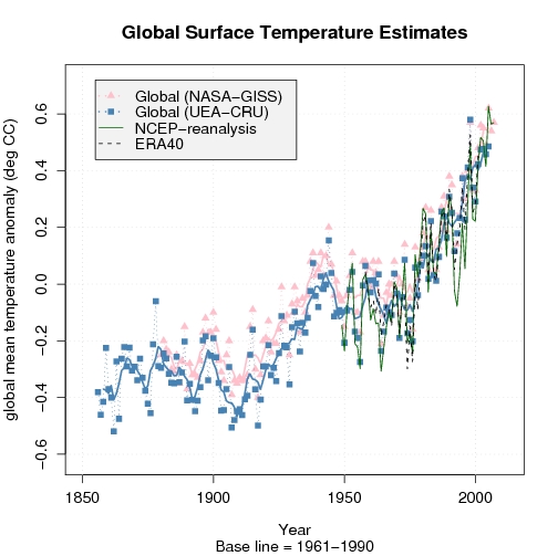
A comparison with other temperature analyses, such as the NASA/GISS (pink in the figure on the left), reveals differences. We can also compare with model-generated data (re-analyses), keeping in mind that one must be very careful with these data since they are not appropriate for studying long-term climate change (they give a misrepresentation of trends – at least on a local scale). Nevertheless, information from independent data suggest an increase in global mean temperatures even over the last decade.
All scientific questions involve some degree of uncertainties (error bars), and these can only be reduced if one can prove that they are influenced by an external factor (’contamination’) or if some of the data are not representative for the study. Hence, if some of the data are incorrect, then it’s fair to exclude these to reduce the error bars. But this requires solid and convincing evidence of misrepresentation, and one cannot just pick the low values and claim that these describe the upper limit without proving that all the data with higher values are wrong. In other words, arguing that a lower limit is the upper bound is utter nonsense (even some who claim they are ’statisticians’ have made this mistake!).
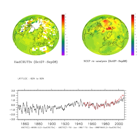
Another issue is that some of the data – i.e. the data from the Climate Research Unit (CRU) – have incomplete coverage, with large gaps in the Arctic where other data suggest the greatest increases in temperature. The figure below reveals the holes in the data knowledge. The figure compares the HadCRUT 3V data with the NCEP re-analysis.
Figure caption: The difference between Oct. 2007 – Sep. 2008 temperature average and the 1961-1990 mean temperature for HadCRUT 3V (upper left) and NCEP re-analysis (upper right). Below is a comparison between the 12-month 60N-90N mean temperature evolution (red=NCEP, black = HadCRUT 3v)). (click on figures for PDF-version)
Re-analysis data are results from atmospheric models where observed data have been fed into the models and used to correct the simulation in order to try to get a best possible description of the real atmosphere. But it’s important to note that the NCEP re-analysis and other re-analyses (e.g. ERA40) are not regarded as being appropriate for trend studies due to changes in observational systems (new satellites coming in etc). Nevertheless, a comparison between the re-analyses and observations can highlight differences, which may suggest where to look for problems.

The animated figure shows the temperature difference between the two 5-year periods 1999-2003 and 2004-2008. Such results do not show the long-term trends, but it’s a fact that there have been high temperatures in the Arctic during the recent years.
The recent Arctic warming is visible in the animated plot on the right showing the NCEP re-analysis mean temperature difference between the periods 2004-2008 and 1999-2003.
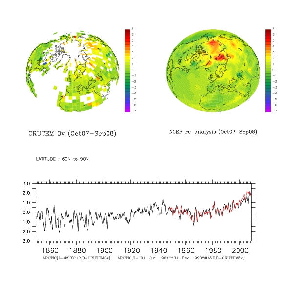
The NOAA report card on the Arctic was based on the CRUTEM 3v data set (see figure below) which excludes temperatures over the ocean – thus showing an even less complete picture of the Arctic temperatures. The numbers I get suggest that more than 80% of the grid-boxes north of 60N contain missing values over the most recent decade.
Figure caption: The difference between Nov. 2007 – Oct. 2008 temperature average and the 1961-1990 mean temperature for CRUTEM 3v (upper left) and NCEP re-analysis (upper right). Below is a comparison between the 12-month 60N-90N mean temperature evolution. (click on figures for PDF-version)
The funny thing, however, is that the last decade of the Arctic CRUTEM 3v temperatures are closer to the corresponding estimates from NCEP re-analysis than the more complete HadCRUT 3v data. This may be a coincidence. The re-analyses use additional data to fill in the voids – e.g. satellite measurements and predictions based on the laws of physics. Thus, the temperature in areas with no observations is in principle physically consistent with surrounding temperatures and the state of the atmosphere (circulation).
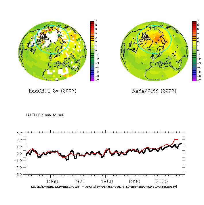
Below is a figure showing a similar comparison between HadCRUT 3v and GISTEMP (from NASA/GISS). The latter provides a more complete representation of the Arctic by taking spatial correlation into account through an extrapolating/interpolating in space. But GISTEMP does not really have a better empirical basis in the Arctic, but the effect from the extrapolation (the filling in of values where there is missing data) gives the recent high Arctic temperatures more weight.
Figure caption: The 2007 mean temperature anomaly wrt to 1961-90: (upper left) HadCRUT 3V, (upper right) GISTEMP, and (lower) temperature evolution for the Arctic (red=GISTEMP, black = HadCRUT 3v).
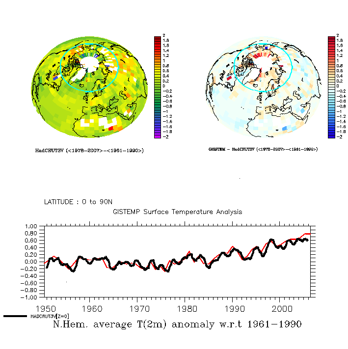
A comparison between temperatures over the most recent available 30-year period (1978-2007) shows high temperatures over parts of Russia (Figure below – upper left panel), and the difference between the GISTEMP and HadCRUT 3v shows a good agreement apart from around the Arctic rim and in some maritime sectors (upper right panel). The time evolution of the Northern Hemisphere mean for the two data sets is shown in the lower panel, showing a good agreement over most of the record, but with slightly higher GISTEMP estimates over the last 10 years (the global mean was not shown because my computer didn’t have sufficient memory for the complete analysis, but the two data sets also show similar evolution in e.g. the IPCC AR4).
Figure caption: (upper left) HadCRUT 3V mean T(2m) anomaly over 1976-2005 (wrt to 1950-1980) ; (upper right) The GISS – HadCRUT 3V difference in mean T(2m) over 1976-2005; and (lower) the Northern Hemisphere mean temperature variations (red=GISTEMP, black=HadCRUT 3v).
Note, the low Arctic sea-ice extent over the last summers are independent evidence of high Arctic temperatures.
The insufficient observational coverage has also been noted by the IPCC AR4 and by Gillett et al. (Nature Geoscience, 2008), who argue that the observed warming in the Arctic and Antarctic are not consistent with internal climate variability and natural forcings alone, but are directly attributable to increased GHG levels.
They also suggested that the polar warming is likely to have discernable impacts on ecology and society (e.g.).
In their study, there are at least 15 grid boxes with valid data (usually representing one measurement) over 1900-2008 period. Furthermore, the only valid observations they used from the Northern Hemisphere were from the Arctic rim, as opposed to in the high Arctic itself. The situation is slightly better for the Antarctic (with one observation near the South Pole). Nevertheless, the title ’Attribution of polar warming to human influence’ [my emphasis] is a bit misleading. Parts of the high-latitudes yes, polar no.
The attribution study was based on series of 5-yr-mean temperatures and spatial averages of 90 degree sectors (i.e. to four different sectors), where sectors and periods with no valid data were excluded.
There are some caveats with their study: The global climate models (GCMs) do not reproduce the 1930-1940 Arctic warm event very well, and the geographical differences in a limited number of grid-boxes in the observations and the GCMs may have been erased through taking the average value over the 90-degree sectors.
The 1930-1940 Arctic warming was probably not externally forced, but one could also argue that the models do not capture all of the internal variations because few reproduce similar features. Furthermore, the present GCMs have problems reproducing the Arctic sea-ice characteristics (which tends to be too extensive), ocean heat content, and fail to capture the ongoing decrease in Arctic sea-ice area. Most of these problems are seen in the gap with no CRUTEM 3v data, but there are also some uncertainties associated with the lack of data in the Polar regions.
The optimal fingerprint analysis hinges on the assumption that control simulations with the GCMs realistically reproduce the climate noise. I think that the GCMs do a good job for most of the planet, but independent work suggest local problems in the Arctic associated with a misrepresentation of the sea-ice extent. This may not have affected the analysis much, if the problem is limited to the high Arctic. Furthermore, the results suggested a one-to-one correspondence in trends between simulations and observations, but the analysis also gave a regression coefficient of 2-4 for natural forcings. The latter suggests to me that there may be some problems with the analysis or the GCMs.
Thus, this is probably not the final word on the matter. At least, I’m not convinced about the attribution yet. The whole boils down to insufficient amounts of empirical data (i.e. observations), GCM limitations at the high-latitudes, and too large data gaps. But the pronounced changes in the Arctic are consistent with AGW. The irony seems to be that the real world shows signs of more dramatic changes than the GCMs project, especially if you look at the sea-ice extent.
The lack of data in the polar region is a problem, and the ongoing International Polar Year (IPY) campaign is a huge concerted international effort to improve the data. Data is irreplaceable, regardless of the modelling capability, as science requires the theory to be tested against independent empirical data. The re-analyses provide a physically consistent description of the atmosphere – suggesting high temperatures in the Arctic – but we can only be sure about this when we actually have been there and made the real measurements (some can be done by satellites too)
A glimpse into the technical details
More technically, the complicated analysis involved a technique called ’optimal fingerprinting’ or ’optimal detection’, looking for best signal in the noisy data and puts emphasis on regions where the GCMs give most realistic description of the climate variations. Basically, the optimal fingerprint techniques involved linear least-squares regression, which is familiar to many analysts.
The analysis of Gillett et al. involved ’time-space’ orthogonal empirical functions (EOF) with truncation of 28 (and up to 78 modes for the Arctic, where the maximum truncation was the number of sectors multiplied with the number of 5-yr means – see supplementary material Fig. S3). These come into the equation through the estimation of the noise (covariance matrix), i.e. the internal variations and their magnitude. The clever thing is that they let each EOFs describe a set of 20 maps of 5-year-mean temperatures, thus representing both the spatial features as well as their chronology.
For the mathematically inclined, EOFs are similar to eigenvectors, and are mainly used to prepare data before further analysis. The purpose of using EOFs is often either to (i) compress the information or (ii) to make the data more ’well-behaved’ (in mathematical terms: orthogonal). While one typically only use a few of the first EOFs, Gillett et al. experimented with just one up to the whole set because they took advantage of their orthogonal properties to allow the calculation of the inverse of the noise co-variance matrix. This is a neat mathematical trick. But this doesn’t help if the GCMs do not provide a good description of the internal variations.
Global temperature deviations from the 1950-2008 average suggests that the earth’s temperature is steadily increasing. Since 1966 the increase has been approximately 0.6 egrees C, indicating a rate of about 0.20 C per decade. The rate of increase appears to be higher now. This site is updated each day.
Thanks for this post Rasmus.
Skeptics seem to point to the Antarctic and say, ”there is little or no warming there” to dispute the importance of the dramatic changes in the Arctic.
Leaving aside the collapse of the Larsen-B ice shelf and other ice shelves in Antarctica, is it too simplistic to expect that dramatic changes should be anticipated first in the Arctic because it is sea covered by a few meters of sea ice and therefore more susceptible to change, in comparison to Antarctica (which is obviously land covered by glacial ice up to several kilometers thick in places)?
In short, why are more rapid changes being observed in the Arctic in comparison to Antarctica?
Are there similar gaps in the temperature record for Antarctica as in the Arctic?
See:
http://climateprogress.org/2008/11/14/coal-stocks-plummet-as-reality-of-climate-and-epa-ruling-finally-sets-in/#more-4232
That says it all. Coal stocks are finally being affected by what you do. For $100 Billion/year, somebody is bound to take a dim view of RealClimate.
[edit]
The observation that temperatures have not been rising since 1998 is generally raised as a ’tongue-in-cheek’ comment. Its not seriously presented as proof that AGW is not real. Its more to teasingly counter the continual selective use of data to ’prove’ that AGW is certain. Hansen had only about 10 years of a rising trend when he first (most publicly) declared AGW is a big threat.
As HADCRU3v is the most prominent data set of the IPCC, surely this has more weight, given how often we are reminded IPCC represents the ’scientific concensus’.
By the way, why does your top graph show HADCRU3v stopping in 2005? Why not include 2007 data, now that we are in Nov 2008, which would show a drop back to 0.4 degC? In contrast, MBH99 managed to include 1998 instrumental data.
You talk about ”confusion”. This only arises from the absence of scientific certainty. Many are saying the science is certain and settled. But it doesn’t take much to demonstrate it is not. Raising the example of non-rising temperutures is only an example of this. We also see IPCC presented as the beacon of truth, but when its data are not extreme enough, we are told (by you here) thta ’there are other data’. As I say, the non-rising temperature does not prove that AGW is not real, but rather demonstrates that the case is not settled.
Rasmus, great and thorough posting! The attention to details is much appreciated with extensive citations. You do echo several points I have been saying both in glogs like these and to people I personally know mis interpreting the models, data and even the lack of direct data for some attribution, yet the agreements among several sources consistent with modeling and observations of AGW and its effects are remarkable. This post also answers alot o questions the denialists so vehemently post and it is consistent with the process of science, not allowing bias and agendas to intefere with a fair and balanced analysis.
I even must concede to the premise and accuracy of these particular wikipedia entries.
A big hello to all the experts at RealClimate.I am an amateur climate guy,Mark J. Fiore,(not the famous political cartoonist), who has read each and every press release and news summary of all studies and news on global warming since 1987.I graduated Harvard, 1982, and Boston College Law, 1987. I sometimes post to RealClimate, as an amateur.It took me one full hour to understand this post, and some of the graphs were not easy for me.
My question today to all of you is this: I understand that we must shoot for 350 ppm as a target,BUT my research indicates that co2 ppm could increase to the upper 500 to low 600 ppm within the next 200 years. My most recent post a few weeks ago noted that the methal hydrates at the bottom of the oceans and the peat mosses in Siberia and Canada have begun their thaw. Are we not and should we not, from a moral standpoint, be concerned about the two hundred year time scale? Native Americans speak of the duty to the seventh generation. Stuart Brand, of the long now foundation, speaks to the same issue.
Let’s be honest. Even a well informed amateur such as myself knows that 350 ppm is completely unrealistic, although completely necessary, to halt the worst effects of global warming. My research, (which amounts to amassing thousands of stories, websites, reports, and international meeing and treaty summaries, along with a close following of all international bodies concerned with global warming, into a huge, huge, disorganized, bookmark list,) indicates, that, for the worst effects of global warming to be SOMEWHAT diminished, we would need to get under 300 ppm.
How in the heck is society going to ever get to under 350 ppm? We are at 387 and counting. The pipleine alone in existence will force us above the high 400’s.China is increasing the burning of coal. The oceans’ acidification indicates CLEARLY that the oceans job as a carbon sink has had it. The oceans will not absorb nearly as much co2 as in the past. The Amazon, and all forests, are under continued,relentless assault. As the glaciers retreat, faster and faster than models ever predicted, even from the past three years, the albedo effect is lost. More ground turns from white reflective snow to black, heat absorbant dirt.The same effect occurs as sea ice is lost.The corals blanch,and, as I stated last year on this site, the shutdown of the north Atlantic current will occur, since the salinity level studies I spoke of last year, off Greenland, continue to show that the upwelling mechanisms driving the North Atlanic current are in severe jeapordy, because the change in salinity levels effects the driver of the current, the upwelling and downwelling of different salinity levels off Greenland. How many feedback loops do we need to see in the news before we realize that an unstoppable, runaway, warming event is taking place? Most people worth their salt,(pun intended), know that the 6th Epoch, the Anthropocene, has indeed been ushered in by mankind.Climate changes that before occurred in scales of hundreds of thousands of years are now taking place within decades.The sheer evidence of many, many, unstoppable feedback mechanisms is enormous.
My original question stands. How does society, as it stands now, not understand that they have locked into the system already a rise to the high 500’s ppm, and, in my humble opinion, the low 600’s are NOT out of the question.To me this is just as much of a tragedy if it takes place 250 years from now as it is if it takes only 100 years.In the end, the seventh generation is screwed by a huge loss of fresh water, a huge increase in temperature, an ocean that no longer produces even one tenth of its total protein and carboydrate output as it did in the 1800’s.An atmosphere clouded by super storms of sand from the large increase in desertification, the extra soot in the air from the burning forests, and the crop losses from soil degradation.
Sorry for the ramble, but the evidence is compelling that things are much, much, much worse than even the best experts fear.Perhaps the reading I did a few years ago about the Earth getting a fever to cleanse it of an infection is coming back to mind. As you all recall, the books talked about man as an infectious disease, or cancer, and, that nature will eventually select against a species that destroys the climate stability that enables it to survive.As I recall, the analogy was similar to the human body getting a fever to destroy an infectious agent.
The climate tips naturally, and has, many, many, times, due to the ice ages, and temperature variations. Yet, those were caused by natural events. We are changing the climate in exactly the same way one would if one were deliberatly trying to eliminate and cause to go extinct most biological diversity on the planet. In fact, if one’s goal were to eliminate most of the current biodiversity on the planet, the strategy would look EXACTLY LIKE THE NEWS SINCE 1987.
350 ppm? The planet will be lucky to stabilize under 550 ppm. Get with the program, humans.The battle will be won of lost on your planet within the next 15 years.
I’ve said it before, and I’ll say it again. If worldwide manmade co2 emissions do not fall 80% below 1990 levels, RIGHT NOW, NOT BY 2050, THEN THERE IS NO CHANCE IN HELL OF STABILIZING ANYWHERE CLOSE TO 350 PPM.
Thanks for reading.
Mark J.Fiore
markfiore50@hotmail.com
Mind the gap, indeed! Great post. Just wanted to let you know that I have filed a class action lawsuit on global warming in the International Criminal Court in the Hague, against all current leaders on all nations on Earth, in behalf of all future generations not born yet, forever and ever, as long as this human species shall last…… and for US$1 billion in damages, to be donated if case is accepted and won to groups fighting global warming now! See the news here:
http://northwardho.blogspot.com
Thanks for the post.
The problem of GCM’s representing the evolution in the Arctic rises the question, if the faster than expected decline might have at least hemispheric consequences that are not captured by the models.
The stronger than average warming in the Arctic leads to a decrease of the temperature gradient between the tropics and the pole. This in turn is probably a major reason for the projected northward shift of the polar front (and storm tracks) and the northward extension of the Hadley cell (and thus the Subtropics). The latter is probably responsible e.g. for the (robust) projection of summer drying of the Mediterranean (and other subtropic regions).
The question is, if a faster than expected warming of the Arctic could speed up and strengthen these developments. Moreover, the faster Arctic warming might produce low pole-tropic temperature gradients that do not show up in climate models. And we therefore have no hint what they might lead to.
I don’t know if it would be possible to force a climate model with the observed sea ice extent evolution (and an extrapolation) to get some information what this might produce.
[edit]
In all of your temperature graphs 1998 is far from the hotest year in history. But it actually was, at least accordong to HadCRUT and alll other temperature data than GISS. It may be the hottest (or a tie) even according to the GISS data.
Thanks for the added analysis. I did not work through all the detail, but it seems clear from the graphs that the global mean temp of the last 10 years has not been falling. PAY ATTENTION MEDIA
Anyway, it is an error to take such a short period on the graph as any indication.
Where can I get some info on the CO2e values for the last 1000 years and for the SRES scenarios. I am after data that i can graph.
So – correct me if I’m misunderstanding – but in a nutshell the problem is that the CRU dataset just doesn’t cover the areas where most warming is occurring?
Climate scientists in the form of the IPCC has not failed to convince those who need to be influenced. Barack Obama is convinced, the EU is convinced, so is China and India (the asian haze needs dealing with first though no doubt) and even Australia now need to act to reduce emissions.
Ok so the world has as yet failed to act globally as yet but it is next years post Kyoto meeting that will assist in the realigning of the global economy and how their power their operations.
Real climate maybe failing to convince that CA website which is full of skeptics but on the whole this website has been scientific at all times and hence faithful to the data, the models and the climate science.
RC has not only confounded the skeptics but also the people pro climate people who are fortelling destruction which is also unlikely to happen.
thank you rasmus for being so candid about Gillett et al.
Would it be possible to complete the figures above with corresponding data including Antarctica, please?
I was also under the impression that the reduction in sea ice can be also explained in terms of changed wind patterns. What is your take into that?
That global temperatures have not been rising this century is not I think disputed.
That this is not inconsistent with an overall global warming trend is (on statistical grounds) not I think disputed. (It is not inconsistent with an overall cooling trend either).
So why does any reasonable person think that the FACTS actually provide CONFIRMATION for a theory of AGW?
Whatever the physics says, we ignore FACTS at our peril.
Great graphics, especially the rotating globe.
I don’t know how much time it took to create this but it would be very informative to try different time periods and see if there are different cycles.
For example, the 1945 versus 1975 globe would show a completely opposite view.
15, Maurizio, there has been changes in dominant winds, but my take on the greater ice melt is a flat out warmer atmosphere (causing these winds to change) which shows itself as a brighter twilight during the long night, especially when there is a cooling on the surface. The brighter light is captured and travels at the interface just below the inversion peak (upper Air temperature Maxima). This warm air layer gets its heat reflected downwards during cloudy periods, especially during long night extensive cloudy periods, as a result, Arctic ocean ice doesn’t thicken so much during darkness and leaves it up to summer sunlight (if there is some) to finish off what is left of it. Complementary
information to the Arctic warming analysis would be using DWT’s of the few left Upper Air stations in the Circumpolar zone and crunch up temperature trends of the entire atmosphere, when variances from year to year are very small, but are mostly for the warmer.
PHE writes:
Actually, annual temperature figures go back to about 1880. There hasn’t been any ”selective use of data to ’prove’ that AGW is certain.” The selective use of data has all been on the denier side, when they claim that ”global warming stopped in 1998!” Don’t tell me it’s meant tongue-in-cheek, not when so many internet morons defend it to the death. Try telling Tilo Reber or ”cohenite” that it’s meant tongue-in-cheek. Deniers generally do not understand and don’t want to understand that ten years means nothing to climate. The World Meteorological Organization defines climate as mean regional or global weather over a period of 30 years or more. They didn’t pick that number out of a hat.
Ricki:
Try here:
http://cdiac.ornl.gov/trends/co2/lawdome.html
I’ve reading the entire report from UNEP on Atmospheric Brown Clouds and that would go a long way to answering the question about the current relative ’cooling trend’. If is was not for the sulphuric and micro carbon (soot) laden atmosphere over almost every major city the world’s temp would now be 2.75C hotter than at present. The sulphur in the lower atmosphere below 15kms is reflecting sunlight back into space but the black soot also a component in the ABC’s is heating when bombarded with solar radiation and warming the atmosphere up to 15kms dramatically affecting cloud formation and monsoon/drought cycles.
The jist of this is that we must NOT suddenly switch off carbon/sulphur producing industries over the planet but instead we must first dramatically reduce CO2 emissions from every conceivable source, then gradually tackle coal/fossil fuel sources to smoothly remove the soot from the air to prevent a sudden leap in average global temps which if it is indeed 2.75C as the UNEP predicts will permanently destroy the climates ability to regulate itself and lead to catastrophic changes on the land and sea.
Re 10:
Magnus, look again at the graph. The Hadcrut data in the graph is labelled UAE-CRU. You’ll see that 1998 is indeed shown as the highest temp for that dataset, just as you stated it to be. (Look for the blue squares.) The GISS data shown also clearly agrees with your (correct) description (though the pink triangle is partially obscured by the ”CRU” blue square.) If, like me, you have trouble seeing the details of the graphic, you can click on it to access a PDF version which will allow you to enlarge it.
from 17..What that report tells me is that we are already on borrowed time and we have been thrown a very ironic life line with respect to ABC’s which we must grasp with both hands.
Good post, important to see why GISS and CRU temperatures are different. Just wondering, why aren’t the satellite-based temperature datasets not included? Would be another independent data source.
Nice graphics. Does HadCrut have any plans to fill in the Arctic. As is the record is certainly flawed. Wendell-what data set is updated daily that you refer to? Mark Fiore astute post anything short of 450 ppm seems unrealistic to me.
Neuroskeptic – There are little to no actual data (i.e., temperature measurements)from most of the Artic. The difference between the HadCrut and GISS treatment of this problem is that HadCrut does not use those grid cells to calculate the global temperature anomaly while GISS interpolates/extrapolates from the few stations around the artic to infill temperature estimates for the grid cells where no ”real” data is available. Both methods are valid approaches to treating areas without actual measurements and both have advantages and disadvantages. I think Rasmus points out that model simulations where the available temp data is plugged into the models (i.e., the re-analysis) provide support for a warming Artic and GISS’s interpolation/extrapolation method. However, he wisely cautions that the model simulations are just that and cannot, by themselves, be considered as evidence of a specific temperature trend.
It is good that there is a concerted effort to obtain more actual data from the Artic region.
[Response: There is a comprehensive arctic buoy program that can be used to give temperature data. This is an ongoing analysis to generate gridded data but it isn’t available in real time like the station data. – gavin]
Note that we’ve got a paper soon to come out in ”The Cryosphere” (and we’ll have a poster at AGU) looking at recent ”Arctic Amplification” that you discuss (the stronger rise in surface air temperatures over the Arctic Ocean compared to lower latitudes). We make use of data from both the NCEP/NCAR and JRA-25 reanalyses. JRA-25 a product of the Japan Meteorological Agency. It’s a pretty impressive signal, and is clearly associated with loss of the sea ice cover. You see the signal in autumn, as this is when the ocean is losing the heat it gained (in summer) back to the atmosphere. Very little happening in summer itself (as expected) as the melting ice surface and heat sensible heat gain in the mixed layer limit the surface air temperature change.
[Response: Thanks for the heads up on this Mark. Looking forward to dropping by your poster at AGU. -mike]
http://nsidc.org/arcticseaicenews/
Is all this related to the strange Arctic sea ice response to latent fusion of sea temperatures which is causing the sea ice to form very oddly on the graphs?
It seems that the oceans have absorbed much heat over the summer but have relased it into the atmosphere which has caused the ocean to freeze quickly and oddly even though the atmosphere is warmer than usual.
Urs (9), a question: Why does lesser tropic-polar gradient shift the fronts and cells? It’s not obvious why that would happen (but then I have limited knowledge here…)
Can someone point to a technical paper where I can learn more about the GISS methodology of arctic treatment.
Also, if the 1930-40 arctic warming was AO-induced, what kind of expected temperature variations would be seen in the coastal areas verus the center of the GIS? Most the older data seems to be mostly southern, all coastal so it seems tough to say with high confidence what that area was doing at the time.
RE 16: Simon wrote:
”So why does any reasonable person think that the FACTS actually provide CONFIRMATION for a theory of AGW?”
Because your mental map of the factual terrain is flawed by the ”cherry-picking” fallacy. That is, you are comparing the 2000’s to 1998 and saying, ”not warmer.” However, if you compare the mean global temp for the 2000’s so far to the mean for the 90’s you are definitely going to have to say, ”warmer.” (This is not the optimum way to assess trends either, but for a simple illustrative comparison is probably not too bad.)
Just curious, why was the data from UAH and RSS not included in this discussion? If one plots the records from GISS, HADCru, RSS and UAH; GISS is the outlier, and three of the four primary global temperature measuring systems show a decrease over the most recent six years and a downward trend over the past decade; not that this establishes a significant trend yet. I have personally checked 24 of the USHCN stations in the western U.S. and after seeing the gross quality control problems with the current ground-based measurements, have far greater confidence in the RSS and UAH data.
#19 Barton Paul Levenson
I don’t think anyone can say with certain what the ”average global temperature” was back in 1880. There were no temperature readings for huge portions of the globe. If you cannot say with certainty what the 1880 temperature was then how can you say with certainty that 2008 is warmer in comparison? At best, studies seem to indicate it might be .5C. Based on recent conversations, there does not seem to be much confidence in what gets reported as overall global october temperatures given the lack of QA on incoming data. Call me a denier if that suits you, but belief in warming does not make it so.
PHE says ”As I say, the non-rising temperature does not prove that AGW is not real, but rather demonstrates that the case is not settled.”
Well, actually what it demonstrates is that those making the argument are either ignorant or disingenuous. Climate is noisy. It takes at least 30 years for a signal–even a strong one–to emerge from the noise with very high confidence. If you don’t know this, you’ve no business making pronouncements on climate. If you do know this and make pronouncements anyway, you’ve no credibility.
Kevin McKinney #31
The words ”warmer” and ”warming” have different meanings. Trends change.
Chris McGrath (2) — Here is my amateur standing take on it. The circumpolar vortex around Antartica (at about 60 degrees south latitude) is much more pronounced than for the Arctic. This tends to meteorologically isolate most of the Antarctic, excepting only the Antarctic Pennisula, which is warming very fast. For reasons I do not fully understand, with global warming the circumpolar vortex has moved somewhat further south, exposing the Antarctic Pennisula.
I think that somehow the ozone hole is involved. In any case there are ample resources on the internet for you to more fully understand this physics; there is at least one thread about the Antarctic here on RealClimate.
[reCAPTCHA reminds us ”Gas Managers”.]
How does http://www.ncdc.noaa.gov/oa/climate/research/2008/oct/global.html fit with this discussion?
And previous ones.
Ray #32 ”Climate is noisy. It takes at least 30 years for a signal–even a strong one–to emerge from the noise with very high confidence.”
Climate is for ever changing as is the rate of change of that change. So after patiently observing for ”at least 30 years” in what is it that you then expect to be able to express an opinion with ”very high confidence”?
Pete Best writes:
> It seems that the oceans have absorbed much heat
> over the summer but have relased it into the
> atmosphere which has caused the ocean to freeze
> quickly and oddly
Pete, I think you’re paraphrasing from the page you point to: http://nsidc.org/arcticseaicenews/
where they write:
”Higher-than-average air temperatures …. the Arctic has shown a pattern of strong low-level atmospheric warming over the Arctic Ocean in autumn because of heat loss from the ocean back to the atmosphere…. As larger expanses of open water are left at the end of each melt season, the ocean will continue to hand off heat to the atmosphere.”
So they are saying to expect something new I think.
——
Re ”anything short of 450 ppm seems unrealistic” — that’s unrealistic!
You’re not looking at the most urgent problem we know.
http://www.sciencemag.org/cgi/content/abstract/sci;318/5857/1737
That’s simple physical chemistry, not quantum radiation physics. There’s no argument there.
How about graphing changes in dew point and not just temperatures? It seems to me, the heating effect might be offset a bit with more humidity but that would still raise DPs. I don’t see much discussion of that here or elsewhere (it’s in keeping with the practice of newspapers, TV weatherfolk and such to target temperature and be vague about humidity! I am tired of that BTW.)
Simon Abingdon, actually, trends do not change–at least they don’t change as rapidly as the noise. That’s the point. And trends in climate emerge from noise on timescales of 30 years or so. Might I suggest the Weather Channel would be more suited to your interests and attention span.
Rasmus asks, why you have ”failed to convince”. From my own experience, the most unconvincing evidence for accelerating warming is this graph: http://data.giss.nasa.gov/gistemp/graphs/Fig.C.lrg.gif
Eyeballing that, it begs the question, when will the warming resume its 0,2C per decade trajectory? That’s anybody’s guess, and some results will be seen in our lifetimes. And this question should be kept separate from discussions of energy and conservation, which are important issues for mankind an sich.
Ray #40 ”trends do not change–at least they don’t change as rapidly as the noise.”
Thank you Ray, I had not until now been aware that this was axiomatic in climate science. (I am surprised however that noise is not generally well-behaved on timescales of 30 years). Please be so kind as to point me to some confirmatory citations.
As far your suggestion is concerned, do remember that the ad hominem is now generally proscribed in rational debate, whatever the subject.
Ray #40 ”trends in climate emerge from noise on timescales of 30 years or so”
Come on Ray, this has to mean that supposing there had been an unexpected trend happening during the last twenty years, we wouldn’t expect to detect it for another ten.
rasmus,
In the figure captioned: ‘The 2007 mean temperature anomaly wrt to 1961-90: (upper left) HadCRUT 3V, (upper right) GISTEMP…’,
there appears to be a fairly large discrepancy between the two data sets in the Arctic areas where both have data (especially NE of Greenland and north of eastern Europe). Is there any explanation for this?
Hank Roberts why don’t you explain the simple physical chemistry to us regarding this matter?
Re #7 A very nice and concise rant about the inevitable. Agreed: the next few years are so crucial that every day seems interesting as it begins to dawn on more people the extent of the problem and necessary reactions.
I am furious that marketing and PR campaigns have for decades been suppressing the growing anxiety of this problem.
Now I sometimes feel that human decimation is inevitable, and the only unknown is whether SOME of our species will be able to survive.
Dear Richard Pauli.(#47) Thanks for the feedback on my comment #7. I am always honored to be able to post to Realclimate among such intelligent experts.I also am furious that Hansen’s work and the work of many other scientists and govt. agencies were redacted and changed, and stopped from being published by the Bush administration, and the head of the EPA.They cost us much lost time(20 years or so) in the fight against global warming because they skewed public opinion away from the severity of the issue, and cast doubt on the facts supporting global warming. See all the reports from Union of Concerned Scientists, a group based out my home college town of Cambridge MA.
Let me add one more thing. ENN(Environmental News Network) and ENS(Environmental News Service)both just posted today a new study on water shortages projected for the year 2080. The report indicates that over 3 billion people(up 50% from former estimates) will, by that year,have no access to any water.I have read projections that within 700 years humans could face a total loss of 90% of the species total. Although that would be a great human tragedy, my thinking is that the planet wil then have a ”restored carrying capacity” so to speak, to renew and restore over future millenia SOME of the biological diverity we will lose over the next 100 years.
Again, thanks to the folks at RealClimate for letting me post, since I am not an actual scientist.Tim Ferris, a popular astronomy and astrophysics author that I’ve read extensivly, and like a lot personally, once said to me at a Commonwealth club meeting, here in San Francisco, a few years ago, that maybe species extinction and loss of human life is part of the natural cycle of the planet cleansing itself.At the time, (although he is still one of my favorite cosmology and astronomy authors), I felt the comment was arrogant, and off base.Now I’m not so sure.
Mark J. Fiore
markfiore50@hotmail.com
> ocean pH
You can look it up.
Using the search box at the top of the page finds much, including
https://www.realclimate.org/index.php?p=169
2 July 2005
The Acid Ocean – the Other Problem with CO2 Emission
Using Scholar (check for how often an article is cited; follow citations forward in time for more):
http://scholar.google.com/scholar?hl=en&lr=&safe=off&scoring=r&q=Ocean+pH+co2&as_ylo=2003&btnG=Search
> ocean pH
Specific details on carbonate chemistry are downloadable as a PDF file; use the link on this page:
http://www.nature.com/nature/journal/v437/n7059/suppinfo/nature04095.html
David Archer’s publications page is here:
http://geosci.uchicago.edu/~archer/reprints/